Create Pivottable"
From Documentation
m (→Attributes) |
|||
| Line 19: | Line 19: | ||
</source> | </source> | ||
Default values are <tt>true</tt>. | Default values are <tt>true</tt>. | ||
| + | |||
| + | |||
===Data orientation=== | ===Data orientation=== | ||
| Line 40: | Line 42: | ||
[[Image: ZKPivotEsn_work_pivot_22.png]] | [[Image: ZKPivotEsn_work_pivot_22.png]] | ||
| + | |||
| + | |||
| + | | ||
==Title Cells== | ==Title Cells== | ||
Revision as of 08:26, 28 March 2011
With a PivotModel, we can easily create a Pivottable component.
Create a Pivottable
Given a PivotModel, creating a Pivottable is as simple as
<pivottable model="${model}" />
Attributes
Grand totals
You can show or hide grand total rows or columns by specfiying
<pivottable model="${model}" grandTotalForColumns="false" grandTotalForRows="false" />
Default values are true.
Data orientation
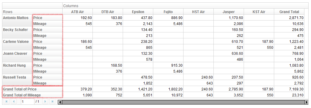
Data orientation means how to arrange data when there are more than one data fields. For example, if we specify "Price" and "Mileage" as data field,
<pivottable model="${model}" dataOrient="column" />
gives
and
<pivottable model="${model}" dataOrient="row" />
will give
Title Cells
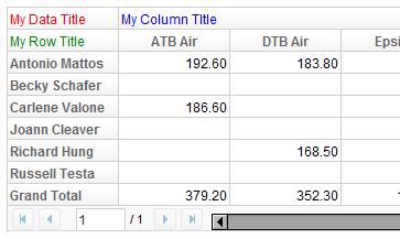
Pivottable can accept up to 3 child components, which will represent the 3 title cells in the order of data title, column title, and row title. For example,
<pivottable model="${model}">
	<div style="color: red">My Data Title</div>
	<div style="color: blue">My Column Title</div>
	<div style="color: green">My Row Title</div>
</pivottable>
results in
Paging
Version History
| Version | Date | Content |
|---|---|---|


