Layouts and Containers"
Jimmyshiau (talk | contribs) |
Jimmyshiau (talk | contribs) |
||
| Line 219: | Line 219: | ||
=== Borderlayout in a container=== | === Borderlayout in a container=== | ||
*Almost of container's height is count on children, place Borderlayout in a container, you have to specify a height to Borderlayout. | *Almost of container's height is count on children, place Borderlayout in a container, you have to specify a height to Borderlayout. | ||
| − | <source lang="xml"> | + | <source lang="xml" high="3"> |
<zk> | <zk> | ||
<window title="win" border="normal"> | <window title="win" border="normal"> | ||
| Line 243: | Line 243: | ||
</source> | </source> | ||
*The default height of Borderlayout is count on parent component, you can put Borderlayout in a fixed height container. | *The default height of Borderlayout is count on parent component, you can put Borderlayout in a fixed height container. | ||
| − | <source lang="xml"> | + | <source lang="xml" high="2"> |
<zk> | <zk> | ||
<window title="win" border="normal" height="200px"> | <window title="win" border="normal" height="200px"> | ||
Revision as of 04:18, 28 June 2011
Layouts are components used to partition the display area it owns into several sub-areas for its child components, while containers group its child components into the display area it owns.
You could nest one from another to create the UI you want.
Layouts
Here are a brief introductions. For detailed information and a complete list, please refer to ZK Component Reference: Layouts.
Hlayout and Vlayout
Hlayout and Vlayout are a simple and lightweight layout that arranges its children to be displayed horizontally and vertically, respectively. They are made of HTML DIV, so they are also easy to customize.
Scrolling
- You can specify "overflow:auto;" to style for make Hlayout and Vlayout can be scrolled.
- Due to the height of Hlayout and Vlayout is count on children, their height will be increased by their children, you have to specify a fixed height to Hlayout and Vlayout or place them in a fixed height container, EX: "<window height="100px"...".
Hbox and Vbox
Similar to Hlayout and Vlayout, Hbox and Vbox arrange its children to be displayed horizontally and vertically. However, they provide more functionality, such as splitter, align and pack, but the performance is slower.
scrolling
- Hbox and Vbox is create by table, HTML table cannot appear a scroll bar, you have to place them in a scrolling container.
Borderlayout
Borderlayout places its child components in up to five areas: north, east, south, west and center. All extra space is placed in the center area.
flex
Layout region will share the height of Borderlayout, the sequence is North, South, Center, and the height of East and West is count on Center, in the previous sample, the div in the layout region will not take whole of the layout region's space , you have to specify flex="true" to the layout region, let the child to occupy whole space.
Scrolling
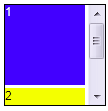
- The height of Center will count on Borderlayout not count on child, so Center's height will not grow by child component, if Center's height is not enough for it's child, Center will cut the content of it's child, you have to specify autoscroll="true" to Center, let Center to handle the scrolling.
Grow by children
- If you want Borderlayout grow by children, you have to use vflex feature, specify vflex="min" to each layout region and Borderlayout.
Borderlayout in a container
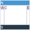
- Almost of container's height is count on children, place Borderlayout in a container, you have to specify a height to Borderlayout.
<zk>
	<window title="win" border="normal">
		<borderlayout height="200px">
			<north>
				<div style="background:blue">N</div>
			</north>
			<south>
				<div style="background:blue">S</div>
			</south>
			<center>
				<div>C</div>
			</center>
			<east>
				<div style="background:yellow">E</div>
			</east>
			<west>
				<div style="background:yellow">W</div>
			</west>
		</borderlayout>
	</window>
</zk>
- The default height of Borderlayout is count on parent component, you can put Borderlayout in a fixed height container.
<zk>
	<window title="win" border="normal" height="200px">
		<borderlayout>
			<north>
				<div style="background:blue">N</div>
			</north>
			<south>
				<div style="background:blue">S</div>
			</south>
			<center>
				<div>C</div>
			</center>
			<east>
				<div style="background:yellow">E</div>
			</east>
			<west>
				<div style="background:yellow">W</div>
			</west>
		</borderlayout>
	</window>
</zk>
Columnlayout
Columnlayout places its child components into multiple columns, and each column could have any number of child components placed vertically with different height (but the same width). Unlike portallayout, the user cannot move the child components to different locations (of course, the application can re-arrange the order anytime it likes).
- Available for ZK:
-

Portallayout
Portallayout places its child components into multiple columns, and each column could have any number of child components placed vertically with different height (but the same width). The user can move any of them to another location he want like a portal.
- Available for ZK:
-

Tablelayout
Tablelayout places its child components in a table. The implementation is based on HTML TABLE tag.
- Available for ZK:
-

Containers
Here are a brief introductions. For detailed information and a complete list, please refer to ZK Component Reference: Containers.
Div and Span
Div and span are the most lightweight containers to group child components. They are the same as HTML DIV and SPAN tags respectively. Div is displayed as block that the following sibling won't be displayed in the same vertical position; as if there is a line break before and after it. On the other hand, span is displayed inline with siblings (as if no line break in between).

|
<div style="border: 1px solid blue" width="150px">
  this is
  <span>inlined with <button label="Hi"/></span>
</div>
<div style="border: 1px solid grey">
	<div>div is a block</div>
	<datebox/>
</div>
|
Scrolling
Span:
- Span is a inline element, it can't be scrolled.
Div:
- You can specify "overflow:auto;" to style for make Div can be scrolled.
- Due to the height of Div is count on children, it's height will be increased by it's children, you have to specify a fixed height to Div.

|
<div height="100px" width="100px"
	style="border:1px solid black;overflow:auto;">
	<grid>
		<rows>
			<row>item</row>
			<row>item</row>
			<row>item</row>
			<row>item</row>
			<row>item</row>
		</rows>
	</grid>
</div>
|
Window
Window is a container providing caption, border, overlapped, draggable, closable, sizable, and many other features. Window is also a owner of a ID space, such that the IDs of its child components won't be conflict with others.

|
<window title="A" closable="true" sizable="true"
 border="normal" mode="overlapped">
   <div style="background: yellow">1</div>
   <combobox/>
</window>
|
Scrolling
- You can specify "overflow:auto;" to contentStyle for make Window can be scrolled.
- Due to the height of Window is count on children, it's height will be increased by it's children, you have to specify a fixed height to Window.
Panel
Like Window, panel is another powerful container, supporting caption, border, overlapped and many other features. However, it does not implement IdSpace, so all of its children belongs to the same ID space of its parent.

|
<panel title="A" framable="true" border="normal"
 maximizable="true" collapsible="true">
   <panelchildren>
      <div style="background: yellow">1</div>
      <combobox/>
   </panelchildren>
</panel>
|
Scrolling
- You can specify "overflow:auto;" to style of Panelchildren for make Panel can be scrolled.
- Due to the height of Panel is count on children, it's height will be increased by it's children, you have to specify a fixed height to Panel.
Groupbox
Groupbox is a lightweight way to group child components. It supports the caption and border, but it can not be overlapped or sized. It does not implement IdSpace either.

|
<groupbox mold="3d">
  <caption label="Fruits"/>
  <radiogroup>
    <radio label="Apple"/>
    <radio label="Orange"/>
    <radio label="Banana"/>
  </radiogroup>
</groupbox>
|
Scrolling
3d mold only
- You can specify "overflow:auto;" to contentStyle for make Groupbox can be scrolled.
- Due to the height of Groupbox is count on children, it's height will be increased by it's children, you have to specify a fixed height to Groupbox.

|
<groupbox mold="3d" height="150px" width="150px"
	contentStyle="overflow:auto;">
	<caption label="3d groupbox" />
	<grid>
		<rows>
			<row forEach="1,2,3,4,5,6">item</row>
		</rows>
	</grid>
</groupbox>
|
Tabbox
Tabbox is a container used to display a set of tabbed groups of components. A row of tabs is displayed at the top (or left or other location) of tabbox which may be used to switch between each group. It does not implement IdSpace either.

|
<tabbox height="80px">
  <tabs>
    <tab label="Tab 1"/>
    <tab label="Tab 2"/>
  </tabs>
  <tabpanels>
    <tabpanel>This is panel 1</tabpanel>
    <tabpanel>This is panel 2</tabpanel>
  </tabpanels>
</tabbox>
|
Scrolling
- You can specify "overflow:auto;" to style of Tabpanel for make Tabpanel can be scrolled.
- Due to the height of Tabpanel is count on children, it's height will be increased by it's children, you have to specify a fixed height to Tabbox.
Version History
| Version | Date | Content |
|---|---|---|


