Cell"
| Line 73: | Line 73: | ||
==The Rowspan Property== | ==The Rowspan Property== | ||
| − | It specifies the number of rows this cell | + | It specifies the number of rows this cell should occupy. It has the same effect as HTML TR tag's rowspan attribute does. |
=Miscellaneous= | =Miscellaneous= | ||
Revision as of 01:42, 1 August 2011
Cell
- Demonstration: Grid (Spreadsheet Functionalities)
- Java API: Cell
- JavaScript API: Cell
- Style Guide: Cell
Employment/Purpose
The generic cell component to be embedded into Row or Hbox or Vbox for fully control style and layout.
Example
<zk>
	<grid>
		<columns>
			<column label="A" />
			<column label="B" />
			<column label="C" />
			<column label="D" />
		</columns>
		<rows>
			<row>
				<cell rowspan="4" align="center" valign="bottom">
					<label value="item 1" />
				</cell>
				<cell colspan="3">
					<label value="item 2" />
				</cell>
			</row>
			<row>
				<cell colspan="2"  align="center">
					<label value="item 3" />
				</cell>
				<label value="item 4" />
			</row>
			<row>
				<label value="item 5" />
				<label value="item 6" />
				<label value="item 7" />
			</row>
			<row>
				<label value="item 8" />
				<label value="item 9" />
				<label value="item 10" />
			</row>
		</rows>
	</grid>
</zk>
<zk>
	<window title="hbox" border="normal" width="320px">
		<hbox width="300px" pack="center">
			<cell hflex="1" align="center">
				<label value="item 1" />
			</cell>
			<cell hflex="1" align="center">
				<label value="item 2" />
			</cell>
		</hbox>
	</window>
</zk>
Properties
The Rowspan Property
It specifies the number of rows this cell should occupy. It has the same effect as HTML TR tag's rowspan attribute does.
Miscellaneous
Comparison to default (no Cell) scenario
The Cell component is meant to provide full controll of the DOM structure, so user needs to expect to handle some lower level styling.
For example, consider the following scenario:
	<grid>
		<columns>
			<column label="A" />
			<column label="B" />
		</columns>
		<rows>
			<row>
				<label>A</label>
				<cell>
					<label>B</label>
				</cell>
			</row>
		</rows>
	</grid>
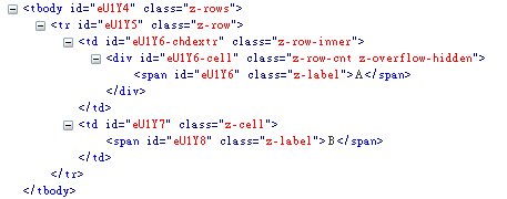
Although they look alike, the DOM structures generated for the two table cells are slightly different:
With a Cell component given, there is no inner <div> element generated, which grants you a more flexible control to the DOM structure, but as a result you may need to provide more style handling. It is also recommended to use Cell for handling row span, column span, and alignment. In neither of the above cases, it is recommended not to use Cell. To put more than 1 Component in a grid cell, you can also use a Div to wrap them.
Supported Events
| None | None |
- Inherited Supported Events: XulElement
Supported Children
*ALL
Use Cases
| Version | Description | Example Location |
|---|---|---|
Version History
| Version | Date | Content |
|---|---|---|


