Chosenbox"
| Line 11: | Line 11: | ||
= Employment/Purpose = | = Employment/Purpose = | ||
| − | A component | + | A component similar to [[ZK_Component_Reference/Input/Combobox | Combobox]] but handles the multi-selection and the select order. |
= Example = | = Example = | ||
Revision as of 02:03, 26 April 2012
Combobutton
- Demonstration:
- Java API: Chosenbox
- JavaScript API: Combobutton
- JavaScript API: Chosenbox
- Style Guide: Chosenbox
- Available for ZK:
-

Employment/Purpose
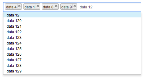
A component similar to Combobox but handles the multi-selection and the select order.
Example
Normal ListModel
In this way, all the content will send to client side and process at client side, this is pretty fast with few items but will cause performance issue at client side if there are lots of items (e.g., 40000 or more) in model and render/process them at once.
<zk>
	<zscript>
		import org.zkoss.zktest.test2.select.models.*;

		ListModelList model = ListModelLists.
			getModel(ListModelLists.MULTIPLE_AND_CLONEABLE);
	</zscript>
	<chosenbox id="lbxThree" width="440px"
		model="${model}" />
</zk>
SubListModel
In this way, the content of drop-down list will not rendered to client side, and is blank without input, server will provide the 'matched' content after user input some text. This will cause some delay at client side cause by the server processing time and network transfer time.
See also: Combobox#Autocomplete_by_ListSubModel
<zk>
	<zscript>
		import org.zkoss.zktest.test2.select.models.*;

		ListModelList model = ListModelLists.
			getModel(ListModelLists.MULTIPLE_AND_CLONEABLE);
		ListSubModel subModel = ListModels.toListSubModel(model);
	</zscript>
	<chosenbox id="lbxThree" width="440px"
		model="${subModel}" />
</zk>
creatable, emptyMessage, noResultsText and createMessage
The creatable attribute denotes whether display createMessage while user input a value which not in model, and send it back with onSearch event if user press the ENTER key or separator.
The emptyMessage will be displayed as a placeholder if nothing selected and not focused.
The noResultText will be displayed if nothing match to the input value and can not create either, the syntax "{0}" will be replaced with the input value at client side.
The createMessage will be displayed in popup if nothing match to the input value but can create as new label, the syntax "{0}" will be replaced with the input value at client side.
No item selected and not focused, the emptyMessage is shown.
data 0 is in model and already selected, noResultText is shown.
There is no item 0 in model and is creatable, createMessage is shown.
<zk>
	<zscript>
		import org.zkoss.zktest.test2.select.models.*;

		ListModelList model = ListModelLists.
			getModel(ListModelLists.MULTIPLE_AND_CLONEABLE);
	</zscript>
	<chosenbox id="lbxThree" width="440px"
		model="${model}" creatable="true"
		emptyMessage=" Please select some items."
		noResultsText=" No such item - {0} - and it is already in the model."
		createMessage=" No such item -{0} - but it is not in model either, you can try to create it.">
		<attribute name="onSearch">
			Object obj = event.getValue();
			((ListModelList)model).add(obj);
			self.addItemToSelection(obj);
		</attribute>
	</chosenbox>
</zk>
Mouseless Entry Chosenbox
- Press UP and DOWN to move the focus up and down by one option.
- Press LEFT and RIGHT to move focus between selected item(s) and the input field.
- Press ESC to clear input and close drop-down list.
- Press DELETE to delete the focused item and move focus to next item if any or input field.
- Press BACKSPACE to delete the focused item and move focus to previous item if any or input field.
- Press ENTER or specified separator to select the focused option.
Properties
- creatable: specify whether send event to server when user input an inexist value then press ENTER or separator. Default: false
- createMessage: displayed in popup if nothing match to the input value and creatable is true, the syntax "{0}" will be replaced with the input value at client side.
- disabled: specify whether it is disabled. Default: false
- emptyMessage: displayed as place holder in input if nothing selected and not focused.
- model: specify the ListModel of this chosenbox. If you set ListModelList to it, All the content will send to client side and process at client side, this is pretty fast with few items but will cause performance issue at client side if there are lots of items (e.g., 40000 or more) in model. If you set ListSubMmodel to it, The content of drop-down list will not rendered to client side, and is blank without input, server will provide the 'matched' content after user input, this will cause some delay at client side cause by the server processing time and network transfer time.
- name: specify the name of the input element of this component.
- noResultsText: displayed in popup if nothing match to the input value and creatable is false, the syntax "{0}" will be replaced with the input value at client side.
- open: specify whether open the drop-down list. Default: false
- tabindex: specify he tab order of the input node of this component. Default: 0
- separator: the separate chars will work as 'Enter' key, it will not considered as input value but send onSerch or onSelect while key up. Supports: 0-9, A-Z (case insensitive), and ,.;'[]/\-=.
Supported Events
| Event: SelectEvent
Represents an event cause by user's the selection is changed at the client. | |
| Event: OpenEvent
Represents an event that indicates a the open state is changed at the client. | |
| Event: InputEvent
Represents an event that indicates user input an inexist value then press ENTER or separator. | |
| Event: InputEvent
Represents an event caused by that user is input text. |
- Inherited Supported Events: HtmlBasedComponent
Supported Molds
- The default mold
Supported Children
None
Use Cases
| Version | Description | Example Location |
|---|---|---|
| 6.0.1+ | Creatable Chosenbox | Chosenbox – A beautiful and powerful multiple combobox |
Version History
| Version | Date | Content |
|---|---|---|
| 6.0.1 | April 3, 2012 | Add the new Chosenbox component |


