ZK 6.5 Responsive design"
Tmillsclare (talk | contribs) |
Tmillsclare (talk | contribs) |
||
| Line 40: | Line 40: | ||
= Adaptive Layouts = | = Adaptive Layouts = | ||
| − | The adaptive layout is more advantageous than [[Fluid Layouts]], the problem we met in the fluid layout is that its content can only change to the screen's size, but the layout may break if the screen is not big enough. The adaptive layout can solve this by using [http://www.w3.org/TR/css3-mediaqueries/ CSS 3 Media Query]. | + | The adaptive layout is more advantageous than [[#Fluid Layouts | Fluid Layouts]], the problem we met in the fluid layout is that its content can only change to the screen's size, but the layout may break if the screen is not big enough. The adaptive layout can solve this by using [http://www.w3.org/TR/css3-mediaqueries/ CSS 3 Media Query]. |
For example, | For example, | ||
Revision as of 06:46, 13 August 2012
Jumper Chen, Senior Engineer, Potix Corporation
August 07, 2012
ZK 6.5
Introduction
Within upcoming release of ZK 6.5, one of the hot topics is how ZK introduces Responsive Design. The aim of ZK framework team is to serve a variety of devices and screens, in the following tutorial we will guide you how to deal with that diverseness.
Fluid Layouts
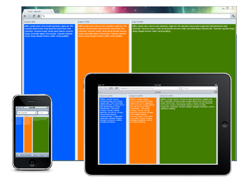
Since the ZK 5 release, we provided a way to adjust the component size using either vflex or hflex instead of giving components a fixed height and/or width in pixels.
For example,
<hlayout vflex="1">
	<window title="Column 25%" vflex="1" hflex="1" sclass="column1" border="normal">
			toffee candy canes cheesecake gummies apple pie. Pie cupcake cheesecake sugar plum tart donut
			bear claw caramels. Sesame snaps candy candy faworki sesame snaps chocolate wypas cheesecake.
			Cupcake cupcake chupa chups dragée bonbon cotton candy pudding.
	</window>
	<window title="Column 25%" vflex="1" hflex="1" sclass="column2" border="normal">
			toffee candy canes cheesecake gummies apple pie. Pie cupcake cheesecake sugar plum tart donut
			bear claw caramels. Sesame snaps candy candy faworki sesame snaps chocolate wypas cheesecake.
			Cupcake cupcake chupa chups dragée bonbon cotton candy pudding.
	</window>
	<window title="Column 50%" vflex="1" hflex="2" sclass="column3" border="normal">
			toffee candy canes cheesecake gummies apple pie. Pie cupcake cheesecake sugar plum tart donut
			bear claw caramels. Sesame snaps candy candy faworki sesame snaps chocolate wypas cheesecake.
			Cupcake cupcake chupa chups dragée bonbon cotton candy pudding.
	</window>
</hlayout>
In the above example, we should use the attributes vflex and hflex to adjust the size according to the screen size of different devices. In the following section we will demonstrate another way call Adaptive Layouts.
Adaptive Layouts
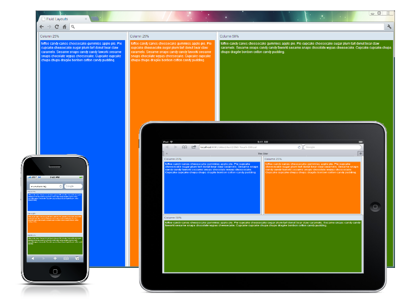
The adaptive layout is more advantageous than Fluid Layouts, the problem we met in the fluid layout is that its content can only change to the screen's size, but the layout may break if the screen is not big enough. The adaptive layout can solve this by using CSS 3 Media Query.
For example,
<?taglib uri="http://www.zkoss.org/dsp/web/theme" prefix="t"?>
<zk>
<style>
.z-hlayout-inner {
	${t:applyCSS3('box-sizing', 'border-box')};
	height: 100%;
}
.z-hlayout-inner {
	width: 25%;
}
.z-hlayout-inner:last-child {
	width: 50%;
}
@media screen and (max-width: 1024px) {
	.z-hlayout-inner {
		width: 50%;
		height: 50%;
	}
	.z-hlayout-inner:last-child {
		width: 100%;
		display: block;
	}
}
@media screen and (max-width: 750px) {
	.z-hlayout-inner {
		width: 100%;
		height: 33%;
		display: block;
	}
}
</style>
<hlayout vflex="1">
	<window title="Column 25%" height="100%" sclass="column1" border="normal">
		toffee candy canes cheesecake gummies apple pie. Pie cupcake cheesecake sugar plum tart donut
		bear claw caramels. Sesame snaps candy candy faworki sesame snaps chocolate wypas cheesecake.
		Cupcake cupcake chupa chups dragée bonbon cotton candy pudding.
	</window>
	<window title="Column 25%" height="100%" sclass="column2" border="normal">
		toffee candy canes cheesecake gummies apple pie. Pie cupcake cheesecake sugar plum tart donut
		bear claw caramels. Sesame snaps candy candy faworki sesame snaps chocolate wypas cheesecake.
		Cupcake cupcake chupa chups dragée bonbon cotton candy pudding.
	</window>
	<window title="Column 50%" height="100%" sclass="column3" border="normal">
		toffee candy canes cheesecake gummies apple pie. Pie cupcake cheesecake sugar plum tart donut
		bear claw caramels. Sesame snaps candy candy faworki sesame snaps chocolate wypas cheesecake.
		Cupcake cupcake chupa chups dragée bonbon cotton candy pudding.
	</window>
</hlayout>
</zk>
As you can see, we remove the vflex and hflex for the Window component and replace it with a pure CSS style and some condition statements with the @media query to switch the layout to fit the screen size. max-width: 1024px for ipad or tablet devices and max-width: 750px for iphone or smartphones. But those changes are only client effects, how ZK developer can do in server side if the orientation change? or how many component's stylings need to be scaled when displaying in touch devices? These answers can be found in the following section.
Responsive Design (mix all)
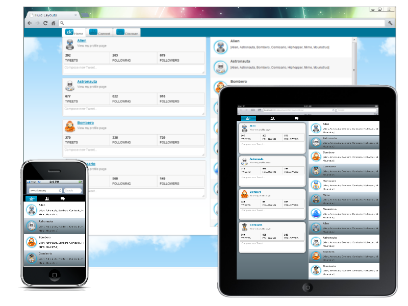
In ZK 6.5, we refine and polish all components to display them seamlessly between PC's browser or Tablet devices. In some of the use cases the default styling is not satisfied for user to adjust the layout for different devices and screen sizes, therefor we can employ the ClientInfoEvent to detect whether the browser's orientation change, and then switch some components' orientation to conform that.
For example,
Zul Source Code
<zk>
<zscript><![CDATA[
void doOrientationChange(ClientInfoEvent evt) {
	if ("portrait".equals(evt.getOrientation())) {
		main.setWidth("100%");
		if (evt.getDesktopWidth() < 640)
			sv.setVisible(false);
		Clients.resize(content);
	} else {
		if (!execution.isBrowser("mobile"))
			main.setWidth("80%");
		sv.setVisible(true);
		Clients.resize(content);
	}
}
]]></zscript>
	<tabbox id="main" sclass="main" width="${zk.mobile > 0 ? '100%' : '80%'}"
		vflex="1" onClientInfo="doOrientationChange(event)" tabscroll="false"
		apply="org.zkoss.bind.BindComposer" viewModel="@id('vm') @init('TweetsVM')">
		<custom-attributes org.zkoss.zul.image.preload="true" />
		<tabs>
			<tab>
				<caption>
					<div sclass="home" />
					Home
				</caption>
			</tab>
			<tab>
				<caption>
					<image sclass="connect" />
					Connect
				</caption>
			</tab>
			<tab>
				<caption>
					<image sclass="discover" />
					Discover
				</caption>
			</tab>
		</tabs>
		<tabpanels vflex="1" hflex="1">
			<tabpanel vflex="1" hflex="1">
				<hlayout id="content" sclass="main-content" vflex="1">
					<scrollview id="sv" orient="vertical" vflex="1" hflex="1"
						visible="${zk.mobile > 0}" children="@init(vm.profiles)">
						<template name="children" var="profile">
							<groupbox mold="3d" sclass="profile" hflex="1">
								<vlayout>
									<hlayout>
										<image sclass="@bind(profile.ownerIcon)" />
										<vlayout>
											<a sclass="fullname" label="@bind(profile.author)" />
											<label value="View my profile page" style="color:gray" />
										</vlayout>
									</hlayout>
									<hlayout sclass="status">
										<div sclass="vbar first-vbar" hflex="1">
											<label sclass="number" value="@bind(profile.tweets)" />
											<separator />
											<label sclass="text" value="TWEETS" />
										</div>
										<div sclass="vbar" hflex="1">
											<label sclass="number" value="@bind(profile.following)" />
											<separator />
											<label sclass="text" value="FOLLOWING" />
										</div>
										<div sclass="vbar" hflex="1">
											<label sclass="number" value="@bind(profile.followers)" />
											<separator />
											<label sclass="text" value="FOLLOWERS" />
										</div>
									</hlayout>
									<textbox rows="2" placeholder="Compose new Tweet..."
										multiline="true" hflex="1" />
								</vlayout>
							</groupbox>
						</template>
					</scrollview>
					<listbox model="@load(vm.tweets)" vflex="1" hflex="1">
						<template name="model" var="tweet">
							<listitem>
								<listcell>
									<hlayout>
										<image sclass="@load(tweet.authorIcon)" />
										<div>
											<label sclass="author" value="@load(tweet.author)" />
											<separator />
											<label sclass="content" multiline="true"
												value="@load(tweet.content)" />
										</div>
									</hlayout>
								</listcell>
							</listitem>
						</template>
					</listbox>
				</hlayout>
			</tabpanel>
		</tabpanels>
	</tabbox>
</zk>
In this example, we layout the page with the normal ZUL Components and only register the ClientInfoEvent to switch the layout being displayed properly and being fitted in the space of different devices. And we also manage the main content of the listbox by using the vflex and the hflex to expand the tweet's content according to the max height it can give, and then we do the same things, mentioned in #Adaptive Layouts, with @Media Query to fine tune some areas in the page, like making the whole styling in portrait orientation with different way (like native apps) and making the profile area invisible for smartphones, you can see the following CSS Content for more details.
Note: some of the components and features used above are available in ZK EE only.
CSS Content
<%@ taglib uri="http://www.zkoss.org/dsp/web/core" prefix="c" %>
<%@ taglib uri="http://www.zkoss.org/dsp/web/theme" prefix="t" %>
<%-- For tablet or orientation in portrait devices  --%>
@media only screen and (orientation:portrait) {
	body {
		margin: 0;
		padding: 0;
		${t:gradient('ver', '#cedce7 0%;#596a72 100%')};
	}
	<%-- Customize the default tabbox styling --%>
	.z-tabs-header {
		height: auto;
		background: black;
	}
	.z-tabs-cnt > li.z-tab,
	.z-tabs-cnt > .z-tab:active {
		background: transparent;
		${t:boxShadow('none')};
		border: 0;
		width: 128px;
		height: 32px;
	}
	.z-tab .z-label {
		display: none;
	}
	.z-tabs-cnt > li.z-tab.z-tab-seld,
	.z-tabs-cnt > li.z-tab.z-tab-seld:first-child,
	.z-tabs-cnt > li.z-tab.z-tab-seld:active,
	.z-tabs-cnt > li.z-tab.z-tab-seld:active:first-child {
		background: black;
		border-color: transparent;
		${t:boxShadow('1px 1px 0 black')};
	}
	.z-tabs-cnt > .z-tabs {
		background: #555;
	}
	td.z-caption-r {
		text-align: center;
	}
	.main-content {
		max-height: 2048px;
	}
	<%-- Change the tab styling --%>
	.z-tab .home {
		background: transparent;
	}
	.z-tab-seld .home {
		background: ${t:gradValue('ver', '#02ABDE 0%; #007497 50%; #02ABDE 100%')};
	}
	.home:before {
		top: 12px;
		left: 25px;
	}
	.home:after {
		top: -1px;
		left: 30px;
	}
	.connect {
		background: url(${c:encodeURL('/images/icons/icon_friendrequests_white.png')}) no-repeat center center;
	}
	.discover {
		background: url(${c:encodeURL('/images/icons/icon_messagestop_white.png')}) no-repeat center center;
	}

	.z-tab .z-image,
	.z-tab .home {
		height: 32px;
		line-height: 28px;
		width: 80px;
	}
	tr.z-listbox-odd {
		${t:gradient('ver', '#cedce7 0%;#596a72 100%')};
	}
	.z-scrollview-content-ver:first-child .profile {
		margin: 10px;
	}
	.profile {
		margin-left: 10px;
		border: 3px solid #CFCFCF;
		${t:borderRadius('15px')};
		${t:boxShadow('0 0 7px rgba(0, 0, 0, 0.70)')};
	}
	.z-groupbox-3d-cnt {
		border: 0px;
	}
}
 <%-- For smartphones or small screen  --%>
@media screen and (orientation:portrait) and (max-width: 720px) {
	.main-content {
		max-height: 1024px;
	}
	.z-tabs-cnt > li.z-tab,
	.z-tabs-cnt > .z-tab:active {
		background: transparent;
		${t:boxShadow('none')};
		border: 0;
		width: 80px;
		height: 32px;
	}
	.z-tab .z-image,
	.z-tab .home {
		height: 32px;
		line-height: 28px;
		width: 60px;
	}
	.home:before {
		top: 12px;
		left: 20px;
	}
	.home:after {
		top: -1px;
		left: 25px;
	}
	.main-content > .z-hlayout-inner:first-child {
		display: none;
	}
}
Summary
ZK framework team are struggling to make the Web and Touch devices war easy and simple, we do not introduce another programming way and component set for user to learn and use it, we just want our user can easily produce their product or website in one way and run everywhere.
Download
The whole example code can be downloaded here - Github
Comments
| Copyright © Potix Corporation. This article is licensed under GNU Free Documentation License. |


