ZK Graphics Component"
Jumperchen (talk | contribs) |
Jumperchen (talk | contribs) |
||
| Line 1: | Line 1: | ||
| − | |||
{{Template:Smalltalk_Author| | {{Template:Smalltalk_Author| | ||
|author=Jumper Chen, Engineer, Potix Corporation | |author=Jumper Chen, Engineer, Potix Corporation | ||
| Line 169: | Line 168: | ||
| :dragend || rect:dragend || Selects all dragend rectangles | | :dragend || rect:dragend || Selects all dragend rectangles | ||
|} | |} | ||
| + | |||
| + | For example, | ||
| + | |||
| + | <source lang="xml" high="8,11"> | ||
| + | <zk> | ||
| + | <stage id="stage" hflex="1" vflex="1"> | ||
| + | <layer> | ||
| + | <circle id="circle" radius='70' draggable="true" x="1000" | ||
| + | y="150" fill='yellow' stroke='black' strokeWidth="4"/> | ||
| + | </layer> | ||
| + | <animation> | ||
| + | #circle:mouseover { | ||
| + | fill: red; | ||
| + | } | ||
| + | #circle:mouseout { | ||
| + | fill: yellow; | ||
| + | } | ||
| + | </animation> | ||
| + | </stage> | ||
| + | </zk> | ||
| + | </source> | ||
| + | |||
| + | As you can see we apply the mouseover event to change the fill color from yellow to red, and then reset it when triggered mouseout event. | ||
| + | |||
=== CSS transition=== | === CSS transition=== | ||
| + | The '''transition''' property is a shorthand property for the four transition properties: | ||
| + | '''transition-property''', '''transition-duration''', '''transition-timing-function''', and '''transition-delay'''. | ||
| + | |||
| + | '''Note''': Always specify the transition-duration property, otherwise the duration is 0, and the transition will have no effect. | ||
| + | Default value: all 0 ease 0 | ||
| + | |||
| + | {| border="1" width="100%" style="margin: 1em 0;background-color: #f9f9f9;border: 1px #aaa olid;border-collapse: collapse;color: black;" | ||
| + | |- | ||
| + | ! Value !! Description | ||
| + | |- | ||
| + | | transition-property || Specifies the name of the Shape property the transition effect is for | ||
| + | |- | ||
| + | | transition-duration || Specifies how many seconds or milliseconds the transition effect takes to complete. Like (1s or 200ms) | ||
| + | |- | ||
| + | | transition-timing-function || Specifies the speed curve of the transition effect | ||
| + | |- | ||
| + | | transition-delay || Defines when the transition effect will start. Like (1s or 200ms) | ||
| + | |} | ||
=== CSS Transform (2D)=== | === CSS Transform (2D)=== | ||
| + | The transform property applies a 2D transformation to an shape. This property allows you to '''rotate''', '''scale''', move, etc., elements. | ||
| + | |||
| + | {| border="1" width="100%" style="margin: 1em 0;background-color: #f9f9f9;border: 1px #aaa olid;border-collapse: collapse;color: black;" | ||
| + | |- | ||
| + | ! Value !! Description | ||
| + | |- | ||
| + | | matrix(n,n,n,n,n,n) || Defines a 2D transformation, using a matrix of six values | ||
| + | |- | ||
| + | | translate(x,y) || Defines a 2D translation | ||
| + | |- | ||
| + | | translateX(x) || Defines a translation, using only the value for the X-axis | ||
| + | |- | ||
| + | | translateY(y) || Defines a translation, using only the value for the Y-axis | ||
| + | |- | ||
| + | | scale(x,y) || Defines a 2D scale transformation | ||
| + | |- | ||
| + | | scaleX(x) || Defines a scale transformation by giving a value for the X-axis | ||
| + | |- | ||
| + | | scaleY(y) || Defines a scale transformation by giving a value for the Y-axis | ||
| + | |- | ||
| + | | rotate(angle) || Defines a 2D rotation, the angle is specified in the parameter | ||
| + | |} | ||
| + | |||
| + | '''Note''': The angle unit identifiers are: | ||
| + | * deg - Degrees. There are 360 degrees in a full circle. | ||
| + | * rad - Radians. There are 2π radians in a full circle. | ||
| + | |||
=== CSS Animation=== | === CSS Animation=== | ||
=== CSS Keyframes=== | === CSS Keyframes=== | ||
Revision as of 04:56, 6 May 2013
Jumper Chen, Engineer, Potix Corporation
May 07, 2013
ZK 6.5.2 and later
Overview
The ZK Graphics component is based on HTML5 canvas to draw a set of shapes for developer to use and the usage of the ZK Graphics is just like SVG syntax for developer to lay out their own graphics products. The main feature of this component is that we utilize CSS3 transition and transform effects for user to customize the animation more easy without any Javascript code, only Java programing. In this smalltalk, I will guide you how to use ZK Graphics Component to draw your own charting component (Bar chart)
Main Features
Here lists the few key features for you to glance through them.
Shapes Component
The built-in component set are:
Circle
<stage id="stage" hflex="1" vflex="1">
	<layer>
		<circle cx="50" cy="50" r="40" stroke="black"
			strokeWidth="2" fill="red" />
	</layer>
</stage>
Ellipse
<stage id="stage" hflex="1" vflex="1">
	<layer>
		<ellipse x="240" y="100" radiusX="220" radiusY="30" fill="purple"/>
	</layer>
</stage>
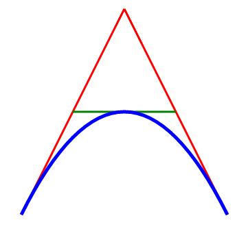
Path
<stage id="stage" hflex="1" vflex="1">
	<layer x="300">
		<path id="lineAB" data="M 100 350 l 150 -300" stroke="red"
			strokeWidth="3" fill="none" />
		<path id="lineBC" data="M 250 50 l 150 300" stroke="red"
			strokeWidth="3" fill="none" />
		<path data="M 175 200 l 150 0" stroke="green" strokeWidth="3"
			fill="none" />
		<path data="M 100 350 q 150 -300 300 0" stroke="blue"
			strokeWidth="5" fill="none" />
	</layer>
</stage>
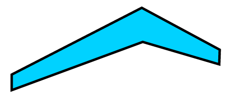
Polygon
<stage id="stage" hflex="1" vflex="1">
	<layer>
		<polygon id="polygon" fill="#00d2ff" stroke="black" strokeWidth="5"
			 points="73,192 73,160 340,23 500,109 499,139 342,93" draggable="true"/>
	</layer>
</stage>
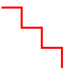
Polyline
<stage id="stage" hflex="1" vflex="1">
	<layer>
		<polyline points="0,40 40,40 40,80 80,80 80,120 120,120 120,160"
				style="fill:white;stroke:red;stroke-width:4" />
	</layer>
</stage>
Rect
<stage id="stage" hflex="1" vflex="1">
	<layer>
		<group draggable="true" x="100" y="50">
			<text y="-20"  textContent="Normal Rectangle" fill="#555"/>
			<rect width="100" height="50" fill="green" stroke="black" strokeWidth="4"/>
		</group>
		<group draggable="true" x="300" y="50">
		<text y="-20" textContent="Radial-Gradient Rectangle" fill="#555"/>
		<rect width="100" height="50" stroke="black" strokeWidth="4"
			fillStyle="radial-gradient" fillStartPoint="0" fillEndPoint="0"
			fillStartRadius="0" fillEndRadius="70" fillColorStops="0, red, 1, yellow"
			/>
		</group>
		<group draggable="true" x="500" y="50">
		<text y="-20" textContent="Linear-Gradient Rectangle" fill="#555"/>
		<rect width="100" height="50" stroke="black" strokeWidth="4"
			fillStyle="linear-gradient" fillStartPoint="-50,-50" fillEndPoint="50,50"
			fillColorStops="0, red, 1, yellow"
			/>
		</group>
	</layer>
</stage>
Text
<stage id="stage" hflex="1" vflex="1">
	<layer x="10" y="10">
		<text fontSize="25" textAnchor="middle" textContent="Radial-Gradient Rectangle"
			 fill="#555" shadowColor="red" shadowBlur="3"/>
	</layer>
</stage>
CSS3 Animation Component
The Animation component, we provided, is designed for developer to ease to use the CSS3 transition/tranform without writing Javascript code. Here are some Component specification guides.
CSS Selector
| Selector | Example | Example description |
|---|---|---|
| .class | .intro | Selects all shapes with class="intro" |
| #id | #firstname | Selects the shape with id="firstname" |
| shape | circle | Selects all <circle> shapes |
| shape, shape | line, circle | Selects all <line> shapes and all <circle> shapes |
| layer shape | layer circle | Selects all <circle> elements inside <layer> elements |
| :mouseover | rect:mouseover | Selects all mouseover rectangles |
| :mouseout | rect:mouseout | Selects all mouseout rectangles |
| :mouseenter | rect:mouseenter | Selects all mouseenter rectangles |
| :mouseleave | rect:mouseleave | Selects all mouseleave rectangles |
| :mousedown | rect:mousedown | Selects all mousedown rectangles |
| :mouseup | rect:mouseup | Selects all mouseup rectangles |
| :click | rect:click | Selects all click rectangles |
| :doubleclick | rect:doubleclick | Selects all doubleclick rectangles |
| :dragstart | rect:dragstart | Selects all dragstart rectangles |
| :dragmove | rect:dragmove | Selects all dragmove rectangles |
| :dragend | rect:dragend | Selects all dragend rectangles |
For example,
<zk>
	<stage id="stage" hflex="1" vflex="1">
		<layer>
			<circle id="circle" radius='70' draggable="true" x="1000"
				y="150" fill='yellow' stroke='black' strokeWidth="4"/>
		</layer>
		<animation>
		#circle:mouseover {
			fill: red;
		}
		#circle:mouseout {
			fill: yellow;
		}
		</animation>
	</stage>
</zk>
As you can see we apply the mouseover event to change the fill color from yellow to red, and then reset it when triggered mouseout event.
CSS transition
The transition property is a shorthand property for the four transition properties: transition-property, transition-duration, transition-timing-function, and transition-delay.
Note: Always specify the transition-duration property, otherwise the duration is 0, and the transition will have no effect.
Default value: all 0 ease 0
| Value | Description |
|---|---|
| transition-property | Specifies the name of the Shape property the transition effect is for |
| transition-duration | Specifies how many seconds or milliseconds the transition effect takes to complete. Like (1s or 200ms) |
| transition-timing-function | Specifies the speed curve of the transition effect |
| transition-delay | Defines when the transition effect will start. Like (1s or 200ms) |
CSS Transform (2D)
The transform property applies a 2D transformation to an shape. This property allows you to rotate, scale, move, etc., elements.
| Value | Description |
|---|---|
| matrix(n,n,n,n,n,n) | Defines a 2D transformation, using a matrix of six values |
| translate(x,y) | Defines a 2D translation |
| translateX(x) | Defines a translation, using only the value for the X-axis |
| translateY(y) | Defines a translation, using only the value for the Y-axis |
| scale(x,y) | Defines a 2D scale transformation |
| scaleX(x) | Defines a scale transformation by giving a value for the X-axis |
| scaleY(y) | Defines a scale transformation by giving a value for the Y-axis |
| rotate(angle) | Defines a 2D rotation, the angle is specified in the parameter |
Note: The angle unit identifiers are:
- deg - Degrees. There are 360 degrees in a full circle.
- rad - Radians. There are 2π radians in a full circle.
CSS Animation
CSS Keyframes
CSS Variables: var-*
CSS Function Notations:
var()
attr()
eval()
Touch device support
Bar Chart Demo
Suppose you define a component for eg. window as shown below in your zul Image
<window title="ZK Rocks" border="normal">
</window>
Downloads
You can get complete source for the example described in this smalltalk from its github
Comments
| Copyright © Potix Corporation. This article is licensed under GNU Free Documentation License. |


