Grid"
Jimmyshiau (talk | contribs) |
Jimmyshiau (talk | contribs) |
||
| Line 125: | Line 125: | ||
| May 2010 | | May 2010 | ||
| Support the autopaging | | Support the autopaging | ||
| + | |- | ||
| + | | 5.0.4 | ||
| + | | July 2010 | ||
| + | | Support onAfterRender event | ||
|} | |} | ||
{{ZKComponentReferencePageFooter}} | {{ZKComponentReferencePageFooter}} | ||
Revision as of 11:09, 9 August 2010
Grid
Employment/Purpose
Components: grid, columns, column, rows and row.
A grid contains components that are aligned in rows like tables. Inside a grid, you declare two things, the columns, that define the header and column attributes, and the rows, that provide the content. To declare a set of rows, use the rows component, which should be a child element of grid. Inside that you should add row components, which are used for each row. Inside the row element, you should place the content that you want inside that row. Each child is a column of the specific row. Similarly, the columns are declared with the columns component, which should be placed as a child element of the grid. Unlike row is used to hold the content of each row, column declares the common attributes of each column, such as the width and alignment, and and optional headers, i.e., label and/or image.
Autopaging
When using the paging mold and vflex, you could also turn on autopaging (Grid.setAutopaging(boolean)) such that the page size will be adjusted automatically based on the available space.
Example
<window title="Grid Demo" border="normal" width="360px">
<zscript>
class Comp implements Comparator {
private boolean _asc;
public Comp(boolean asc) {
_asc = asc;
}
public int compare(Object o1, Object o2) {
String s1 = o1.getChildren().get(0).getValue(),
s2 = o2.getChildren().get(0).getValue();
int v = s1.compareTo(s2);
return _asc ? v: -v;
}
}
Comp asc = new Comp(true), dsc = new Comp(false);
</zscript>
<grid>
<columns sizable="true">
<column label="Type" sortAscending="${asc}" sortDescending="${dsc}"/>
<column label="Content"/>
</columns>
<rows>
<row>
<label value="File:"/>
<textbox width="99%"/>
</row>
<row>
<label value="Type:"/>
<hbox>
<listbox rows="1" mold="select">
<listitem label="Java Files,(*.java)"/>
<listitem label="All Files,(*.*)"/>
</listbox>
<button label="Browse..."/>
</hbox>
</row>
<row>
<label value="Options:"/>
<textbox rows="3" width="99%"/>
</row>
</rows>
</grid>
</window>
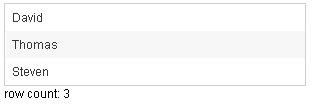
<zk>
	<zscript><![CDATA[
		ListModelList lm = new ListModelList(Arrays.asList(new String[] { "David",
				"Thomas", "Steven" }));
	]]></zscript>

	<grid model="${lm}" width="300px"
		onAfterRender='gridCount.setValue("row count: "+self.getRows().getChildren().size()+"");' />
	<label id="gridCount" />
</zk>
Supported events
| PagingEvent
Description: Notifies one of the pages of a multi-page component is selected by the user. | |
| onAfterRender
Description: Notifies one that the model's data has been rendered. |
Supported Children
* Columns, Rows
Use cases
| Version | Description | Example Location |
|---|---|---|
Version History
| Version | Date | Content |
|---|---|---|
| 5.0.2 | May 2010 | Support the autopaging |
| 5.0.4 | July 2010 | Support onAfterRender event |
