Customizing Bootstrap Theme Demonstration"
Raymondchao (talk | contribs) |
Raymondchao (talk | contribs) |
||
| Line 129: | Line 129: | ||
=== Tooltip === | === Tooltip === | ||
| − | The ZK tooltip's look is totally different from the demo. The easiest way to customize tooltip's look is | + | The ZK tooltip's look is totally different from the demo. The easiest way to customize tooltip's look is assigneing [[http://books.zkoss.org/wiki/ZK_Style_Guide/ZK_Class_Concept] zclass] <tt>tooltip</tt> to it. |
[[File:CBTDTooltip.png]] | [[File:CBTDTooltip.png]] | ||
| Line 140: | Line 140: | ||
</source> | </source> | ||
| − | The <tt>span</tt> componet inside the popup is to display as an arrow of the tooltip. | + | The <tt>span</tt> componet with sclass "tooltip-arrow" inside the popup is to display as an arrow of the tooltip. |
| + | |||
| + | [[File:CBTDTooltipCss.png]] | ||
| + | |||
| + | The bootstrap tooltip's opacity level is zero. We style the opacity to 1 to make it visible when the tooltip show up. | ||
<source lang="css"> | <source lang="css"> | ||
.tooltip { | .tooltip { | ||
| − | .opacity(1); | + | .opacity(1) !important; |
} | } | ||
.tooltip-success.tooltip { | .tooltip-success.tooltip { | ||
> .tooltip-content >.tooltip-inner { | > .tooltip-content >.tooltip-inner { | ||
| − | background-color:@tooltip-success-color; | + | background-color: @tooltip-success-color; |
color:#FFF; | color:#FFF; | ||
text-shadow:1px 1px 0 rgba(60,100,20,0.3); | text-shadow:1px 1px 0 rgba(60,100,20,0.3); | ||
| Line 158: | Line 162: | ||
} | } | ||
</source> | </source> | ||
| + | |||
=== Tabbox === | === Tabbox === | ||
When Tabbox is in the default orientation, the row of tabs displayed on top left side. If we want to move the tabs to the top right side, we can add <tt>pull-right</tt> class to each tab. After pull each tab to the right, the first tab will be pulled to the rightmost. So the order of tabs should be inversed, and the last tab should be selected as default. The header and tabbox need be displayed horizontally side by side, so tabbox's position should be absolute. | When Tabbox is in the default orientation, the row of tabs displayed on top left side. If we want to move the tabs to the top right side, we can add <tt>pull-right</tt> class to each tab. After pull each tab to the right, the first tab will be pulled to the rightmost. So the order of tabs should be inversed, and the last tab should be selected as default. The header and tabbox need be displayed horizontally side by side, so tabbox's position should be absolute. | ||
Revision as of 17:53, 10 November 2013
Introduction
ZK 7 is an upcoming big release focusing on HTML5 and CSS3. In our previous blog, we demonstrated how to use ZK 7′s new theme system with Bootstrap & CSS3. And we also provided another guid with more details on how to integrate ZK components and Bootstrap 3. In this smalltalk, we will customize another theme to look like one coming from {wrap}bootstrap.
Prerequisites
Design Template
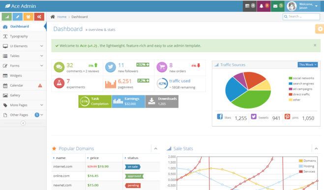
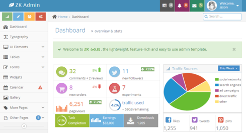
We picked Ace Template from {wrap}bootstrap as our design template. In this demonstration, we will customize the Dashboard page with Pure ZK and CSS3.
Analyze Layout
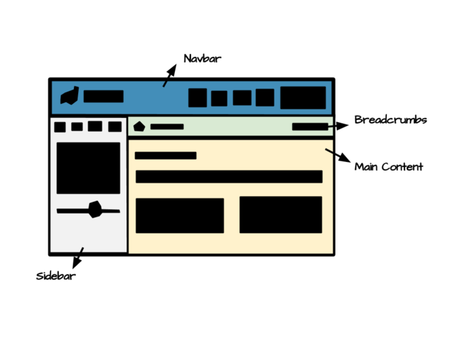
The layout can be separated into 4 parts.
- Navbar
- A brand int the left
- A set of menu navigation in the right
- Sidebar
- 4 shourtcut buttons
- Navigation bar
- Collapsed button
- Breadcrumbs
- Breadcrumb
- Search input
- Content
- Header
- Notification
- Infobox
- Panel
- Tab
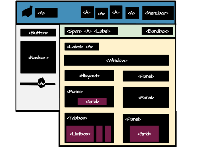
According to the analysis, we combined ZK components hlayout and vlayout to layout the the structure of the page, then assigned hflx="1" to auto adjust its width when resizing. Component include is used to include each part's content.
<include src="navbar.zul"/>
<hlayout id="main" spacing="0">
	<include src="sidebar.zul"/>
	<vlayout spacing="0" hflex="1">
		<include src="breadcrumbs.zul"/>
		<include src="content.zul"/>
	</vlayout>
</hlayout>
Implements Component
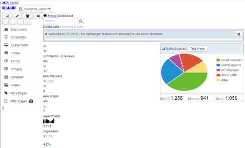
After constructed the basic layout, we can add ZK components to implement content in each part.
And it will look like this:
Customize Look And Feel
In this section, we will mention the necessary preparations and some customized components as examples. In the end of the section are some tips for customization which contains the problem user may encounter when in customization.
Open Sans Font
Before we customize the look and feel, we need to import the Open Sans font from google server or download them to your folder directly and import it.
<?link href="css/fonts.css" rel="stylesheet" type="text/css"?>
Button
We mimic the one from bootstrap and ace template.
.z-button {
	position: relative;
	padding: 3px 12px;
	border-radius: 0;
	text-shadow: 0 -1px 0 rgba(0, 0, 0, 0.25);
	min-height: 0;
	color: #FFF !important;
	.transition(~"all ease .15s");

	&:active {
		top: 1px;
		left: 1px;
	}

	&, &:hover, &:focus, &:active {
		background-image: none;
	}

	/* Icon in the button */
	> [class*="z-icon-"] {
		display: inline;
		margin-right: 4px;
	}
}
Progressmeter
To customizing progressmeter, we change its height and background color, remove the border line.
<progressmeter value="65" width="100%"/>
.z-progressmeter {
  height: 9px;
  border: 0;
  background-image: none;
  background-color: #DADADA;

  &-image {
    display: inline-block;
    background-color: #2A91D8;
    background-image: none;
  }
}
Tooltip
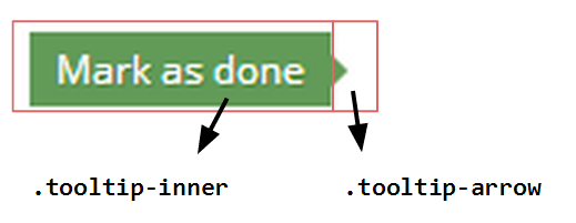
The ZK tooltip's look is totally different from the demo. The easiest way to customize tooltip's look is assigneing [[1] zclass] tooltip to it.
<popup zclass="tooltip" sclass="left tooltip-success">
	<span zclass="tooltip-arrow"/>
	<label zclass="tooltip-inner" value="Mark as done"/>
</popup>
The span componet with sclass "tooltip-arrow" inside the popup is to display as an arrow of the tooltip.
The bootstrap tooltip's opacity level is zero. We style the opacity to 1 to make it visible when the tooltip show up.
.tooltip {
  .opacity(1) !important;
}
.tooltip-success.tooltip {
  > .tooltip-content >.tooltip-inner {
   background-color: @tooltip-success-color;
   color:#FFF;
   text-shadow:1px 1px 0 rgba(60,100,20,0.3);
   border-radius: 0;
  }
  &.left .tooltip-arrow {
    border-left-color: @tooltip-success-color;
  }
}
Tabbox
When Tabbox is in the default orientation, the row of tabs displayed on top left side. If we want to move the tabs to the top right side, we can add pull-right class to each tab. After pull each tab to the right, the first tab will be pulled to the rightmost. So the order of tabs should be inversed, and the last tab should be selected as default. The header and tabbox need be displayed horizontally side by side, so tabbox's position should be absolute.
<a label="RECENT" iconSclass="z-icon-rss orange icon-mr8" disabled="true"
    style="font-size: 17px; font-weight: lighter;"/>
<tabbox sclass="rtab">
	<tabs>
		<tab label="Comments"/>
		<tab label="Members"/>
		<tab label="Tasks" selected="true"/>
	</tabs>
	<tabpanels>
		<tabpanel><!-- Comments content --></tabpanel>
		<tabpanel><!-- Menbers content --></tabpanel>
		<tabpanel><!-- Tasks content --></tabpanel>
	</tabpanels>
</tabbox>
Functionality Code
We declare an event handler in popup which will be notified when onOpen event occurs, it will toggle the open sclass to the anchor component. So the anchor's background will be darken when its popup is opened.
<a id="atask" iconSclass="z-icon-tasks" popup="taskpp, position=after_end" sclass="grey">
    ...
</a>
<popup id="taskpp" sclass="tasktodo" width="240px" onOpen="toggleOpenSclass(event, atask);">
    ...
</popup>
<zscript><![CDATA[
import org.zkoss.zk.ui.Component;
import org.zkoss.zk.ui.event.OpenEvent;

// Toggle open sclass to the component
void toggleOpenSclass(OpenEvent event, Component comp) {
	String scls = comp.getSclass();
	if (event.isOpen()) {
		comp.setSclass(scls + " open");
	} else {
		comp.setSclass(scls.replace(" open", ""));
	}
}
]]></zscript>
Implement Collapse Mechanism
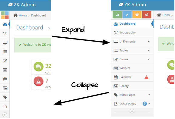
The sidebar is collapsible, user can click the button in the bottom of navbar to collapse or expand sidebar. Like the below picture shows.
So we need to declare toggleSidebarCollapsed() to proceed the actions. As the below code shows:
void toggleSidebarCollapsed() {
	if (!navbar.isCollapsed()) {
	    navbar.setCollapsed(true);
	    calitem.setTooltip("");
		sidebar.setSclass("sidebar sidebar-min");
		toggler.setIconSclass("z-icon-double-angle-right");
	} else {
	    navbar.setCollapsed(false);
	    calitem.setTooltip("calpp, position=end_center, delay=0");
        sidebar.setSclass("sidebar");
        toggler.setIconSclass("z-icon-double-angle-left");
	}
	Clients.resize(main);
}
Because Navbar is collapsible, isCollapsed() can determine whether navbar is collapsed or not. If not, we can easily call setCollapsed(true) to collapse it. When navbar is collapsed, its children only appear with icon and badge. The text part will popup when mouse hover the icon. Next, we need remove the tooltip of Navitem to prevent it show up with text when hovering. Then add sidebar-min class to sidebar and change the toggler's icon. In the end, Clients.resize(main) will force the client to recalculate the size of the main content.
The shortcuts also need to be collapsed, so it needs an additional set of collapsed shortcuts to display when the sidebar collapsed. If user's mouse hovers the collapsed shortcuts, the expand shortcuts will appear.
<div class="shortcuts">
	<div class="shortcuts-expand">
		<button type="button" class="btn btn-success" iconSclass="z-icon-signal"/>
		<button type="button" class="btn btn-info" iconSclass="z-icon-pencil"/>
		<button type="button" class="btn btn-warning" iconSclass="z-icon-group"/>
		<button type="button" class="btn btn-danger" iconSclass="z-icon-cogs"/>
	</div>
	<div class="shortcuts-collapsed">
		<button type="button" class="btn btn-success"/>
		<button type="button" class="btn btn-info"/>
		<button type="button" class="btn btn-warning"/>
		<button type="button" class="btn btn-danger"/>
	</div>
</div>
