Scrollview"
Chunfuchang (talk | contribs) |
|||
| Line 9: | Line 9: | ||
= Employment/Purpose = | = Employment/Purpose = | ||
| − | Scrollview | + | Scrollview is a container that makes its content scrollable on tablet/mobile device with a '''rubber band''' effect you see on iPhone/iPad. When you attempt to scroll past the end of the content area, the area still moves slowly with your fingers. Since there is no more content, then the area will bounce back to the correct position after your fingers leave the screen. |
= Example = | = Example = | ||
Revision as of 10:07, 19 September 2017
Scrollview
- Demonstration: N/A
- Java API: Scrollview
- JavaScript API: Scrollview
- Style Guide: N/A
- Available in ZK EE only
Employment/Purpose
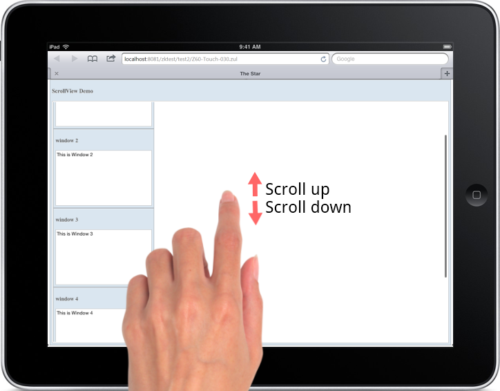
Scrollview is a container that makes its content scrollable on tablet/mobile device with a rubber band effect you see on iPhone/iPad. When you attempt to scroll past the end of the content area, the area still moves slowly with your fingers. Since there is no more content, then the area will bounce back to the correct position after your fingers leave the screen.
Example
You can scroll up/down to see other window components with the following sample ZUL.

<scrollview vflex="1" hflex="1">
    <zk forEach="1,2,3,4,5">
        <window title="window ${each}" border="normal" width="255px" height="200px">
        This is Window ${each}
        </window>
    </zk>
</scrollview>
Properties
Orient
The default orient of child components inside Scrollview is vertical. You can also change it to horizontal.
<scrollview vflex="1" hflex="1" orient="horizontal" />
Supported Events
| Event: ScrollEvent
In mobile devices: Denotes that the content of a scrollable component has been scrolled by the user. Notice that you can check if it is scrolled outside/inside boundaries by invoking getOutOfBound method in the ScrollEvent. In desktop: This event will be triggered when users scroll all the way to the top or to the end of the page. | |
| Event: ScrollEvent
Denotes that the user is scrolling a scrollable component. |
- Inherited Supported Events: XulElement
Supported Children
*ALL
Use Cases
| Version | Description | Example Location |
|---|---|---|
Version History
| Version | Date | Content |
|---|---|---|
| 6.5.0 | August, 2012 | new added component |