New Features of ZK 8.6.0"
| Line 8: | Line 8: | ||
= Introduction = | = Introduction = | ||
| − | + | Rich and reusable components are the main reason that people adopt ZK. In 8.6 release, we focus on making components more powerful, we create several new components for multimedia and enhance some components to support more features. | |
Highlighted features: | Highlighted features: | ||
| − | + | * 8 new components | |
| − | * | + | * Compact theme |
| − | * | ||
== Download and Demo == | == Download and Demo == | ||
| − | |||
<br /> | <br /> | ||
| − | |||
| − | |||
<div style="float: left;"><imagelink link="http://www.zkoss.org/download/zk" image="/_w/images/0/00/Download-zk-7.png" /></div> | <div style="float: left;"><imagelink link="http://www.zkoss.org/download/zk" image="/_w/images/0/00/Download-zk-7.png" /></div> | ||
<div style="float: left"><imagelink link="http://www.zkoss.org/zkdemo/" image="/_w/images/6/68/Demo-zk-7.png" /></div> | <div style="float: left"><imagelink link="http://www.zkoss.org/zkdemo/" image="/_w/images/6/68/Demo-zk-7.png" /></div> | ||
| − | |||
<br /> | <br /> | ||
<br /> | <br /> | ||
| − | |||
<div style="height:70px; border-radius:5px;font-family: 'Didact Gothic', sans-serif; text-align:center; padding:5px; background-color: #0093f9;"> | <div style="height:70px; border-radius:5px;font-family: 'Didact Gothic', sans-serif; text-align:center; padding:5px; background-color: #0093f9;"> | ||
| Line 31: | Line 25: | ||
</div> | </div> | ||
| − | = | + | = Refresh Theme without Change - Compact Theme = |
{{ZK All}} | {{ZK All}} | ||
| + | The new default theme iceblue is great. But we also hear from some users' voice, we now build a compact theme to let you refresh your application's looking without modification. | ||
| − | = | + | Please check: [https://www.zkoss.org/zk85themedemo/ Theme Demo] |
| − | <!-- http://tracker.zkoss.org/browse/ZK- | + | |
| + | |||
| + | |||
| + | = Multi-Window Layout - Goldenlayout = | ||
| + | <!-- http://tracker.zkoss.org/browse/ZK-3954 --> | ||
| + | |||
| + | |||
| + | = Video Player = | ||
| + | |||
| + | |||
| + | = Take a Photo = | ||
| + | <!-- http://tracker.zkoss.org/browse/ZK-3930 --> | ||
| − | = | + | = Record a Clip = |
| − | |||
| − | |||
= Organigram = | = Organigram = | ||
| Line 49: | Line 53: | ||
= Rating = | = Rating = | ||
<!-- http://tracker.zkoss.org/browse/ZK-3960 --> | <!-- http://tracker.zkoss.org/browse/ZK-3960 --> | ||
| + | |||
| + | |||
| + | = Display and Scan a Barcode = | ||
| + | {{ZK EE}} | ||
| + | |||
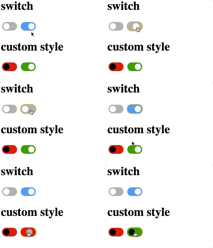
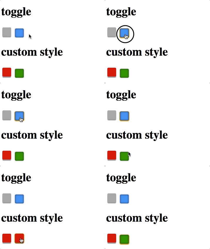
| + | = Ios Style Switch and Toggle = | ||
| + | <!-- http://tracker.zkoss.org/browse/ZK-3958 --> | ||
| + | Checkbox supports 2 new molds: | ||
| + | == Ios Style Switch == | ||
| + | [[File:checkbox-ios-style-switch.gif | center]] | ||
| + | |||
| + | == Toggle == | ||
| + | [[File:checkbox-toggle.gif | center]] | ||
| + | |||
| + | Check [[Component Reference ]] | ||
| + | |||
| + | = 3 States Checkbox = | ||
| + | <!-- http://tracker.zkoss.org/browse/ZK-136 --> | ||
| + | |||
| + | Checkbox supports intermediate states: | ||
| + | [[File:checkbox-3states.png | center]] | ||
| + | |||
| + | |||
= Knob-like Slider = | = Knob-like Slider = | ||
| Line 57: | Line 84: | ||
| − | = Toolbar | + | = Toolbar Accommodates More Buttons = |
<!-- http://tracker.zkoss.org/browse/ZK-3179 --> | <!-- http://tracker.zkoss.org/browse/ZK-3179 --> | ||
| + | |||
| + | |||
= Page Navigation Helper= | = Page Navigation Helper= | ||
<!-- http://tracker.zkoss.org/browse/ZK-4028 --> | <!-- http://tracker.zkoss.org/browse/ZK-4028 --> | ||
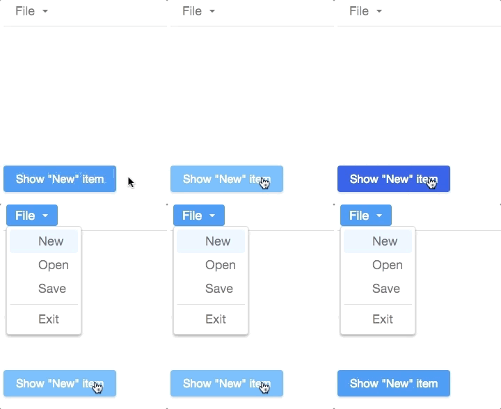
| − | = | + | = Guide Users with a Pop-up Menuitem = |
| − | + | {{ZK All}} | |
| − | |||
| − | |||
| − | {{ZK | ||
| + | If you want to guide new users to click a menuitem or open a menupopup for them, ZK provide a method to pop up the menuitem in front of users. | ||
| − | [ | + | [[File:menuitem-setactive.gif | center]] |
| + | <source lang='java'> | ||
| + | menu.getMenupopup().setActive(i); | ||
| + | </source> | ||
| + | = Web Fragment = | ||
= Improved Rendering Speed = | = Improved Rendering Speed = | ||
| Line 83: | Line 114: | ||
tree | tree | ||
chosenbox | chosenbox | ||
| − | |||
| − | |||
| − | |||
| − | |||
| − | |||
| − | |||
| − | |||
| − | |||
| Line 104: | Line 127: | ||
<br /> | <br /> | ||
| − | |||
<br/> | <br/> | ||
| − | |||
| − | |||
<br/> | <br/> | ||
Revision as of 05:21, 17 October 2018
Hawk Chen, Engineer, Potix Corporation
2018
ZK 8.6.0
Introduction
Rich and reusable components are the main reason that people adopt ZK. In 8.6 release, we focus on making components more powerful, we create several new components for multimedia and enhance some components to support more features.
Highlighted features:
- 8 new components
- Compact theme
Download and Demo
Highlighted Features
Refresh Theme without Change - Compact Theme
- Available for ZK:
-

The new default theme iceblue is great. But we also hear from some users' voice, we now build a compact theme to let you refresh your application's looking without modification.
Please check: Theme Demo
Multi-Window Layout - Goldenlayout
Video Player
Take a Photo
Record a Clip
Organigram
Sigature
Rating
Display and Scan a Barcode
- Available for ZK:
-

Ios Style Switch and Toggle
Checkbox supports 2 new molds:
Ios Style Switch
Toggle
Check Component Reference
3 States Checkbox
Checkbox supports intermediate states:
Knob-like Slider
Crop a Uploaded Image
Toolbar Accommodates More Buttons
Guide Users with a Pop-up Menuitem
- Available for ZK:
-

If you want to guide new users to click a menuitem or open a menupopup for them, ZK provide a method to pop up the menuitem in front of users.
menu.getMenupopup().setActive(i);
Web Fragment
Improved Rendering Speed
tree chosenbox
Summary
ZK is made by Java developers for Java developers; continue bringing technology innovations to enterprise Java web development has always been our top priority. ZK 8.5 provides a great balance between the required server-side simplicity, security, and integrity and the client-side usability, look, and feel.
Join us this fall and harvest Javascript from Java roots!
ZK grows with you. Feel free to share with us your feedback or suggestion.
Comments
| Copyright © Potix Corporation. This article is licensed under GNU Free Documentation License. |


