New Features of ZK 7.0.0"
m (→Atlantic Theme) |
m |
||
| Line 491: | Line 491: | ||
</source> | </source> | ||
| − | + | [[Category:New Features]] | |
{{Template:CommentedSmalltalk_Footer| | {{Template:CommentedSmalltalk_Footer| | ||
|name=Potix Corporation | |name=Potix Corporation | ||
}} | }} | ||
Revision as of 04:44, 26 January 2021
Timothy Clare, Potix Corporation
November 26, 2013
ZK 7.0.0
Introduction
The ZK team is proud to announce the release of ZK 7!
ZK 7's main focus was on improving the theme system. Over the last year you (our customers and users) have both stated that you want more power, flexibility and simplicity from your theme engine. Thus ZK 7 brings with it our most powerful theme engine to date combining the power of CSS 3, LESS and Bootstrap to create the best possible experience.
That's not all, in addition to the theme we have new components and upgrades to old ones including enhanced CSS 3 and HTML 5 support along with performance improvements. Please read on for more details!
Download and Demo
Important Upgrade Notes
Due to the introduction of more HTML 5 and CSS 3 functionality this unfortunately means that ZK 7 cannot be used with IE 6 and 7. This is unfortunate, however, the extra power, flexibility and simplicity provided by HTML 5 and CSS 3 make this well worth it.
It is also important to note that due to IE 8 not fully supporting HTML 5 & CSS 3 specs that rounded corners will be square on the browser. IE 9 also has incomplete support for HTML 5 & CSS 3, to best work with IE 9, you need to upgrade your commons-codec library to version 1.8.
If you do still want to use ZK with IE 6 and 7 do not worry, ZK 6.5 will continue to be updated and will maintain its support for those legacy browsers.
Enhanced themes with Bootstrap, CSS 3 and LESS
- Available for ZK:
-

ZK 7's theme engine has been discussed at length and is was the major topic when we performed our user surverys. Your feedback was acted upon and we are proud to announce that ZK 7 has significantly simplified the process of creating and customizing themes. This simplification has the following major benefits:
- It is now much easier to create your own themes from scratch and customize existing themes
- Bootstrap themes can be used to kickstart theme creation
- The existing default theme has been simplified, including the DOM structure
Number 1 was particularly important as we have gathered extensive feedback from the community and customers who were looking to create themes for ZK. Whether that would be for fun, or to implement corporate stylings into an application.
What technologies were leveraged and why?
To completely rewrite the ZK 7's theme technology we leveraged existing technologies:
- Bootstrap theme support - You can seamlessly apply Bootstrap themes without breaking component functionality
- LESS support - Themes are now based on LESS, meaning the code is cleaner and more concise than ever before
- CSS 3 support - The default theme has been totally revised using CSS 3 functionality, bringing better performance and cleaner code
These technologies were the right choice as they hit the sweet spot of existing standards as well as developer familiarity (both within the ZK community and outside of it). The video below demonstrates a sample application in action using a Boostrap theme and LESS.
For information on how to customize a bootstrap theme, please click here. For more information please refer to Jumper's blog post here
Why Bootstrap and why the change?
The text above hints at the reasons for this change "to simplify the process of creating themes" and that is the core fundamental reason for the introduction by the ZK team. However, ZK 7 these features bring much more than that, thus it is only fitting we highlight them.
The power of Bootstrap
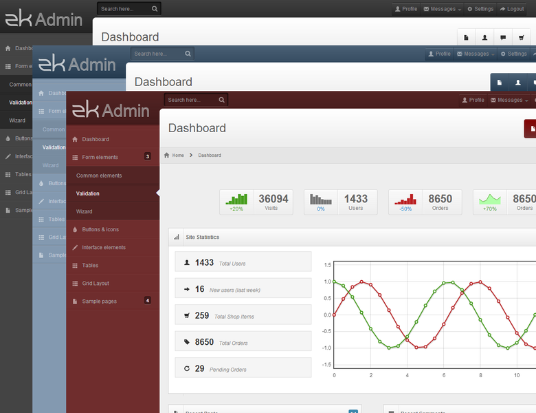
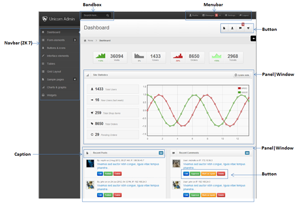
Bootstrap has a lot of downloadable themes, this gives ZK developers the ability to use and expand other's Bootstrap themes within their ZK applications substantially reducing the resources needed to produce great looking themes. For example the theme that you see on this page was created by diablo9983 and is available here.
Additionally, designers are now much more familiar with Bootstrap conventions and this gives a significant learning advantage when designing for ZK as Bootstrap conventions for are used for base components. ZK's more sophisticated components which are not covered by Bootstrap specifications still follow similar naming patterns.
The image below shows Bootstrap styled ZK components in action.
CSS 3
The power of CSS 3 is obvious, later browsers are supporting more and more of the specification and it means that previous effects which used DOM "tricks" to implement can now be implemented using simple CSS. This leads to applications & themes having much more simplified CSS code along with major performance boosts which CSS 3 brings with it.
The combination of Bootstrap and further CSS 3 support gives developers the opportunity to build themes quicker and for less money which perform much better in the browser.
So what does this mean for designers and developers
Design and development teams have a much easier job spending less time to create great looking and high performing applications. These changes will make prototyping even easier, ZUL provides a great base for prototyping but the theme changes it will take less time to produce an impressive application which uses, or is similar to the company's theme.
Atlantic Theme
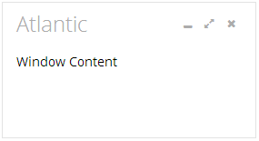
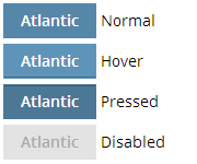
Flat Design is getting more and more popular lately and has become the new trend in the world of user interface design (you can take a look at this article explaining the philosophy of flat design if you’re interested). We have created a whole new theme based on flat design named Atlantic in our latest ZK 7. The basic concept of Atlantic is to remove gradients, rounded corners and shadows that are used in a lot of the breeze theme. Without these effects also makes Atlantic easier for customization.
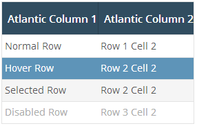
Here are some atlantic themed components:
Window
Button
Listbox
Please note that this theme is not included in ZK 7. For more information on how to use this theme and how to use it please click here.
- Available for ZK:
-

Navigation is a key component in a website, a good navigation design can greatly improve a user’s experience. It not only presents the website’s key sections, but also helps users locate and link to other pages in the website.
In ZK 7 we are pleased to introduce a new set of navigation components. Developers are able to design navigation menus and sitemaps more easily and rapidly using the new navigation components.
The video below shows the navigation component in action.
The following is an implementation of a navigation component using ZUL.
<navbar id="sidebar" orient="vertical">
  <navitem label="Inbox" iconSclass="z-icon-inbox"/>
  <navitem label="Create Task" iconSclass="z-icon-pencil"/>
  <nav label="Next Actions" iconSclass="z-icon-th-list" detailed="true">
    <navitem label="Rescue the Baby" iconSclass="z-icon-star"/>
    <navitem label="Play Darts" />
For more information please see Raymond's blogpost.
Tree supports render on demand
- Available for ZK:
-

The tree now transparently supports render on demand on the model giving better performance for users while also saving developers time having to concoct strategies to handle big data.
It is also possible to specify how many page sizes will be kept in memory, you can do this with the following custom attribute in the zk.xml file.
<tree>
  <custom-attributes org.zkoss.zul.tree.maxRodPageSize="5"/>
...
For more information please visit our ZK Configuration Guide.
ZK now supports SLF4J API for logging
- Available for ZK:
-

ZK has adopted slf4j as its default logging system. Users can change their logger to Log4j, Simple or any other adapter that they wish.
For more information on logging please refer to the Developer's Reference
ZK FileUpload supports HTML 5's accept attribute
- Available for ZK:
-

Since ZK 7 the File Upload component supports HTML 5's accept attribute. This gives developers the ability to easily filter the types of uploads.
For more information please visit our Component Reference and the w3schools information on the accept attribute.
Toggle to enable & disable tablet UI
- Available for ZK:
-

Since ZK 7 it is now possible to enable and disable the tablet UI, in case you want more of a desktop-like experience for your tablet.
To do so is simple, specify the org.zkoss.zkmax.tablet.ui.disabled property in your zk.xml file. For more information please refer to our ZK's Configuration Reference.
Performance Improvement
- Available for ZK:
-

In addition to the already existing performance improvements using CSS 3 the ZK team have been working hard to boost component performance. Four attribute layout performance has been improved in ZK 7, those are:
- height & width
- hflex & vflex
Height & Width
The height & width calculation code has been updated in ZK 7 with tests indicating a 30% improvement.
hflex & vflex
hflex & vflex have also been updated with their ZK 7 improvement coming in at around 20%.
It should be noted that the improvement is not for every single component but around 70% of available components.
Tabbox supporting right and bottom positioned tabs
- Available for ZK:
-

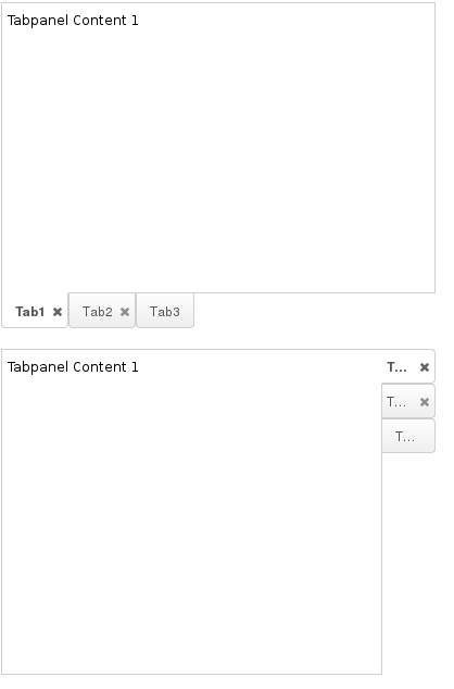
ZK 7 introduces the ability to position tabs on the right and bottom of the tab boxes providing developers with more flexibility than ever before. The screenshot below shows both tab boxes in action.
The position of the tabs can be specified using the "orient" attribute. The code sample below outlines this.
<tabbox height="300px" width="400px" orient="bottom">
   ...
</tabbox>

<tabbox height="300px" width="400px" orient="right">
   ...
</tabbox>
ZK Components support static UUID
- Available for ZK:
-

In previous versions if your test tool running at the client cannot access JavaScript, you needed to implement an ID generator to generate desktop's ID and component's UUID in a predictable and repeatable matter.
With ZK 7 this has changed as we have introduced a static UUID generator. To use it, simply add the following configuration to your zk.xml file.
<system-config>
    <id-generator-class>org.zkoss.zk.ui.impl.StaticIdGenerator</id-generator-class>
</system-config>
For more information please consult our Developer's Reference.
Audio component now supports HTML 5
- Available for ZK:
-

The audio component has now been enhanced to support HTML 5. Instead of using the "embed" HTML tag it now uses the HTML 5 "audio" tag.
To use the audio component is very simple, an example is provided below.
<audio id="audio" height="20"/>
Clients.scrollIntoView(Component c) supports horizontal scrolling
- Available for ZK:
-

Before ZK 7 Clients' scrollIntoView method only supported vertical scrolling to a specified component. ZK 7 now delivers the ability to scroll horizontally to a specified component.
For more information please visit the Developer's Reference and the jsdoc.
Major Tabbox improvements
Tabbox supports listmodel
- Available for ZK:
-

It is now possible to to use a listmodel to create a tabbox's contents. This makes it easier to produce a tabbox's contents dynamically using information provided by the model.
There are two ways to do this, one using a template approach and one using a renderer. It is up to the developer to choose which approach they prefer.
The template approach (applicable for MVVM & MVC)
To do this you are required to use two templates, one called tab and one called tabpanel for the respective controls.
The following example shows this:
ZUL file
<div apply="foo.FruitProvider">
<tabbox id="mytab" model="${$composer.fruits}">
	<template name="model:tab">
		<tab iconSclass="z-icon-user">
			${each[0]}
		</tab>
	</template>
	<template name="model:tabpanel">
		<tabpanel>
			<div style="background:green">
				${each[1]}
			</div>
		</tabpanel>
	</template>
</tabbox>
</div>
In a class file
public class FruitProvider extends org.zkoss.zk.ui.select.SelectorComposer {
    public ListModelArray fruits = new ListModelArray(
            new String[][] {
                {"Apple", "10kg"},
                {"Orange", "20kg"},
                {"Mango", "12kg"}
            });

    public ListModelArray getFruits() {
         return fruits;
    }
}
Output
For more information on this please consult ZK's Developer's Reference.
The renderer approach
When a tabbox is assigned a model a default renderer is assigned as well. This default renderer will make a lot of assumptions thus it is best if you want to do something custom to create your own. The following is a sample renderer:
public class MyRenderer implements TabboxRenderer{
	public void renderTab(Tab tab, Object data, int index) {
		tab.setLabel("New -- " + data);
	}
	public void renderTabpanel(Tabpanel tabpanel, Object data, int index) {
		tabpanel.appendChild(new Label("New -- " + data));
	}
}
For more information on this please consult ZK's Developer's Reference.
Tabbox's panel now can have a restricted height
- Available for ZK:
-

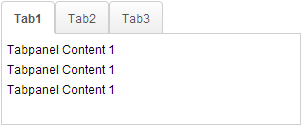
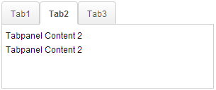
Previously if a tabbox's contents differed then the height of the tabbox's may also differ, with one being larger than the other.
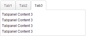
ZK 7 now introduces a tabbox feature called maximal height which will restrict the height of the tabbox's tabpanels meaning they are all a consistent height (of the largest tab panel). The following example demonstrates how to use this feature.
<tabbox maximalHeight="true" width="300px">
	<tabs id="tabs0">
		<tab label="Tab1" />
		<tab label="Tab2" />
		<tab label="Tab3" />
	</tabs>
	<tabpanels id="pnls0">
		<tabpanel>
			<div>Tabpanel Content 1</div>
			<div>Tabpanel Content 1</div>
			<div>Tabpanel Content 1</div>
		</tabpanel>
		<tabpanel>
			<div>Tabpanel Content 2</div>
			<div>Tabpanel Content 2</div>
		</tabpanel>
		<tabpanel>
			<div>Tabpanel Content 3</div>
			<div>Tabpanel Content 3</div>
			<div>Tabpanel Content 3</div>
			<div>Tabpanel Content 3</div>
		</tabpanel>
	</tabpanels>
</tabbox>
Please note that doing this disables client ROD functionality. For more information please refer to the Component Reference.
Tree supports Frozen column
- Available for ZK:
-

In ZK 7 you are now able to freeze columns within a Tree. This mirrors functionality seen within Excel and makes data in these components easier to read, interpret and handle.
The following code demonstrates how to freeze a column within a Tree:
<tree id="tree" rows="5" width="600px">
    <frozen columns="2" start="1" />
    <treecols sizable="true">
        <treecol width="100px">ID</treecol>
        <treecol width="50px">Priority</treecol>
        <treecol width="50px">Status</treecol>
        <treecol width="150px">Summary</treecol>
        <treecol width="250px">Detail</treecol>
    </treecols>
    <treechildren>
        <treeitem>
            <treerow>
                <treecell>0001</treecell>
                <treecell>1</treecell>
                <treecell>closed</treecell>
                <treecell>Fix login issue</treecell>
                <treecell>Login does not work at all</treecell>
            </treerow>
        </treeitem>
        <treeitem>
            <treerow>
                <treecell>0002</treecell>
                <treecell>3</treecell>
                <treecell>open</treecell>
                <treecell>Button style broken</treecell>
                <treecell>Check main.css</treecell>
            </treerow>
            <treechildren>
                <treeitem>
                    <treerow>
                        <treecell>00021</treecell>
                        <treecell>1</treecell>
                        <treecell>closed</treecell>
                        <treecell>Fix logout issue</treecell>
                        <treecell>Logout does not work at all</treecell>
                    </treerow>
                </treeitem>
            </treechildren>
        </treeitem>
        <treeitem>
            <treerow>
                <treecell>0003</treecell>
                <treecell>2</treecell>
                <treecell>open</treecell>
                <treecell>Client search result</treecell>
                <treecell>Search service returns incomplete result</treecell>
            </treerow>
        </treeitem>
    </treechildren>
</tree>
For further details, please refer to Frozen component directly.
Popup can now be toggled
- Available for ZK:
-

If a popup/context menu is assigned to a target component via the popup/context attribute, the popup up will show up when the user clicks on the target component. Click the target component again, the popup will still show up by default.
Since ZK 7 the popup/context attribute supports an additional toggle type, which will make target component act as a toggle switcher. If the popup has not shown up yet, clicking the target component will cause the popup to show up. If the popup is showing, clicking on the target component again will hide the popup.
The following demonstrates how to use the feature.
<button label="Popup" popup="id, type=toggle"/>
Disable & Enable Tablet UI
- Available for ZK:
-

With the advent of ZK 7 it is now possible to disable Tablet UIs if you prefer to show the normal ZK UI rather than the specialized tablet version. This is done by setting the tablet ui property "disabled" to true.
For information on this property please refer here.
Multiple selection components now carry previously selected items
- Available for ZK:
-

It is now possible to retrieve previously selected items from the SelectEvent for multple selection components. This makes it easier to implement business logic around what has been selected and what actions to take.
Developer's can use the SelectEvent's getPreviousSelectedItems() to do this, for example suppose your SelectEvent was named se.
se.getPreviousSelectedItems();
For more information on the SelectEvent, please click here.
Ignore Content-Disposition header
- Available for ZK:
-

It is now possible to ignore the Content-Disposition header using ZK. This helps the developer to decide whether or not IE and other browsers should show a confirmation dialog for the download or not.
The following code shows how to implement this:
AMedia media = new AMedia("file", "txt", "text/plain", is);
media.setContentDisposition(false);
Portallayout now supports row based layouts
- Available for ZK:
-

As of ZK 7 the portallayout can be displayed as rows rather than vertical columns. To do this is easy, you specify the orient property to horizontal. The information below shows how this is accomplished.
<portallayout orient="horizontal">
	<portalchildren width="50%">
		<panel height="150px" title="Yahoo">
			<panelchildren>
				<iframe width="100%" src="http://www.yahoo.com/"/>
			</panelchildren>
		</panel>
		<panel height="300px" title="Google">
			<panelchildren>
				<iframe width="100%" src="http://www.google.com/"/>
			</panelchildren>
		</panel>
	</portalchildren>
	<portalchildren width="50%">
		<panel height="150px" title="ZK">
			<panelchildren>
				<iframe width="100%" src="http://www.zkoss.org/"/>
			</panelchildren>
		</panel>
	</portalchildren>
</portallayout>
Comments
| Copyright © Potix Corporation. This article is licensed under GNU Free Documentation License. |
