Data-Scrollable"
| Line 6: | Line 6: | ||
{{versionSince| 7.0.1}} | {{versionSince| 7.0.1}} | ||
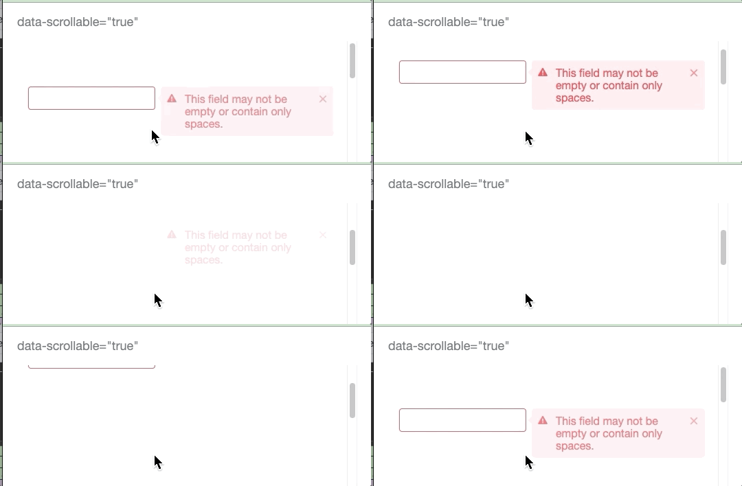
| − | If you specify the attribute with <tt>true</tt> on a [http://www.zkoss.org/javadoc/7.0.3/jsdoc/zul/ContainerWidget.html ContainerWidget] or [http://www.zkoss.org/javadoc/7.0.3/jsdoc/zul/mesh/MeshWidget.html MeshWidget], the error message box (poped up by violating rules in <tt>constraint</tt> attribute), combobox popup, datebox popup, inside the container component will also move by scrolling<ref> For more information, please refer to http://www.zkoss.org/javadoc/7.0.1/jsdoc/zul/ContainerWidget.html</ref>. Those popups will disappear when you scroll them out of the visible area. | + | If you specify the attribute with <tt>true</tt> on a [http://www.zkoss.org/javadoc/7.0.3/jsdoc/zul/ContainerWidget.html ContainerWidget] or [http://www.zkoss.org/javadoc/7.0.3/jsdoc/zul/mesh/MeshWidget.html MeshWidget] including <tt><window>, <groupbox>, <panelchildren>, <tabpanel>, <grid>, <listbox>, <tree></tt>, the error message box (poped up by violating rules in <tt>constraint</tt> attribute), combobox popup, datebox popup, inside the container component will also move by scrolling<ref> For more information, please refer to http://www.zkoss.org/javadoc/7.0.1/jsdoc/zul/ContainerWidget.html</ref>. Those popups will disappear when you scroll them out of the visible area. |
| + | |||
| + | [[File:errobox-scrollable.gif | center]] | ||
'''Usage example''' | '''Usage example''' | ||
Revision as of 01:54, 17 May 2021
data-scrollable="true"
Since 7.0.1
If you specify the attribute with true on a ContainerWidget or MeshWidget including <window>, <groupbox>, <panelchildren>, <tabpanel>, <grid>, <listbox>, <tree>, the error message box (poped up by violating rules in constraint attribute), combobox popup, datebox popup, inside the container component will also move by scrolling[1]. Those popups will disappear when you scroll them out of the visible area.
Usage example
<div xmlns:ca="client/attribute">
    <window height="100px" contentStyle="overflow:auto" ca:data-scrollable="true">
        <textbox constraint="no empty"/>
        <separator height="100px"/>
    </window>
</div>
- Try to trigger an error box of the Textbox and scroll down.
Since 8.5.0
If you specify true on a ContainerWidget or MeshWidget, the popup inside the container component will also move by scrolling.
Usage example
<div xmlns:ca="client/attribute">
	<window height="100px" contentStyle="overflow:auto" ca:data-scrollable="true">
		<label value="Left click" popup="pop"/><separator/>
		<separator height="20px"/>
		<popup id="pop">
			popup
		</popup>
	</window>
</div>
- Click the label, trigger a popup, and scroll down.
<div xmlns:ca="client/attribute">
	<window height="100px" contentStyle="overflow:auto" ca:data-scrollable="true">
		<label value="Right click" context="ctx"/>
		<separator height="20px"/>
		<popup id="ctx">
			popup
		</popup>
	</window>
</div>
- Right click the label, trigger a popup, and scroll down.
data-scrollable="false"
When a user swipes on the content of Listbox, Grid, Tree in a tablet device, the friendly scrollbar will appear. To disable the friendly scrollbar, please use the following setting[2].
- Available for ZK:
-

tablet only
<div xmlns:ca="client/attribute">
    <listbox ca:data-scrollable="false"/>
</div>
- ↑ For more information, please refer to http://www.zkoss.org/javadoc/7.0.1/jsdoc/zul/ContainerWidget.html
- ↑ For more information, please refer to ZK Component Reference Tablet Devices: Listbox, ZK Component Reference Tablet Devices: Grid, ZK Component Reference Tablet Devices: Tree.
