Drawer"
m ((via JWB)) |
Jumperchen (talk | contribs) m (→Example) |
||
| Line 22: | Line 22: | ||
<drawer id="fi" title="File information"> | <drawer id="fi" title="File information"> | ||
<grid> | <grid> | ||
| − | |||
| − | |||
| − | |||
| − | |||
<rows> | <rows> | ||
<row> | <row> | ||
Revision as of 07:17, 24 February 2022
Drawer
- Demonstration: Introduce a new ZK Addon: Drawer
- Java API: Drawer
- JavaScript API: Drawer
- Available for ZK:
-

Since 9.0.0
Employment/Purpose
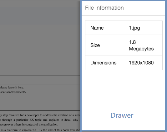
A Drawer is a component that acts as a panel but sticks to the boundary of a web page. With this, you can make the page cleaner and put details into the Drawer for a better user experience.
Example
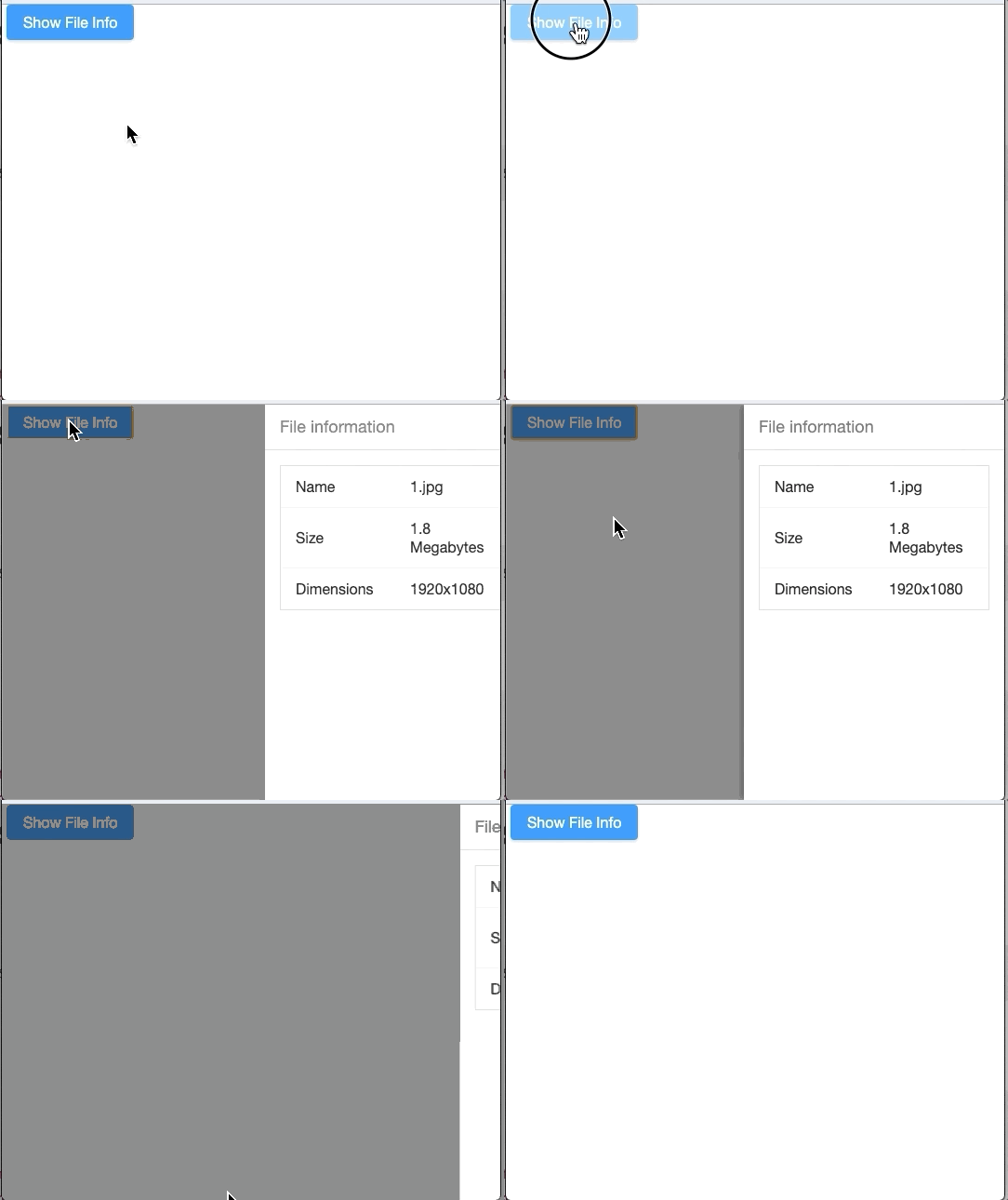
In this example we dock a drawer on the right side and put detailed file information into the drawer.

<button label="Show File Info" onClick="fi.open()"/>
<drawer id="fi" title="File information">
  <grid>
    <rows>
      <row>
        <label value="Name"/>
        1.jpg
      </row>
      <row>
        <label value="Size"/>
        1.8 Megabytes
      </row>
      <row>
        <label value="Dimensions"/>
        1920x1080
      </row>
    </rows>
  </grid>
</drawer>
Open / Close the Drawer
Both visible attribute and open/close methods allow you to open or close the Drawer.
Data-AnimationSpeed
Article: ZUML Reference/ZUML/Namespaces/Client Attribute/Data-AnimationSpeed
This component respects the data-animationspeed attribute.
Properties
Autodrop
When enabled, the drawer will be opened automatically when the mouse cursor is near the page edge.
This feature is not yet supported on mobile devices.
Closable
Sets whether it is closeable by a user (displays the close button). If enabled, there is a button for users to close the drawer.
Note that even if closable is false, users can still click outside the drawer to close it.
Mask
Sets whether it is masked when the drawer is opened. By default, there is a translucent dark gray full-screen mask.
Note that even if mask is false, users can still click outside the drawer to close it.
Position
Sets the position of the drawer. Valid values are "left", "right", "top" and "bottom".
Title
Sets the title of this drawer. null means no title.
Supported Events
onOpen |
Event: OpenEvent
Denotes that the user has opened or closed a component. Note: unlike |
- Inherited Supported Events: XulElement
Supported Children
*ALL
Use Cases
| Version | Description | Example Location |
|---|---|---|
Version History
| Version | Date | Content |
|---|---|---|
| 9.0.0 | September 2019 | ZK-4365: Provide a drawer component |

