Default"
From Documentation
Jumperchen (talk | contribs) (→Source) |
m (→Structure) |
||
| Line 15: | Line 15: | ||
[[Image:Menupopup1.jpg]] | [[Image:Menupopup1.jpg]] | ||
| − | [[Image: | + | [[Image:Menuseparatorinmenupopupone.jpg]] |
=Events= | =Events= | ||
Latest revision as of 06:49, 20 September 2010
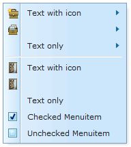
This is the Default mold for Menuseparator.
Source
The CSS source for Menuseparator from GitHub
Structure
Events
| CSS\Action | Normal (Open) | Hover | Click, Select, and Drag. | Focus | Focus and Hover | Disable |
| Naming: | .z-menu-separator | |||||
| Supported: | V |
Note: An exclamation mark(!) means that the action effect is done by CSS background , not CSS background-position
CSS Specification
| Class Name | Description | Default Values |
| .z-menu-popup-cnt .z-menu-separator | The outline of menuseparator | line-height:100%;
list-style-image:none !important; list-style-position:outside !important; list-style-type:none !important; margin:0 !important; display:block; padding:1px; cursor:pointer; |
| .z-menu-popup-cnt .z-menu-separator-inner | Background | background-color:#E0E0E0;
border-bottom:1px solid #FFFFFF; display:block; font-size:1px; line-height:1px; margin:2px 3px; overflow:hidden; width:auto; |

