Treeitem
Treeitem
Employment/Purpose
Treeitem contains a row of data (treerow), and an optional treechildren.
If the component doesn't contain a treechildren, it is a leaf node that doesn't accept any child items.
If it contains a treechildren, it is a branch node that might contain other items.
For a branch node, an +/- button will appear at the beginning of the row, such that user could open and close the item by clicking on the +/- button.
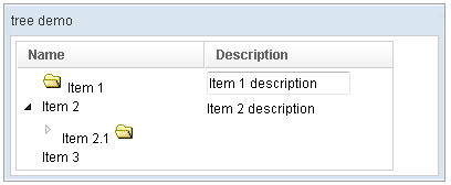
Example
<window title="tree demo" border="normal" width="400px">
	<tree id="tree" width="90%">
		<treecols sizable="true">
			<treecol label="Name" />
			<treecol label="Description" />
		</treecols>
		<treechildren>
			<treeitem>
				<treerow>
					<treecell>
						<image src="/img/folder.gif" />
						Item 1
					</treecell>
					<treecell>
						<textbox value="Item 1 description" />
					</treecell>
				</treerow>
			</treeitem>
			<treeitem>
				<treerow>
					<treecell label="Item 2" />
					<treecell label="Item 2 description" />
				</treerow>
				<treechildren>
					<treeitem open="false">
						<treerow>
							<treecell label="Item 2.1">
								<image src="/img/folder.gif" />
							</treecell>
						</treerow>
						<treechildren>
							<treeitem>
								<treerow>
									<treecell label="Item 2.1.1" />
								</treerow>
							</treeitem>
						</treechildren>
					</treeitem>
				</treechildren>
			</treeitem>
			<treeitem label="Item 3" />
		</treechildren>
	</tree>
 </window>
Label and Image
Treeitem provides Treeitem.setImage(String) and Treeitem.setLabel(String) to simplify the assignment of image and label to a treeitem. However, they are actually placed in the first treecell (of the child treerow). Furthermore, if the treecell or treerow are not created, they will be created automatically. For example,
<treeitem label="hello"/>
is equivalent to
<treeitem>
  <treerow>
    <treecell label="hello"/>
  </treerow>
It also means you cannot attach a treerow child to the treeitem, after setImage or setLabel was invoked. It means, though a bit subtle, the following will cause an exception:
<treeitem label="hello"> <!-- treerow is created automatically because of setLabel -->
  <treerow/> <!-- exception since only one treerow is allowed per treeitem -->
</treeitem>
Supported Events
| MouseEvent
Description: Denotes user has right-clicked the component. | |
| MouseEvent
Description: Denotes user has double-clicked the component. | |
| OpenEvent
Description: Denotes user has opened or closed a component. It is useful to implement load-on-demand by listening to the onOpen event, and creating components when the first time the component is opened. |
Supported Children
*ALL
Use cases
| Version | Description | Example Location |
|---|---|---|
Version History
| Version | Date | Content |
|---|---|---|
