Datebox
From Documentation
Datebox
- Demonstration: Date and Time
- Java API: Datebox
- JavaScript API: Datebox
- Style Guide: Datebox
Employment/Purpose
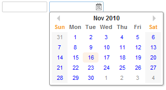
An edit box for holding a date. After click on the calender, a calender will pop-up for inputting date.
Mouseless Entry datebox
- Alt+DOWN to pop up the calendar.
- LEFT, RIGHT, UP and DOWN to change the selected day from the calendar.
- ENTER to activate the selection by copying the selected day to the datebox control.
- Alt+UP or ESC to give up the selection and close the calendar.
The First Day of the Week
The first day of the week is decided by the locale (actually the return value of the getFirstDayOfWeek method in the java.util.Calendar).
Since 5.0.3, you can control the first day of the week by use of the session attribute and the library property. Please refer to The First Day of the Week for details.
Customization
Since 5.0.3, the rendering of the calendar can be customized at the client by providing JavaScript code that overrides Renderer.
Example
 <datebox lenient="true" buttonVisible="false" />
 <datebox lenient="false" compact="false" buttonVisible="true" />
Inherited Functions
Please refer to InputElement for inherited functions.
Supported Events
| Event: Event
Denotes the time zone of the component is changed by user. |
- Inherited Supported Events: FormatInputElement
Supported Molds
Available molds of a component are defined in lang.xml embedded in zul.jar.
[Since 5.0.0] |
Supported Children
| None | None |
Use Cases
| Version | Description | Example Location |
|---|---|---|
Version History
| Version | Date | Content |
|---|---|---|
| 5.0.3 | July, 2010 | An application can control the first day of the week by use of the session attribute and the library property. Please refer to The First Day of the Week for details. |
