Slider
Slider
Employment/Purpose
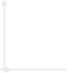
A slider component represents a slider with a scale and knob. It can be used to let user select a value by sliding the knob along the scale. A slider accepts a range of value starting from 0 to certain maximum value. The default maximum value of slider scale is 100. You could change the maximum allowed value by the maxpos property. However the default minimum is 0 and cannot be changed.
Example
  <slider id="slider" orient="vertical"/>
  <slider curpos="1" maxpos="20"  />
Page Increment
By default, the slider will move to the position of the try on which an user clicks. If you prefer to move in a fixed amount (like the scrollbar does), you could specify the amount of value to move by use of Slider.setPageIncrement(int).
<slider pageIncrement="10"/>
Supported Events
| Event: ScrollEvent
Denotes the content of a scrollable component has been scrolled by the user. | |
| Event: ScrollEvent
Denotes that the user is scrolling a scrollable component. Notice that the component's content (at the server) won't be changed until onScroll is received. Thus, you have to invoke the getPos method in the ScrollEvent class to retrieve the temporary position. |
- Inherited Supported Events: XulElement
Supported Molds
Available molds of a component are defined in lang.xml embedded in zul.jar.
Supported Children
*None
Use Cases
| Version | Description | Example Location |
|---|---|---|
Version History
| Version | Date | Content |
|---|---|---|
| 5.0.4 | August 2010 | Slider.setPageIncrement(int) is supported. |
| 5.0.4 | August 2010 | Slider support for clicking to increment or decrement |
