ZK Graphics Component
Jumper Chen, Engineer, Potix Corporation
May 07, 2013
ZK 6.5.2 and later
Overview
The ZK Graphics component is based on HTML5 canvas to draw a set of shapes for developer to use and the usage of the ZK Graphics is just like SVG syntax for developer to lay out their own graphics products. The main feature of this component is that we utilize CSS3 transition and transform effects for user to customize the animation more easy without any Javascript code, only Java programing. In this smalltalk, I will guide you how to use ZK Graphics Component to draw your own charting component (Bar chart)
Main Features
Here lists the few key features for you to glance through them.
Shapes Component
The built-in component set are:
Circle
<stage id="stage" hflex="1" vflex="1">
	<layer>
		<circle cx="50" cy="50" r="40" stroke="black"
			strokeWidth="2" fill="red" />
	</layer>
</stage>
Ellipse
<stage id="stage" hflex="1" vflex="1">
	<layer>
		<ellipse x="240" y="100" radiusX="220" radiusY="30" fill="purple"/>
	</layer>
</stage>
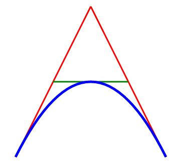
Path
<stage id="stage" hflex="1" vflex="1">
	<layer x="300">
		<path id="lineAB" data="M 100 350 l 150 -300" stroke="red"
			strokeWidth="3" fill="none" />
		<path id="lineBC" data="M 250 50 l 150 300" stroke="red"
			strokeWidth="3" fill="none" />
		<path data="M 175 200 l 150 0" stroke="green" strokeWidth="3"
			fill="none" />
		<path data="M 100 350 q 150 -300 300 0" stroke="blue"
			strokeWidth="5" fill="none" />
	</layer>
</stage>
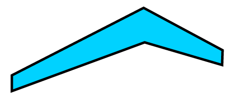
Polygon
<stage id="stage" hflex="1" vflex="1">
	<layer>
		<polygon id="polygon" fill="#00d2ff" stroke="black" strokeWidth="5"
			 points="73,192 73,160 340,23 500,109 499,139 342,93" draggable="true"/>
	</layer>
</stage>
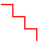
Polyline
<stage id="stage" hflex="1" vflex="1">
	<layer>
		<polyline points="0,40 40,40 40,80 80,80 80,120 120,120 120,160"
				style="fill:white;stroke:red;stroke-width:4" />
	</layer>
</stage>
Rect
<stage id="stage" hflex="1" vflex="1">
	<layer>
		<group draggable="true" x="100" y="50">
			<text y="-20"  textContent="Normal Rectangle" fill="#555"/>
			<rect width="100" height="50" fill="green" stroke="black" strokeWidth="4"/>
		</group>
		<group draggable="true" x="300" y="50">
		<text y="-20" textContent="Radial-Gradient Rectangle" fill="#555"/>
		<rect width="100" height="50" stroke="black" strokeWidth="4"
			fillStyle="radial-gradient" fillStartPoint="0" fillEndPoint="0"
			fillStartRadius="0" fillEndRadius="70" fillColorStops="0, red, 1, yellow"
			/>
		</group>
		<group draggable="true" x="500" y="50">
		<text y="-20" textContent="Linear-Gradient Rectangle" fill="#555"/>
		<rect width="100" height="50" stroke="black" strokeWidth="4"
			fillStyle="linear-gradient" fillStartPoint="-50,-50" fillEndPoint="50,50"
			fillColorStops="0, red, 1, yellow"
			/>
		</group>
	</layer>
</stage>
Text
<stage id="stage" hflex="1" vflex="1">
	<layer x="10" y="10">
		<text fontSize="25" textAnchor="middle" textContent="Radial-Gradient Rectangle"
			 fill="#555" shadowColor="red" shadowBlur="3"/>
	</layer>
</stage>
CSS3 Animation Component
CSS Selector
CSS transition
CSS Transform (2D)
CSS Animation
CSS Keyframes
CSS Variables: var-*
CSS Function Notations:
var()
attr()
eval()
Touch device support
Bar Chart Demo
Suppose you define a component for eg. window as shown below in your zul Image
<window title="ZK Rocks" border="normal">
</window>
Downloads
You can get complete source for the example described in this smalltalk from its github
Comments
| Copyright © Potix Corporation. This article is licensed under GNU Free Documentation License. |


