Nav
From Documentation
Employment/Purpose
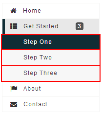
A container is used to display navitem, it should be placed inside a navbar.
Example
<navbar orient="vertical" width="200px">
	<navitem label="Home" iconSclass="z-icon-home" />
	<nav label="Get Started" iconSclass="z-icon-th-list" detailed="true">
		<navitem label="Step One" />
		<navitem label="Step Two" />
		<navitem label="Step Three" />
	</nav>
	<navitem label="About" iconSclass="z-icon-flag" />
	<navitem label="Contact" iconSclass="z-icon-envelope"/>
</navbar>
Properties
Detailed
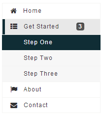
We can show the number of the Navitem inside the Nav. For example, Nav Get Started 's contains three Navitem components - Step One, Step Two, Step Three. when we set Get Started 's detailed to "true". The right hand side of the Nav will display the number. The code snippets as shown below:

|
<nav label="Get Started" iconSclass="z-icon-th-list" detailed="true">
	<navitem label="Step One" />
	<navitem label="Step Two" />
	<navitem label="Step Three" />
</nav>
|
Supported Events
| Event: OpenEvent
Denotes user has opened or closed a nav component. |
- Inherited Supported Events: LabelImageElement
Supported Children
* Nav, Navitem
Use Cases
| Version | Description | Example Location |
|---|---|---|
Version History
| Version | Date | Content |
|---|---|---|
| 7.0.0 | August, 2013 | Nav was introduced. |
