UI Pattern Bootstrap and Borderlayout
Redirect page
Redirect to:
Sefi Lin, Engineer, Potix Corporation
Jun 2, 2016
ZK 8.0.2
Introduction
More and more mobile devices are appearing on the market today, meaning the ability to browse on small screens has now become a necessity. To meet this demand, ZK provides a variety of layout components to help customers build their own user interface, such as TableLayout, VLayout, HLayout or BorderLayout. However, these layouts are not designed for mobile device, which leads to the question- how can we improve our user experience on mobile devices? One of the solutions is to rely on RWD frameworks such as Bootstrap. This article will show how to build a RWD ZK page with BorderLayout and Bootstrap.
Demo
Video:
Watch on Youtube
Prerequisites
- ZK 8.0.2 or later
- Bootstrap 3 knowledge, read here
Idea
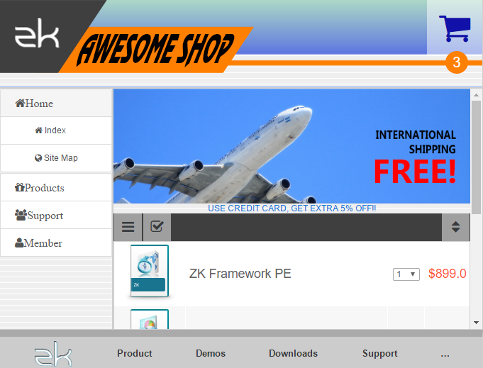
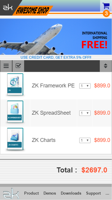
This demo shows a simple shopping cart. Since we expect the page to support RWD, we would need to design two different layout templates; one is for desktop browser written in ZK BorderLayout, and the other is for mobile device browser written in Bootstrap. We suggest using the same MVVM module to synchronize data and applying the new feature in ZK 8.0.2 called "MatchMedia" to switch each templates. In this case, you will then be able to define more templates for other devices in different screen sizes.
Structure
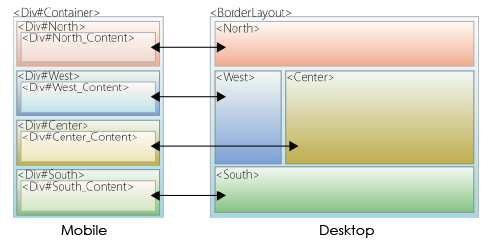
This image explains the relationship of two templates. You can see that each template's block corresponds to another template's block. The desktop template layout on the right side uses ZK Borderlayout, while the mobile template layout on the left side follows the standard Bootstrap layout rules.

- To learn more about Bootstrap layout grid system, please read here
Main page
We use a MVVM model to control which template will be displayed. The following contains the source code of the main zul page:
<?meta name="viewport" content="width=device-width, initial-scale=1"?>
<zk>
    <div viewModel="@id('vm') @init('org.zkoss.zkshopcart_MVVM')" width="100%" height="100%">
        <apply template="@load(vm.layoutTemplate)"/>
    </div>
</zk>
The following is the MVVM java code. For now it simply displays the desktop layout. We will discuss how to detect which template will be displayed later in the section Media Queries.
public class zkshopcart_MVVM {
        private String _layoutTemplate = "desktop_layout" ;

        public String getLayoutTemplate() {
                return _layoutTemplate;
        }
}
Desktop layout template
For this demo, we use BorderLayout for the desktop layout template. We only use these four blocks: north, west, center and south (east block not required). The north is the header; the west block is a simple menu tree; the center block acts as the main block that contains the shopping cart items; and the south block represents the footer.
<template name="desktop_layout">
    <borderlayout>
        <north>
            <apply templateURI="includes/header.zul"/>
        </north>
        <west width="160px">
            <apply templateURI="includes/menu.zul"/>
        </west>
        <center autoscroll="true">
            <apply templateURI="includes/shoplist.zul"/>
        </center>
        <south>
            <apply templateURI="includes/footer.zul"/>
        </south>
    </borderlayout>
</template>
Mobile layout template
Similar to the desktop layout template, the mobile layout template also has four blocks. These blocks follow the standard Bootstrap rules. The typical layout for mobile is in vertical order. Normally, the order of these blocks from top to bottom is header, menu, content and footer. Each Divs(North, West, Center and South) is a row, and the xxx_content inside each block is a full width column.
<template name="mobile_layout">
    <div sclass="container-fluid">
        <div id="north" sclass="north row">
            <div id="north_content" sclass="col-xs-12 ">
                <apply templateURI="includes/header.zul"/>
            </div>
        </div>
        <div id="west" sclass="west row">
            <div id="west_content" sclass="col-xs-12">
                <apply templateURI="includes/menu.zul"/>
            </div>
        </div>
        <div id="center" sclass="center row">
            <div id="center-content" sclass="col-xs-12">
                <apply templateURI="includes/shoplist.zul"/>
            </div>
        </div>
        <div id="south" sclass="south row">
            <div id="south-content" sclass="col-xs-12">
                <apply templateURI="includes/footer.zul"/>
            </div>
        </div>
    </div>
</template>
Although the id is not essential, we add it to make the code more readable. The sclass "container-fluid" at line 2 tells Bootstrap this container is a full width container; "row" at line 3, 8, 13, 18 indicates that this block is a row; and "col-xs-12" at line 4, 9, 14, 19 means this block is a column with full width.
Media Queries
We use MatchMedia Queries to define when the template should be switched. In this demo, if screen width is greater than 640px, the desktop template will be shown; otherwise, the mobile template is shown. Remember to add @NotifyChange("*") after MatchMedia Queries to notify ZK update UI.
public class zkshopcart_MVVM {
    private String _layoutTemplate = "desktop_layout" ;

    @MatchMedia("all and (max-width : 640px)")
    @NotifyChange("*")
    public void getMobileTemplate(){
        _layoutTemplate = "mobile_layout";
    }

    @MatchMedia("all and (min-width : 640px)")
    @NotifyChange("*")
    public void getDesktopTemplate(){
        _layoutTemplate = "desktop_layout";
    }

    public String getLayoutTemplate() {
        return _layoutTemplate;
    }
}
Now your page has RWD and will auto-switch templates when screen width is changed.
Some other tips
It is important to note that if you want to use RWD features (i.e. MatchMedia, Bootstrap) in your page, you must add a meta tag on top of the file to describe the viewport.
<?meta name="viewport" content="width=device-width, initial-scale=1"?>
- For more information of viewport meta, please refer to here
If you want to use Bootstrap style component appearance, you would need to use some CSS to override ZK's original style; for instance, you can follow the CSS code to clear ZK's button appearance, and add another Bootstrap button class on this:
.z-button.btn{
    background-image:inherit
}
.z-button.btn:hover,
.z-button.btn:focus{
    background-image:inherit
}
Download
- The source code for this article can be found on github.
Comments
| Copyright © {{{name}}}. This article is licensed under GNU Free Documentation License. |
</includeonly>
This will not display properly unless included in the page.

