Tabpanel
From Documentation
Tabpanel
Employment/Purpose
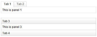
A tabpanel is the body of a single tab panel. You would place the content for a group of components within a tab panel. The first tabpanel corresponds to the first tab, the second tabpanel corresponds to the second tab and so on.
Example
<zk>
	<tabbox width="400px">
		<tabs>
			<tab label="Tab 1" />
			<tab label="Tab 2" />
		</tabs>
		<tabpanels>
			<tabpanel>This is panel 1</tabpanel>
			<tabpanel>This is panel 2</tabpanel>
		</tabpanels>
	</tabbox>
	<space />
	<tabbox width="400px" mold="accordion">
		<tabs>
			<tab label="Tab 3" />
			<tab label="Tab 4" />
		</tabs>
		<tabpanels>
			<tabpanel>This is panel 3</tabpanel>
			<tabpanel>This is panel 4</tabpanel>
		</tabpanels>
	</tabbox>
</zk>
Supported Events
| None | None |
- Inherited Supported Events: XulElement
Supported Children
*ALL
Use Cases
| Version | Description | Example Location |
|---|---|---|
| 3.6 | How to put a scrollbar inside a tabpanel | http://www.zkoss.org/forum/listComment/9889 |
| 3.6 | How to make a tabpanel loaded on demand | http://www.zkoss.org/forum/listComment/6236 |
See also: Tabbox
Version History
| Version | Date | Content |
|---|---|---|
