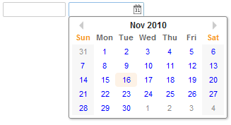
Datebox
Datebox
- Demonstration: Date and Time
- Java API: Datebox
- JavaScript API: Datebox
Employment/Purpose
An edit box for holding a date. After click on the calender, a calender will pop-up for inputting date.
Mouseless Entry datebox
‧ Alt+DOWN to pop up the calendar.
‧ LEFT, RIGHT, UP and DOWN to change the selected day from the calendar.
‧ ENTER to activate the selection by copying the selected day to the datebox control.
‧ Alt+UP or ESC to give up the selection and close the calendar.
Example
 <datebox lenient="true" buttonVisible="false" />
 <datebox lenient="false" compact="false" buttonVisible="true" />
Supported events
| Event: MouseEvent
Denotes user has clicked the component. | |
| Event: InputEvent
An input control notifies the application with the onChange event if its content is changed by the user.
| |
| Event: InputEvent
An input control also notifies the application with the onChanging event, when user is changing the content. | |
| Event: SelectionEvent
Denotes that user is selecting a portion of the text of an input component. You can retrieve the start and end position of the selected text by use of the getStart and getEnd methods. | |
| Event: Event
Denotes when a component gets the focus. | |
| Event: Event
Denotes when a component loses the focus. |
Supported Children
| None | None |
Use cases
| Version | Description | Example Location |
|---|---|---|
Version History
| Version | Date | Content |
|---|---|---|
| 5.0.2 | 4/27/2010 | Initialization |
