Listbox
Listbox
Employment/Purpose
Components: listbox, listitem, listcell, listhead and listheader.
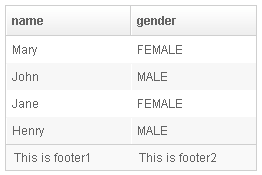
A list box is used to display a number of items in a list. The user may select an item from the list.
Example
 <window title="listbox demo" border="normal">
         <listbox id="box" width="250px">
             <listhead sizable="true">
                 <listheader label="name" sort="auto"/>
                 <listheader label="gender" sort="auto"/>
             </listhead>
             <listitem>
                 <listcell label="Mary"/>
                 <listcell label="FEMALE"/>
             </listitem>
             <listitem>
                 <listcell label="John"/>
                 <listcell label="MALE"/>
             </listitem>
             <listitem>
                 <listcell label="Jane"/>
                 <listcell label="FEMALE"/>
             </listitem>
             <listitem>
                 <listcell label="Henry"/>
                 <listcell label="MALE"/>
             </listitem>
             <listfoot >
                 <listfooter><label value="This is footer1"/></listfooter>
                 <listfooter><label value="This is footer2"/></listfooter>
             </listfoot>
         </listbox>
 </window>
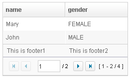
Listbox has two molds: default and select. If the select mold is used, the HTML's SELECT tag is generated instead.
<zk>
	<zscript><![CDATA[
		ListModelList lm = new ListModelList(Arrays.asList(new String[] { "David",
				"Thomas", "Steven" }));
	]]></zscript>

	<listbox width="300px" model="${lm}" onAfterRender="self.setSelectedIndex(2)"/>
</zk>
Autopaging
When using the paging mold and vflex, you could also turn on autopaging (Listbox.setAutopaging(boolean)) such that the page size will be adjusted automatically based on the available space.
Nonselectable Tags
By default, when an user clicks on a BUTTON, INPUT, TEXTAREA or A tag, the selection state of the item won't be changed. For example, when an user clicks the textbox in the following example, the selection state of the item won't be changed (only the textbox gains the focus).
<listitem>
  <listcell><textbox/></listcell>
Sometimes it is not intuitive, such as using with inplace editing (InputElement.isInplace()). If you want to have more control of whether to select an item, you could specify a list of tags in the nonselectableTags property (Listbox.setNonselectableTags(String)). For example, if you want to select the item, no matter what tag the user clicks, you could specify an empty string as follows.
<listbox nonselectableTags="">
    <listitem><listcell><textbox/></listcell></listitem>
    <listitem><listcell><button label="button"/></listcell></listitem>
    <listitem><listcell><h:input xmlns:h="native"/></listcell></listitem>
    <listitem><listcell><datebox/></listcell></listitem>
</listbox>
If you only want to ignore BUTTON and INPUT only, you could specify nonselectableTags="button, input".
Deselect Others when Clicking an Item with Checkmark
If a listbox's checkmark (Listbox.isCheckmark()) is enabled, the selection will be toggled when an user clicks an item. In other words, all other items will remain the same.
If you prefer to deselect all other items and select the item being clicked (which the behavior of ZK 5.0.4 and earlier), you could specify true to this library property called org.zkoss.zul.listbox.checkmarkDeselectOthers in WEB-INF/zk.xml:
<library-property>
	<name>org.zkoss.zul.listbox.checkmarkDeselectOthers</name>
	<value>true</value>
</library-property>
Toggle Selection when Right Clicking an Item with Checkmark
If a listbox's checkmark (Listbox.isCheckmark()) is enabled, the selection will be toggled when user right click on item.
If you prefer not to select/deselect item on right click, you could specify false to this library property called org.zkoss.zul.listbox.rightSelect in WEB-INF/zk.xml:
<library-property>
	<name>org.zkoss.zul.listbox.rightSelect</name>
	<value>false</value>
</library-property>
SizedByContent
By default, the widths of columns have to be specified explicitly, or it will be split equally among columns regardless what content they might have. If you want to have the minimal width (that fit the content), you could specify hflex="min" at the column (not the listbox).
However, the listbox has a special mode called sized-by-content (Listbox.setSizedByContent(boolean)). By specifying it to true, the column width will be adjusted automatically. However, it is controlled by the browser, so have have no 100% control of it. For example, if an user resized a column, the final width might not be exactly the same as what he resized.
In general, we suggest to specify hflex in column, rather than specifying sizedByContent at listbox for much more predictable result.
Span
By default, when sizedByContent is true, column only take required space.

If wanna to span the width of the columns to occupy the whole listbox, you could specify true to this attribute

<listbox sizedByContent="true" span="true" width="800px">
	<listhead>
		<listheader	label="Time Message" />
		<listheader label="Level" />
		<listheader label="Source" />
		<listheader label="Message" />
	</listhead>
	<listitem>
		<listcell label="6/28/10 4:19:18 PM" />
		<listcell label="Info, long content.........................." />
		<listcell label="Server" />
		<listcell label="Merging recovery point 52 created 20 6/27/10 10 :11 PM" />
	</listitem>
</listbox>
Supported Events
| SelectEvent
Description: Notifies one that the user has selected a new item in the list box | |
| Event
Description: Notifies one that the model's data has been rendered. |
Supported Molds
Available molds of a component are defined in lang.xml embedded in zul.jar.

| |

| |

|
Supported Children
Listitem, Listhead, Listfoot
Use Cases
| Version | Description | Example Location |
|---|---|---|
Version History
| Version | Date | Content |
|---|---|---|
| 5.0.2 | May 2010 | Support the autopaging |
| 5.0.4 | July 2010 | Support onAfterRender event |
| 5.0.5 | September 2010 | The nonselectabletag property was introduced to enhance the control of when to select an item |
| 5.0.5 | September 2010 | When a listbox's checkmark is enabled and an item is clicked, it will toggle the selection of the item and the other remains the same. |
| 5.0.5 | October 2010 | When a listbox's checkmark is enabled and an item is right clicked, it will toggle the selection of the item. |
| 5.0.5 | October 2010 | The span property was introduced to span the columns to occupy the whole listbox. |

