Tree
Tree
Employment/Purpose
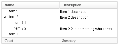
A tree consists of tree parts, the set of columns, the set of footers, and the tree body. The set of columns is defined by a number of treecol components, one for each column. Each column will appear as a header at the top of the tree. The second part, The set of footers is defined by a number of treefooter components, one for each column also. Each column will appear as a footer at the bottom of the tree. The third part, the tree body, contains the data to appear in the tree and is created with a treechildren component.
Example
<window title="tree demo" border="normal">
     <tree id="tree" width="400px" rows="5">
         <treecols sizable="true">
             <treecol label="Name"/>
             <treecol label="Description"/>
         </treecols>
         <treechildren>
             <treeitem>
                 <treerow>
                     <treecell label="Item 1"/>
                     <treecell label="Item 1 description"/>
                 </treerow>
             </treeitem>
             <treeitem>
                 <treerow>
                     <treecell label="Item 2"/>
                     <treecell label="Item 2 description"/>
                 </treerow>
                 <treechildren>
                     <treeitem>
                         <treerow>
                             <treecell label="Item 2.1"/>
                         </treerow>
                     </treeitem>
                     <treeitem>
                         <treerow>
                             <treecell label="Item 2.2"/>
                             <treecell label="Item 2.2 is something who cares"/>
                         </treerow>
                     </treeitem>
                 </treechildren>
             </treeitem>
             <treeitem label="Item 3"/>
         </treechildren>
         <treefoot>
             <treefooter label="Count"/>
             <treefooter label="Summary"/>
         </treefoot>
     </tree>
 </window>
<zk>
	<zscript><![CDATA[
	SimpleTreeModel stm = new SimpleTreeModel(new SimpleTreeNode("ROOT",
		Arrays.asList(new SimpleTreeNode[]{
				new SimpleTreeNode("David",new ArrayList()),
				new SimpleTreeNode("Thomas",new ArrayList()),
				new SimpleTreeNode("Steven",new ArrayList())})));
	]]></zscript>

	<tree width="300px" model="${stm}" onAfterRender="self.setSelectedItem(self.getTreechildren().getLastChild())"/>
</zk>
Change Style
To change the style of tree icon, you may call setZclass(String style). Four built in style includes "z-tree","z-dottree","z-filetree","z-vfiletree"
Autopaging
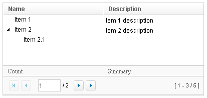
When using the paging mold and vflex, you could also turn on autopaging (Tree.setAutopaging(boolean)) such that the page size will be adjusted automatically based on the available space.
Nonselectable Tags
By default, when an user clicks on a BUTTON, INPUT, TEXTAREA or A tag, the selection state of the item won't be changed. For example, when an user clicks the textbox in the following example, the selection state of the item won't be changed (only the textbox gains the focus).
<treeitem>
  <treerow>
    <treecell><textbox/></treecell>
Sometimes it is not intuitive, such as using with inplace editing (InputElement.isInplace()). If you want to have more control of whether to select an item, you could specify a list of tags in the nonselectableTags property (Tree.setNonselectableTags(String)). For example, if you want to select the item, no matter what tag the user clicks, you could specify an empty string as follows.
<tree nonselectableTags="">
  <treechildren>
    <treeitem>
      <treerow>
        <treecell><textbox/></treecell>
Deselect Others when Clicking an Item with Checkmark
If a tree's checkmark (Tree.isCheckmark()) is enabled, the selection will be toggled when an user clicks an item. In other words, all other items will remain the same.
If you prefer to deselect all other items and select the item being clicked (which the behavior of ZK 5.0.4 and earlier), you could specify true to this library property called org.zkoss.zul.tree.checkmarkDeselectOthers in WEB-INF/zk.xml:
<library-property>
	<name>org.zkoss.zul.tree.checkmarkDeselectOthers</name>
	<value>true</value>
</library-property>
Toggle Selection when Right Clicking an Item with Checkmark
If a tree's checkmark (Tree.isCheckmark()) is enabled, the selection will be toggled when user right click on item.
If you prefer not to select/deselect item on right click, you could specify false to this library property called org.zkoss.zul.tree.rightSelect in WEB-INF/zk.xml:
<library-property>
	<name>org.zkoss.zul.tree.rightSelect</name>
	<value>false</value>
</library-property>
SizedByContent
By default, the widths of columns have to be specified explicitly, or it will be split equally among columns regardless what content they might have. If you want to have the minimal width (that fit the content), you could specify hflex="min" at the column (not the tree).
However, the tree has a special mode called sized-by-content (Tree.setSizedByContent(boolean)). By specifying it to true, the column width will be adjusted automatically. However, it is controlled by the browser, so have have no 100% control of it. For example, if an user resized a column, the final width might not be exactly the same as what he resized.
In general, we suggest to specify hflex in column, rather than specifying sizedByContent at tree for much more predictable result.
Supported events
| SelectEvent
Description: Denotes user has selected one or multiple child components(a set of treeitem). | |
| onAfterRender
Description: Notifies one that the model's data has been rendered. |
Supported molds
Available molds of a component are defined in lang.xml embedded in zul.jar.

| |

|
Supported Children
* Treecols, Treechildren, Treefoot
Use cases
| Version | Description | Example Location |
|---|---|---|
| 3.6 | Smalltalk: Building a Complex Tree with Grid-in-Grid | http://docs.zkoss.org/wiki/Building_a_Complex_Tree_with_Grid-in-Grid |
| 3.6 | Open treeitem at start | http://docs.zkoss.org/wiki/ZK/How-Tos/Concepts-and-Tricks#Open_treeitem_at_start |
| 3.6 | Expand all items of a Tree at start | http://www.zkoss.org/forum/listComment/9379 |
Browser Limitations
| Browser | description |
|---|---|
| Chrome & Safari |
<zk>
	<hbox>
		<tree>
			<treecols>
				<treecol label="Name" />
				<treecol label="Description" />
			</treecols>
			<treechildren>
				<treeitem>
					<treerow>
						<treecell label="Item 1" />
						<treecell label="Item 1 description" />
					</treerow>
				</treeitem>
			</treechildren>
		</tree>
	</hbox>
</zk>
The width of the tree will be zero with Chrome & Safari. the Webkit considers the width of tree as zero. please specify the width to tree to work around. |
Version History
| Version | Date | Content |
|---|---|---|
| 5.0.2 | May 2010 | Support the autopaging |
| 5.0.4 | July 2010 | Support onAfterRender event |
| 5.0.5 | September 2010 | The nonselectabletag property was introduced to enhance the control of when to select an item |
| 5.0.5 | September 2010 | When a tree's checkmar is enabled and an item is clicked, it will toggle the selection of the item and the other remains the same. |
| 5.0.5 | October 2010 | When a tree's checkmark is enabled and an item is right clicked, it will toggle the selection of the item. |
