Box
Box
Employment/Purpose
The box model of XUL is used to divide a portion of the display into a series of boxes. Components inside of a box will orient themselves horizontally or vertically. By combining a series of boxes and separators, you can control the layout of the visual presentation.
A box can lay out its children in one of two orientations, either horizontally or vertically. A horizontal box lines up its components horizontally and a vertical box orients its components vertically. You can think of a box as one row or one column from an HTML table.
Example
 <zk>
     <box orient="vertical">
         <button label="Button 1"/>
         <button label="Button 2"/>
     </box>
     <box  orient="horizontal">
         <button label="Button 3"/>
         <button label="Button 4"/>
     </box>
 </zk>
Properties
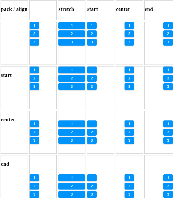
Align and Pack
<zk xmlns:n="http://www.zkoss.org/2005/zk/native">
	<zscript><![CDATA[
		Map map = new LinkedHashMap();
		String[] packs = new String[]{"", "start", "center", "end"};
		String[] aligns = new String[]{"", "stretch", "start", "center", "end"};

		for (int i = 0; i < aligns.length; i++) {
			String align = aligns[i];
			List list = new ArrayList();
			for (int j = 0; j < packs.length; j++) {
				list.add(packs[j]);
			}
			map.put(align, list);
		}

	]]></zscript>
	<tablelayout columns="6">
		<tablechildren >
			<panel border="normal" height="150px" width="100px"
				forEach='"pack / align", "", "start", "center", "end"'>
				<panelchildren>
					<n:h3>${each}</n:h3>
				</panelchildren>
			</panel>
		</tablechildren>
		<tablechildren forEach="${map}">
			<variables key="${each.key}"/>
			<panel border="normal" height="150px" width="100px">
				<panelchildren>
					<n:h3>${key}</n:h3>
				</panelchildren>
			</panel>
			<panel border="normal" height="150px" width="100px" forEach="${each.value}" >
				<panelchildren>
					<box align="${key}" pack="${each}" height="90%" width="100%">
						<button label="1" />
						<button label="2" />
						<button label="3" />
					</box>
				</panelchildren>
			</panel>
		</tablechildren>
	</tablelayout>
</zk>
[Since 5.0.0]
Cell Component
In ZK5, we have introduced a new component named Cell which can be embedded into a Grid or Box (Hbox and Vbox) to fully control the layout and the style. You can now use the rowspan or the colspan property to layout your Grid, for example a content cell can now cross over multiple rows. The code below demonstrates how to do this:
<box>
    <cell sclass="years">
        ...
    </cell>
</box>
[Since 5.0.0]
Supported Events
| None | None |
- Inherited Supported Events: XulElement
Supported Molds
Available molds of a component are defined in lang.xml embedded in zul.jar.

|
Supported Children
*ALL
Use Cases
| Version | Description | Example Location |
|---|---|---|
Version History
| Version | Date | Content |
|---|---|---|
| 5.0.4 | August, 2010 | Add a sizedByContent method for splitter to resize smoothly |

