Splitter
Splitter
Employment/Purpose
An element which should appear before or after an element inside a box (Box, Vbox and Hbox).
When the splitter is dragged, the sibling elements of the splitter are resized. If getCollapse() is true, a grippy in placed inside the splitter, and one sibling element of the splitter is collapsed when the grippy is clicked. If the Splitter is used in a context that allows resizing, it will be draggable. To make it collapsible only, it can be used in a different context, e.g. with Borderlayout.
Example
<hbox spacing="0" width="100%">
	<vbox height="200px">
		Column 1-1: The left-top box. To know whether a splitter is collapsed,
		you can listen to the onOpen event.
		<splitter collapse="after" />
		Column 1-2: You can enforce to open or collapse programming by calling
		setOpen method.
	</vbox>
	<splitter collapse="before" />
	Column 2: Whether a splitter allows users to open or collapse depending
	on the collapse attribue.
</hbox>
Properties and Features
OS Styling
If you want to change the styling to be more similar to OS's look as follows.
You could specify HtmlBasedComponent.setZclass(String) with z-splitter-os-ver or z-splitter-os-hor, depending on the orient is vertical or horizontal.
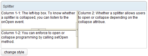
Here is an example that switches the styling between the default and OS-look:
<window>
	<panel title="Splitter" border="normal" width="500px">
		<panelchildren>
			<hbox spacing="0" width="100%" height="100%">
				<vbox spacing="0" width="100%" heights="60px,60px">
					Column 1-1: The left-top box. To know whether a splitter
					is collapsed, you can listen to the onOpen event.
					<splitter id="s1" collapse="before"/>
					Column 1-2: You can enforce to open or collapse programming
					by calling setOpen method.
				</vbox>
				<splitter id="s2" collapse="before"/>
				Column 2: Whether a splitter allows users to open or collapse
				depending on the collapse attribue.
			</hbox>
		</panelchildren>
	</panel>
	<button label="change style">
		<attribute name="onClick">
		if ("z-splitter-ver".equals(s1.getZclass()))
			s1.setZclass("z-splitter-os-ver");
		else
			s1.setZclass("z-splitter-ver");
		if ("z-splitter-hor".equals(s2.getZclass()))
			s2.setZclass("z-splitter-os-hor");
		else
			s2.setZclass("z-splitter-hor");
		</attribute>
	</button>
</window>
Supported Events
| Event: OpenEvent
When a splitter is collapsed or opened by a user, the onOpen event is sent to the application. |
- Inherited Supported Events: XulElement
Supported Molds
Available molds of a component are defined in lang.xml embedded in zul.jar.
Supported Children
*NONE
Use Cases
| Version | Description | Example Location |
|---|---|---|
| 5.0 | Used to seperate contents within hbox/vbox. | http://www.zkoss.org/zksandbox/userguide/#l13 |
Version History
| Version | Date | Content |
|---|---|---|

