New Features of ZK 6.5
From Documentation
Author
Timothy Clare, Potix Corporation
Timothy Clare, Potix Corporation
Date
September 12, 2012
September 12, 2012
Version
ZK 6.5
ZK 6.5
Device Transparency - desktop, tablet & smartphone support
Touch Event Detection
Detect orientation changes
Responsive Components
HTML 5 Support
File Upload now supports dragging & dropping local files
Input elements support HTML 5 types
Input element supports placeholder
Closable Notification
Calendar support shows the week's number
Scrollview Component
- Available for ZK:
-

Cardlayout Component
- Available for ZK:
-

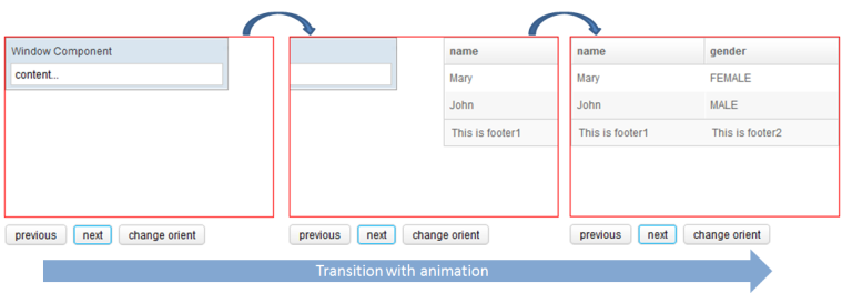
The Cardlayout is a new component which enables end-users to switch components like switching cards. On tablet, this navigation operation is supported by simply swiping or switching through components.
The image and source below shows an example of the Cardlayout component being used.
	<cardlayout id="card" width="300px" height="200px" style="border:1px solid red" selectedIndex="1">
		<div vflex="1" hflex="1" style="background-color:yellow;padding:20px">flex component</div>
		<window title="Window Component" border="normal" width="250px">content...</window>
		<listbox>
			<listhead sizable="true">
				<listheader label="name" sort="auto" />
				<listheader label="gender" sort="auto" />
			</listhead>
			<listitem>
				<listcell label="Mary" />
				<listcell label="FEMALE" />
			</listitem>
			<listitem>
				<listcell label="John" />
				<listcell label="MALE" />
			</listitem>
			<listfoot>
				<listfooter>
					<label value="This is footer1" />
				</listfooter>
				<listfooter>
					<label value="This is footer2" />
				</listfooter>
			</listfoot>
		</listbox>
	</cardlayout>
	<hlayout>
		<button onClick="card.previous()">previous</button>
		<button onClick="card.next()">next</button>
		<button onClick='card.setOrient("horizontal".equals(card.getOrient()) ? "vertical" : "horizontal")'>change orient</button>
	</hlayout>
Tablet Behaviour
- Available for ZK:
-

In addition to the ability to change the Cardlayout view using commands (next and previous) ZK also includes default swipe behaviour for tablets. On swipe in an appropriate direction, the viewport will change which component is shown. The following video demonstrates this behaviour.
