ZK Graphics Component
Jumper Chen, Senior Engineer, Potix Corporation
May 07, 2013
ZK 6.5.2 and later
Overview
The ZK Graphics component is a component based on HTML5 canvas to draw a set of shapes for developers to use that is similar if not identical to the usage of SVG syntax enabling developers to lay out their own graphics products. The main feature of this component is that we utilize CSS3 transition and transform effects so users can customize the animation more easily with Pure Java, shielding them from any JavaScript. At the moment, this project is still at its early stage. however, this smalltalk will give you a heads up and will show you how you can use ZK Graphics Component to create and draw your own charting component (Bar chart)!
Note: All samples run on the server-side in pure Java.
Feature Highlights
Shapes Component
Following are the built-in component sets are:
Circle
<stage id="stage" hflex="1" vflex="1">
	<layer>
		<circle cx="50" cy="50" r="40" stroke="black"
			strokeWidth="2" fill="red" />
	</layer>
</stage>
Ellipse
<stage id="stage" hflex="1" vflex="1">
	<layer>
		<ellipse x="240" y="100" radiusX="220" radiusY="30" fill="purple"/>
	</layer>
</stage>
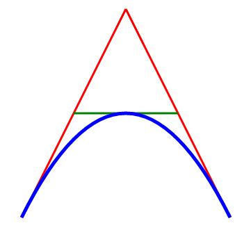
Path
<stage id="stage" hflex="1" vflex="1">
	<layer x="300">
		<path id="lineAB" data="M 100 350 l 150 -300" stroke="red"
			strokeWidth="3" fill="none" />
		<path id="lineBC" data="M 250 50 l 150 300" stroke="red"
			strokeWidth="3" fill="none" />
		<path data="M 175 200 l 150 0" stroke="green" strokeWidth="3"
			fill="none" />
		<path data="M 100 350 q 150 -300 300 0" stroke="blue"
			strokeWidth="5" fill="none" />
	</layer>
</stage>
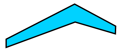
Polygon
<stage id="stage" hflex="1" vflex="1">
	<layer>
		<polygon id="polygon" fill="#00d2ff" stroke="black" strokeWidth="5"
			 points="73,192 73,160 340,23 500,109 499,139 342,93" draggable="true"/>
	</layer>
</stage>
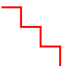
Polyline
<stage id="stage" hflex="1" vflex="1">
	<layer>
		<polyline points="0,40 40,40 40,80 80,80 80,120 120,120 120,160"
				style="fill:white;stroke:red;stroke-width:4" />
	</layer>
</stage>
Rect
<stage id="stage" hflex="1" vflex="1">
	<layer>
		<group draggable="true" x="100" y="50">
			<text y="-20"  textContent="Normal Rectangle" fill="#555"/>
			<rect width="100" height="50" fill="green" stroke="black" strokeWidth="4"/>
		</group>
		<group draggable="true" x="300" y="50">
			<text y="-20" textContent="Radial-Gradient Rectangle" fill="#555"/>
			<rect width="100" height="50" stroke="black" strokeWidth="4"
				fillStyle="radial-gradient" fillStartPoint="0" fillEndPoint="0"
				fillStartRadius="0" fillEndRadius="70" fillColorStops="0, red, 1, yellow"/>
		</group>
		<group draggable="true" x="500" y="50">
			<text y="-20" textContent="Linear-Gradient Rectangle" fill="#555"/>
			<rect width="100" height="50" stroke="black" strokeWidth="4"
				fillStyle="linear-gradient" fillStartPoint="-50,-50" fillEndPoint="50,50"
				fillColorStops="0, red, 1, yellow"/>
		</group>
	</layer>
</stage>
Text
<stage id="stage" hflex="1" vflex="1">
	<layer x="10" y="10">
		<text fontSize="25" textAnchor="middle" textContent="Radial-Gradient Rectangle"
			 fill="#555" shadowColor="red" shadowBlur="3"/>
	</layer>
</stage>
CSS3 Animation Component
The Animation component we provide is designed to make easy a developer's job by enabling the use of CSS3 transition/transform without writing JavaScript code. Below are some component specification guides.
CSS Selector
| Selector | Example | Example description |
|---|---|---|
| .class | .intro | Selects all shapes with class="intro" |
| #id | #firstname | Selects the shape with id="firstname" |
| shape | circle | Selects all <circle> shapes |
| shape, shape | line, circle | Selects all <line> shapes and all <circle> shapes |
| layer shape | layer circle | Selects all <circle> elements inside <layer> elements |
| :mouseover | rect:mouseover | Selects all mouseover rectangles |
| :mouseout | rect:mouseout | Selects all mouseout rectangles |
| :mouseenter | rect:mouseenter | Selects all mouseenter rectangles |
| :mouseleave | rect:mouseleave | Selects all mouseleave rectangles |
| :mousedown | rect:mousedown | Selects all mousedown rectangles |
| :mouseup | rect:mouseup | Selects all mouseup rectangles |
| :click | rect:click | Selects all click rectangles |
| :doubleclick | rect:doubleclick | Selects all doubleclick rectangles |
| :dragstart | rect:dragstart | Selects all dragstart rectangles |
| :dragmove | rect:dragmove | Selects all dragmove rectangles |
| :dragend | rect:dragend | Selects all dragend rectangles |
For example,
<zk>
	<stage id="stage" hflex="1" vflex="1">
		<layer>
			<circle id="circle" radius='70' draggable="true" x="200"
				y="150" fill='yellow' stroke='black' strokeWidth="4"/>
		</layer>
		<animation>
		#circle:mouseover {
			fill: red;
		}
		#circle:mouseout {
			fill: yellow;
		}
		</animation>
	</stage>
</zk>
As you can see, we apply the style of animation such that a mouseover event will change the fill color from yellow to red, and then reset it when received a mouseout event.
Note: This part is a little different from Browser's CSS specification where all of the applied CSS will not be reset when the applied event is gone, if you want to reset the changes please specify the relative event to reset it.
CSS Transition
The transition property is a shorthand property for the four transition properties: transition-property, transition-duration, transition-timing-function, and transition-delay.
Note: Always specify the transition-duration property, because if the duration is 0, the transition will have no effect.
Default value: all 0 ease 0
| Value | Description |
|---|---|
| transition-property | Specifies the name of the Shape property the transition effect is for |
| transition-duration | Specifies how many seconds or milliseconds the transition effect takes to complete. Like (1s or 200ms) |
| transition-timing-function | Specifies the speed curve of the transition effect |
| transition-delay | Defines when the transition effect will start. Like (1s or 200ms) |
CSS Transform (2D)
The transform property applies a 2D transformation to a shape. This property allows you to rotate, scale, move etc. elements.
| Value | Description |
|---|---|
| matrix(n,n,n,n,n,n) | Defines a 2D transformation, using a matrix of six values |
| translate(x,y) | Defines a 2D translation |
| translateX(x) | Defines a translation, using only the value for the X-axis |
| translateY(y) | Defines a translation, using only the value for the Y-axis |
| scale(x,y) | Defines a 2D scale transformation |
| scaleX(x) | Defines a scale transformation by giving a value for the X-axis |
| scaleY(y) | Defines a scale transformation by giving a value for the Y-axis |
| rotate(angle) | Defines a 2D rotation, the angle is specified in the parameter |
Note: The angle unit identifiers are:
- deg - Degrees. There are 360 degrees in a full circle.
- rad - Radians. There are 2π radians in a full circle.
CSS Animation
The animation property is a shorthand property for five of the animation properties: animation-name, animation-duration, animation-timing-function, animation-delay, and animation-iteration-count.
Default value: none 0 ease 0 1
Note: Always specify the animation-duration property, otherwise if the duration is 0, it will never be played.
| Value | Description |
|---|---|
| animation-name | Specifies the name of the keyframe you want to bind to the selector |
| animation-duration | Specifies how many seconds or milliseconds an animation takes to complete. Like 1s or 200ms |
| animation-timing-function | Specifies the speed curve of the animation |
| animation-delay | Specifies a delay before the animation will start. Like 1s or 200ms. |
| animation-iteration-count | Specifies how many times an animation should be played |
For example,
<stage id="stage" hflex="1" vflex="1">
	<layer>
		<circle id="circle" radius='70' draggable="true" x="200" y="150" fill='yellow' stroke='black' strokeWidth="4"/>
	</layer>
	<animation>
	circle {
		animation: test 5s ease-in-out 0s 3;
	}
	@keyframes test {
		0%   {fill:red; x:100; y:100;}
		25%  {fill:yellow; x:500; y:100;}
		50%  {fill:blue; x:500; y:400;
			transform: scale(2);}
		75%  {fill:green; x:100; y:400;}
		100% {fill:red; x:100; y:100;}
	}
	</animation>
</stage>
As you can see, we declare the test keyframes for the animation of the circle shape, it will run the changes during 5 seconds with ease-in-out timing function for 3 times.
Note: Unlike CSS3 Animation's specification, we don't support animation-direction and animation-play-state properties
CSS Keyframes
- With the @keyframes rule, you can create animations.
- The animation is created by gradually changing from one set of CSS styles to another.
- During the animation, you can change the set of CSS styles many times.
- Specify when the change will happen in percent, or use the keywords from and to, which is the same as 0% and 100%. 0% is the beginning of the animation, 100% is when the animation is complete.
Note: Use the animation properties to control the appearance of the animation, and also to bind the animation to selectors
| Value | Description |
|---|---|
| animation name | Required. Defines the name of the animation |
| keyframes-selector | Required. Percentage of the animation duration.
Legal values: 0-100% from (same as 0%) to (same as 100%) Note: You can have many keyframes-selectors in one animation. |
| css-styles | Specifies the speed curve of the animation |
| animation-delay | Required. One or more legal CSS style properties |
For example,
<stage id="stage" hflex="1" vflex="1">
	<layer>
		<circle id="circle" radius='70' draggable="true" x="200" y="150" fill='yellow' stroke='black' strokeWidth="4"/>
	</layer>
	<animation>
	circle {
		animation: test 5s ease-in-out 0s 3;
	}
	@keyframes test {
		0%   {fill:red; x:100; y:100;}
		25%  {fill:yellow; x:500; y:100;}
		50%  {fill:blue; x:500; y:400;
			transform: scale(2);}
		75%  {fill:green; x:100; y:400;}
		100% {fill:red; x:100; y:100;}
	}
	</animation>
</stage>
As you can see, we declare the test keyframes with 4 steps:
- Change the fill color from red to yellow and the x position from 100 to 500 during the time between 0% to 25%.
- Change the fill color from yellow to blue and the y position from 100 to 400 and scale the shape to 2 times bigger during the time between 25% to 50%.
- Change the fill color from blue to green and the x position from 500 to 100 during the time between 50% to 75%.
- Change the fill color from green to red and the y position from 400 to 100 and scale the shape to the original size between 75% to 100%.
CSS Variables: var-*
The var-* family of properties. This specification defines an open-ended set of properties called custom properties, which are used to define variables.
Note: The variable scope is the shape component itself. For example:
<stage id="stage" hflex="1" vflex="1">
	<layer>
		<circle id="circle" radius='70' draggable="true" x="200" y="150" fill='yellow' stroke='black' strokeWidth="4"/>
	</layer>
	<animation>
	circle:dragstart {
		var-scale-start:  attr(scale);
		transform: scale(1.3, 1.3);
		-zk-shadow-color: black;
		-zk-shadow-blur: 10;
		-zk-shadow-offset: 15 15;
		-zk-shadow-opacity: 0.6;
	}
	circle:dragend {
		transition-property: transform;
		transition-duration: 0.5s;
		-zk-shadow-offset: 0 0;
		-zk-shadow-blur: 0;
		transition-timing-function: ease-out;
		transform: scale(var(scale-start)), rotate(180);
	}
	</animation>
</stage>
As you can see, we declare the scale-start property to store the default value of the shape scale value at the dragstart event, and then apply it back to the dragend event via the function notation var().
CSS Function Notations
Here lists three function notations available for user to use with the Animation Component
var()
The var() notation is used to retrieve data stored in custom property.
attr()
The attr() notation is used to get the current attribute of the shape.
eval()
The eval() notation is used to evaluate the JavaScript code in the current context. With an event, you can have the following built-in variables to use.
- attrs the attributes of the current shape
stroke-width: eval("attrs.strokeWidth * 2")
- event the current ZK Event object
x: eval("event.pageX * 2")
- vars the current variables of the current shape
transform: scale(eval("vars['start-scale']"))
Touch device support
The ZK Graphics Component is also runnable on touch devices with touch events supported.
Bar Chart Demo
The bar chart demo is what we demonstrate how to utlize the ZK Graphics Component without writing Javascript code.
Demo Video
Demo Code
Custom Component
The Charts component is a custom component that contains a set of ZK Graphics components providing some basic operations for developers to use. It can also support the customization of Chart styling outside the component. (chartStyle)
For example (ZUL),
<charts id="barchart" width="500px" height="420px"
        type="bar" model="@bind(vm.model)"
        legend="@bind(vm.legend)"
        watermark="@bind(vm.watermark)"
	onChartClick="@command('onClick', event=event)" onChartTooltip="@command('onTooltip', event=event)">
	<attribute name="chartStyle">
		.category_0 {
			transition: opacity 0.5s ease 0s;
			opacity: 1;
		}
		.category_1 {
			transition: opacity 0.5s ease 250ms;
			opacity: 1;
		}
		.category_2 {
			transition: opacity 0.5s ease 0.5s;
			opacity: 1;
		}
		.category_3 {
			transition:	opacity 0.5s ease 0.75s;
			opacity: 1;
		}
		.series:mouseover{
			 stroke: #FFF5AD;
			 stroke-width: 0.6;
			 transform:	scaleX(1.3);
			 z-index: 99;
		}
		.series:mouseout {
			stroke:	transparent;
			stroke-width: 1;
			transform: scaleX(1);
			z-index: 1;
		}
		.legend text:mouseover {
			font-style: bold;
			font-size: 12;
		}
		.legend text:mouseout {
			font-style:	normal;
			font-size: 11;
		}
	</attribute>
</charts>
As you can see from the above, we declare the default opacity transition of the barchart at the loading phase to make some animation effects like fade in while all the shapes inside the barchart are customizable as well.
Here is the pseudo code of the Charts class, which is extended from a Div component and provides some manipulations of ZK Graphics components such as resizing, enable watermark, enable legend, and save as image functions.
public class Charts extends Div {
	//... omitted

	public void setLegend(boolean legend) {
		_legend = legend;
		if (_chart != null)
			_chart.getFellow("legend").setVisible(legend);
	}
	public void setWatermark(boolean watermark) {
		_watermark = watermark;
		if (_chart != null) {
			_chart.getFellow("watermark").setVisible(watermark);
		}
	}
	public void saveChartAsImage(String message,
			final EventListener<UploadEvent> listener) {
		if (_chart == null)
			throw new UiException("Chart Engine is not ready yet");

		_chart.saveAsImage(message, listener);
	}

	public void setChartStyle(String style) {
		if (style == null)
			style = "";
		if (!Objects.equals(_chartStyle, style)) {
			_chartStyle = style;
		}
	}

	public void setModel(ChartModel model) {
		if (_model != model) {
			if (_model != null) {
				_model.removeChartDataListener(_dataListener);
			}
			_model = model;
			initDataListener();
		}

		// Always redraw
		smartDrawChart();
	}
	private void initChart() {
		_chart = new CartesianChartEngine(this).build();
		_chart.applyStyle(getChartStyle());
		appendChild(_chart);

		_chart.getFellow("legend").setVisible(_legend);
		_chart.getFellow("watermark").setVisible(_watermark);
	}
	public void resize(String width, String height) {
		this.setWidth(width);
		this.setHeight(height);
		if (_chart != null) {
			_chart.redraw();
			_chart.getFellow("legend").setVisible(_legend);
			_chart.getFellow("watermark").setVisible(_watermark);
		}
	}
	public void invalidate() {
		super.invalidate();
		this.getChildren().clear();
		initChart();
	}
}
Chart Engine
Here we design a basic Chart Engine class including three APIs: build, redraw, and applyStyle methods.
abstract public class ChartEngineBase extends Stage {
	protected ChartEngineBase() {
	}
	public abstract ChartEngineBase build();
	public abstract ChartEngineBase redraw();
	public abstract ChartEngineBase applyStyle(String style);
}
The Cartesian chart engine implementation is as follows:
public class CartesianChartEngine extends ChartEngineBase {

	private void initSize() {
		//... omitted
	}

	public ChartEngineBase build() {
		redraw0(false);
		setTooltip();
		return this;
	}

	public ChartEngineBase redraw() {
		return redraw0(true);
	}

	private ChartEngineBase redraw0(boolean isRedraw) {
		this.getChildren().clear();
		initSize();
		drawBackgroud();
		drawWatermark();
		drawLegend();
		drawAxis();
		drawSeries(isRedraw);
		return this;
	}

	//... omitted

	private Animation checkAnimation() {
		Animation anima = this.getAnimation();
		if (anima == null) {
			anima = new Animation();
			this.appendChild(anima);
		}
		return anima;
	}

	@Override
	public ChartEngineBase applyStyle(String style) {
		checkAnimation().setContent(style);
		return this;
	}

}
We have omitted a lot of implementation details for you to understand the charting implementation more easily. In the redraw0 method, which is used for build() and refraw(), is to draw the look and feel of the whole bar chart component with the following steps.
- clear all of the child components
- initiatethe default or scaled size (if resized)
- draw the background of the barchart, including the grid layout.
- draw the watermark, if any. (we may optimize this by only creating on demand)
- draw the legend, if any. (we may optimize this by only creating on demand)
- draw the x and y axis.
- draw the series with animation if it is a redraw command.
Note: All implementation details can be found in the download area.
Control Window
The control area is a simple ZK component with MVVM example, if you are not familiar with the two topics, please take a look at ZK Documentation.
For example, (ZUL)
<window position="center" id="win" title="Bar Chart" border="normal" mode="overlapped" sizable="true"
	apply="org.zkoss.bind.BindComposer"
    viewModel="@id('vm') @init('demo.chart.bar.BarChartVM')"
		onSize="@command('resize', chart=barchart, width=event.getWidth(), height=event.getHeight())">
	<caption>
	<hlayout hflex="min" vflex="min" valign="bottom">
		<vlayout>
			<checkbox label="Show Legend" checked="true"
				onCheck="@command('legendChanged', legend=self.checked)" />
			<button label="Reset Chart" mold="trendy"
				onClick='@command("reset", chart=barchart)' />
			</vlayout>
			<vlayout>
				<checkbox label="Show Watermark"
					onCheck="@command('watermarkChanged', watermark=self.checked)" />
				<!-- omitted -->
			</vlayout>
		</hlayout>
	</caption>
	<!-- omitted -->
</window>
Below is a fragment of the BarchartVM class implementation.
For example, (View Model)
public class BarChartVM {

	CategoryModel model;
	boolean watermark = false;
	boolean legend = true;

	@Init
	public void init() {
		// prepare chart data
		model = ChartData.getModel();
	}

	public CategoryModel getModel() {
		return model;
	}

	public boolean isWatermark() {
		return watermark;
	}

	public boolean isLegend() {
		return legend;
	}

	@Command("watermarkChanged")
	@NotifyChange({ "watermark" })
	public void watermarkChanged(@BindingParam("watermark") Boolean watermark) {
		if (watermark != null)
			this.watermark = watermark;
	}

	@Command("legendChanged")
	@NotifyChange({ "legend" })
	public void legendChanged(@BindingParam("legend") Boolean legend) {
		if (legend != null)
			this.legend = legend;
	}

	@Command("reset")
	public void reset(@BindingParam("chart") Charts chart) {
		chart.invalidate();
	}

	@Command("resize")
	public void resize(@BindingParam("chart") Charts chart,
			@BindingParam("width") String width,
			@BindingParam("height") String height) {
		int w = Integer.parseInt(width.replace("px", ""));
		int h = Integer.parseInt(height.replace("px", ""));
		chart.resize(w - 20 + "px", h - 70 + "px");
	}

	// ... omitted
}
As you can see, we register some commands to notify component attributes which are changed, and make it display as what we would expect.
File I/O
The ZK Graphics component supports saving the canvas content to an image
For example, (ZUL)
<button id="btn" label="Save Chart" mold="trendy" onClick="@command('onSaveImage', chart=barchart, target=self)">
	<template name="viewImage">
		<window border="normal" mode="highlighted"
			title="View Image" id="highlight">
			<caption>
				<button label="Close" mold="trendy"
					onClick='highlight.detach()' />
				<button label="Download" mold="trendy"
					onClick='@command("onFiledownload", target=self)' />
			</caption>
		</window>
		</template>
</button>
For example, (View Model)
public class BarChartVM {
	// ... omitted

	@Command("onSaveImage")
	public void saveImage(@BindingParam("chart") Charts chart,
			@BindingParam("target") final Button btn) {
		chart.saveChartAsImage("Exporting", new EventListener<UploadEvent>() {
			public void onEvent(UploadEvent evt) throws Exception {
				Image image = new Image();
				org.zkoss.util.media.AMedia media = (AMedia) evt.getMedia();
				image.setContent(new org.zkoss.image.AImage(media.getName(),
						media.getByteData()));

				org.zkoss.zk.ui.util.Template tm = btn.getTemplate("viewImage");
				final Component[] items = tm.create((Component)btn.getSpaceOwner(), null, null, null);
				Window highlight = (Window)items[0];
				highlight.setAttribute("media", media);
				highlight.appendChild(image);
			}
		});
	}

	@Command("onFiledownload")
	public void fileDownload(@BindingParam("target") Button btn) {
		Window highlight = (Window) btn.getSpaceOwner();
		Filedownload.save((Media) highlight.getAttribute("media"), "barchart.png");
	}
}
We register an UploadEvent listener for saveChartAsImage method to display the image in a highlight window, and download it via a button with ZK's Filedownload API to save as file for user.
Summary
The Barchart demo in this article is designed as a simple implementation to demonstrate how to utilize ZK Graphics to draw your own charting library without the use of any Javascript code. However, in cases where you want to utilize this in a more advanced way with more complex functions, you may consider to provide some JavaScript functions for better user experience to make your product more professional and efficient on PC and touch devices.
Downloads
You can get complete source for the example described in this smalltalk from its github or directly download the war file here
Comments
| Copyright © Potix Corporation. This article is licensed under GNU Free Documentation License. |


