Navbar
From Documentation
- Demonstration:
- Java API: Preview/zk/org/zkoss/zkmax/zul/Navbar.html
- JavaScript API:
- Style Guide:
- Available for ZK:
-

Employment/Purpose
Provide a roadmap to help user navigate through website. It's a container that usually contains nav elements.
Example
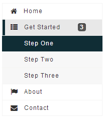
<navbar orient="vertical" width="200px">
	<navitem label="Home" iconSclass="z-icon-home" />
	<nav label="Get Started" iconSclass="z-icon-th-list" detailed="true">
		<navitem label="Step One" />
		<navitem label="Step Two" />
		<navitem label="Step Three" />
	</nav>
	<navitem label="About" iconSclass="z-icon-flag" />
	<navitem label="Contact" iconSclass="z-icon-envelope"/>
</navbar>
Properties
Orient
A navbar could be placed in a vertical or horizontal orientation, the orient attribute decides.

| |

|
Supported Events
| Event: SelectEvent
Notifies one that the user has selected a navitem in the navbar. |
- Inherited Supported Events: LabelImageElement
Supported Children
* Nav, Navitem
Use Cases
| Version | Description | Example Location |
|---|---|---|
Version History
| Version | Date | Content |
|---|---|---|
| 7.0.0 | August, 2013 | Navbar was introduced. |