Popup
Popup
- Demonstration: Tooltips and Popup
- Java API: Popup
- JavaScript API: Popup
- Style Guide: Popup
Employment/Purpose
A container can be displayed as a popup. The popup window does not have any special frame. Popups can be displayed when an element is clicked by assigning the id of the popup to either the XulElement.setPopup(java.lang.String), XulElement.setContext(java.lang.String) or XulElement.setTooltip(java.lang.String) attribute of the element.
Example
<separator bar="true" />
<label value="Tooptip for Another Popup" tooltip="any" />
<popup id="any" width="300px">
	<vbox>
		ZK simply rich.
		<toolbarbutton label="ZK your killer Web application now!"
			href="http://www.zkoss.org" />
	</vbox>
</popup>
<textbox popup="popup, position=after_start"/>
<popup id="popup" width="300px">
	<vbox>
		ZK simply rich.
		<toolbarbutton label="ZK your killer Web application now!"
			href="http://www.zkoss.org" />
	</vbox>
</popup>
Position
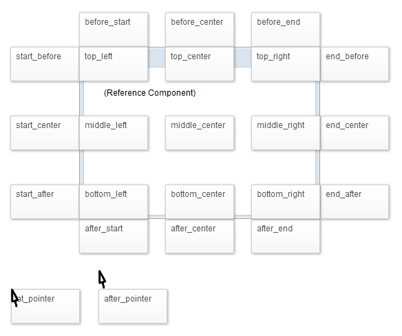
The method Popup.open(Component, String) is used to specify the position of a popup component. The function's second argument takes a relative position
Since 6.0.1, we provided the following options for Popup position:

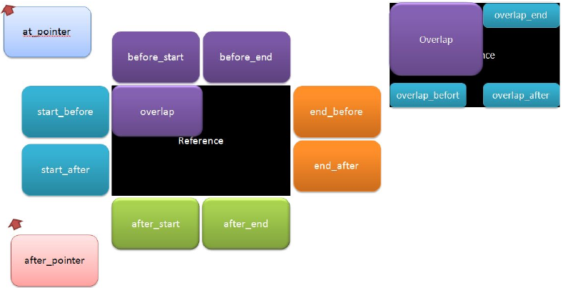
overlap, overlap_end, overlap_before, overlap_after are kept (still available) for backward compatibility. They are identical with top_left, top_right, bottom_left, and bottom_right, respectively.
Before 6.0.0
The 14 possible positions are provided below:
The following illustrates the simplicity of usage,
<popup id="pp">
	Here is popup
</popup>
<button label="before_start" onClick='pp.open(self, "before_start");' />
Upon clicking the button the popup component will appear in the relative position specified. In this case the position is just above the button.
Or specify these positions using the following code.
<button id="btn" label="overlap" width="300px" height="300px" popup="component_id, position=overlap_end"/>
In addition to this more options are available such as positioning by x and y co-ordinates as demonstrated below.
<button id="btn" label="overlap" width="300px" height="300px" popup="component_id, x=50,y=50"/>
Toggle Popup
Since 7.0.0
If a popup/context menu is assigned to a target component via the popup/context attribute, the popup up will show up when the user clicks on the target component. Click the target component again, the popup will still show up by default. As of 7.0.0, The popup/context attribute supports additional toggle type, which could make target component act as a toggle switcher. If the popup has not shown up yet, click the target component will cause the popup to show up. If the popup is showing up, click on the target component again will toggle the popup to hide. The usage is in below code.
<button label="Popup" popup="id, type=toggle"/>
Tooltip Delay
The tooltip attribute can also support a delay, the following code outlines how to accomplish this.
<label label="Tooltip" tootlip="id, position=before_start, delay=500"/>
Supported Events
| Event: OpenEvent
Denotes a Popup has been opened or closed (in this case OpenEvent::isOpen() returns false). |
- Inherited Supported Events: XulElement
Supported Children
*ALL
Use Cases
| Version | Description | Example Location |
|---|---|---|
| 3.6 | Smalltalk: Toolbar and Menus | ZK Developer's Reference: Tooltips, Context Menus and Popups |
| 3.6 | A way to specify the position of the Popup component | New Features of ZK 3.6.1 |
| 3.6 | Popup, tooltip and context positions | New Features of ZK 3.6.3 |
Version History
| Version | Date | Content |
|---|---|---|
| 7.0.0 | Nov 2013 | Popup support toggle type |


