Datebox
Datebox
- Demonstration: Date and Time
- Java API: Datebox
- JavaScript API: Datebox
- Style Guide: Datebox
Employment/Purpose
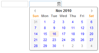
An edit box for holding a date. After click on the calender, a calender will pop-up for inputting date.
Mouseless Entry datebox
- Alt+DOWN to pop up the calendar.
- LEFT, RIGHT, UP and DOWN to change the selected day from the calendar.
- ENTER to activate the selection by copying the selected day to the datebox control.
- Alt+UP or ESC to give up the selection and close the calendar.
Customization
Since 5.0.3 You can customize the rendering of the calendar at the client by JavaScript code that overrides Renderer.
Example
 <datebox lenient="true" buttonVisible="false" />
 <datebox lenient="false" buttonVisible="true" />
Properties and Features
Constraint
You can specify the date range to accept by the constraint property with one or multiple following values:
- no empty
- no future
- no past
- no today.
It also supports an interval of dates. For example,
<datebox constraint="between 20071225 and 20071203"/>
<datebox constraint="before 20071225"/>
<datebox constraint="after 20071225"/>
Notices
- The format of the date in the constraint must be yyyMMdd. It is independent of the locale.
- The date specified in the above constraints (before/after/between) is included. For example, "before 20071225" includes December 25, 2007 and any day before it, and "after 20110305" includes March 5, 2011 and any day after it.
- The constraint is actually represented with an instance of the org.zkoss.zul.SimpleDateConstraint class. You can retrieve the parsed beginning and ending date with the getBeginDate and getEndDate methods.
((SimpleDateConstraint)datebox.getConstraint()).getBeginDate();
Multiple Constraints
To specify two or more constraints, use a comma to separate them as follows:
<datebox constraint="no past,no empty"/>
Custom Error Message
If you prefer to display a different message from the default one, you can append the error message to the constraint with a colon.
<datebox constraint="no empty, no future: now or never"/>
Notes:
- The error message, if specified, must be the last element and start with a colon.
- To support multiple languages, you could use the 「l」 function as depicted in the Internationalization chapter.
<datebox constraint="no empty, no future: ${c:l('err.date.nowornever')}"/>
Displayed Time Zones
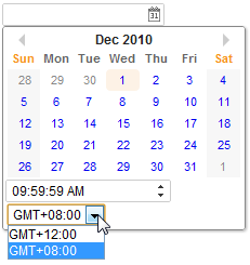
The image below shows the new Datebox functionality which allows the user to change the time zone to other predefined time zones. Viewing the zul markup provided below the image we can see that the displayedTimeZones is set to "GMT+12,GMT+8". These options are specified by the developer and restrict the user to the available time zones.
<datebox id="datebox1" format="M/d/yy KK:mm:ss a" width="150px" displayedTimeZones="GMT+12,GMT+8" timeZone="GMT+8" timeZonesReadonly="false"/>
Format
You are able to format the field by providing specifying the attribute with a formatting string. The default value is null. When the formatting of the datebox is null, it means the date will be outputted using the format yyyy/MM/dd.
<datebox format="MM/dd/yyyy"/>
Like any other properties, you are able to change the format dynamically, as depicted below.
<datebox id="db"/>
<button label="set MM-dd-yyyy" onClick='db.setFormat("MM-dd-yyyy")'/>
Length Option
In addition to specifying the format explicitly, you could specify the length option[1]. It supports four different length options mentioned at java.text.DateFormat:
- short
- medium
- long
- full
For example, you could specify the styling rather than the real format as follows.
<datebox format="short"/>
<datebox format="long"/>
Then the real format of the datebox will be decided at run time depending on the configuration. For more information, please refer to ZK Developer's Reference: Date and Time Formatting.
In addition, you could specify the format with both date and time by using the syntax: option_for_date+option_for_time. For example,
<datebox format="medium+full"/>
- ↑ The length option is available since *5.0.7*
Validation
If a user's input doesn't match the specified format, a Datebox will show an error message. It's a client-side validation.
Locale
By default, the real format depends on the current locale (i.e., Locales.getCurrent()). However, you could specify the locale for an individual instance such as:
<datebox format="medium+full" locale="de_DE"/>
<datebox format="long" locale="fr"/>
Position
[Since 8.0.3]
By default, the popup position is set to after_start, for other possible popup positions please refer to [[1]].
The First Day of the Week
The first day of the week is decided by the locale (actually the return value of the getFirstDayOfWeek method in the java.util.Calendar).
Since 5.0.3, you can control the first day of the week by the use of the session attribute and the library property. Please refer to The First Day of the Week for details.
2DigitYearStart
Since 8.6.2, you can control the 2DigitYearStart by the use of the library property. Please refer to [[2]] for details.
Show Week Number
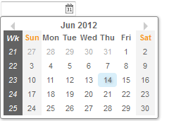
Datebox supports to show a week number of the year in a calendar.
- Available for ZK:
-

[Since 6.5.0]
<datebox weekOfYear="true" />
Show Link of Today
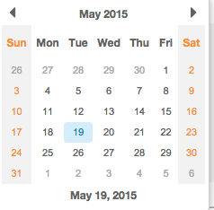
Datebox supports a link to jump back to the date of today quickly
[Since 8.0.0]
<datebox id="db" showTodayLink="true" ></datebox>
The format is the same with that specified on format attribute
Show Timebox
By default, there is no Timebox in the popup Calendar. If the specified format attribute contains a time format (like below), it will show a Timebox at the bottom of the popup Calendar.
<datebox format="yyyy-MM-dd HH:mm"/>
Monthly / yearly option
Since 9.5.1
You can specify the selectLevel attribute to restrict the date granularity users can select. Available options are year, month and day. Default setting is day.
<datebox format="yyyy" selectLevel="year"/>
Inherited Functions
Please refer to FormatInputElement for inherited functions.
Supported Events
| Event: Event
Denotes the time zone of the component is changed by user. |
- Inherited Supported Events: FormatInputElement
Supported Molds
Available molds of a component are defined in lang.xml embedded in zul.jar.
[Since 5.0.0] |
Supported Children
| None | None |
Use Cases
| Version | Description | Example Location |
|---|---|---|
Version History
| Version | Date | Content |
|---|---|---|
| 5.0.3 | July, 2010 | An application can control the first day of the week by use of the session attribute and the library property. Please refer to The First Day of the Week for details. |
| 5.0.4 | August, 2010 | Calendar supports moving to next/prev mon by mouse scrolling. |
| 5.0.7 | April, 2011 | Datebox.setFormat(String) supported the styling. |
| 5.0.7 | April, 2011 | Datebox.setLocale(Locale) was introduced. |
| 6.5.0 | June, 2012 | ZK-1175: Calendar support show week number |
| 9.5.1 | October 2020 | ZK-3289: Monthly / yearly options for datebox. |


