Chosenbox
Chosenbox
- Demonstration
- Java API: Chosenbox
- JavaScript API: Chosenbox
- Style Guide: Chosenbox
- Available for ZK:
-

Employment/Purpose
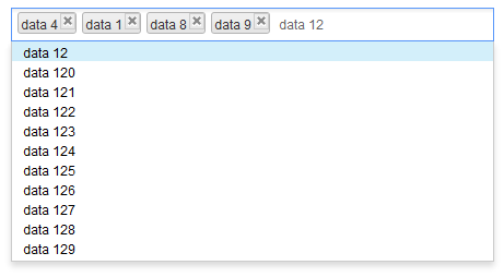
A component similar to Combobox but handles the multi-selection and the select order.
Example
Typical Usage
- creatable attribute denotes whether or not to display createMessage when a user inputs a value that is non-existing in the model, and sends it back to the server along with an onSearch event when user clicks the ENTER key or separator.
- emptyMessage will be displayed as a placeholder if nothing is selected or focused.
- noResultText will be displayed if nothing matches the input value and it cannot be created either; syntax "{0}" will be replaced with the input value at client side.
- createMessage will be displayed in popup if nothing matches the input value but can be created as new label; syntax "{0}" will be replaced with the input value at the client-side.
When no item is selected or focused, emptyMessage is visible.
When there is no data to be shown in the model and data 0 already selected, noResultText appears.
When there is no item in the model but it is creatable, createMessage appears.
    <zscript>
        ListModelList model = new ListModelList(Locale.getAvailableLocales());
    </zscript>
    <chosenbox width="400px"
               model="${model}" creatable="true"
               emptyMessage=" Please select some items."
               noResultsText=" No such item - {0} - and it is already in the model."
               createMessage=" No such item -{0} - but it is not in model either, you can try to create it.">
        <attribute name="onSearch">
            Object obj = event.getValue();
            ((ListModelList)model).add(obj);
            self.addItemToSelection(obj);
        </attribute>
    </chosenbox>
Rendering All
Here, all the content will be sent to and processed at the client side. The rendering process is pretty fast with a few items but may cause performance issue when the model exceeds 40,000 items and rendering them all at once.
    <zscript>
        ListModelList model = new ListModelList(Locale.getAvailableLocales());
    </zscript>
    <chosenbox width="400px" model="${model}"/>
Lazy Rendering
With this usage, Chosenbox doesn't render any DOM elements in the drop-down list. When a user enters a character, it get a 'matched' content from the server-side and renders them in the drop-down list. This will cause some delay at the client side because of server processing time and network latency.
See also: Combobox#Autocomplete_by_ListSubModel
    <zscript><![CDATA[
        ListModelList model = new ListModelList(Locale.getAvailableLocales());
        ListSubModel subModel = ListModels.toListSubModel(model);
    ]]></zscript>
    <chosenbox width="400px" model="${subModel}"/>
Mouseless Entry Chosenbox
- Press UP and DOWN to move the focus up and down by one option.
- Press LEFT and RIGHT to move focus between selected item(s) and the input field.
- Press ESC to clear input and close drop-down list.
- Press DELETE to delete the focused item and move focus to next item if any or input field.
- Press BACKSPACE to delete the focused item and move focus to previous item if any or input field.
- Press ENTER or specified separator to select the focused option.
Properties
- creatable: specify whether to send an event to server when user inputs an non-existing value by clicking ENTER or separator. Default: false
- createMessage: displayed in popup if nothing matches the input value and creatable is true; syntax "{0}" will be replaced with the input value at client side
- disabled: specify whether or not it is disabled. Default: false
- emptyMessage: displayed as place holder in input if nothing is selected or focused
- model: specify the ListModel of this chosenbox
- If you set ListModelList to the model of chosenbox, all the content will be sent to and processed at the client-side, The rendering process is pretty fast with a few items but may cause performance issue when the model exceeds 40,000 items and rendering them all at once
- If you set ListSubModel to the chosenbox model, the content of the drop-down list will not be rendered to the client-side,and will remain blank until user enters an input. The server will then provide a 'matched' content for the input. This will cause some delay at the client side because of server processing time and network transfer time
- name: specify the name of the input element of this component
- noResultsText: displayed in popup window if nothing matches the input value and creatable is false; syntax "{0}" will be replaced with the input value at client-side
- open: specify whether or not to open the drop-down list. Default: false
- tabindex: specify the tab order of the input node of this component. Default: 0
- separator: the separate characters will work as 'Enter' key when clicked on; it will not be considered as an input value. Upon releasing the key, it will an send onSearch or onSelect event depending on the situation. Supports: 0-9, A-Z (case insensitive), and ,.;'[]/\-=
Supported Events
| Event: SelectEvent
Represents an event caused by user's the selection changed at the client. | |
| Event: OpenEvent
Represents an event that indicates an open state that is changed at the client. | |
| Event: InputEvent
Represents an event that indicates users inputting an non-existing value by clicking ENTER or separator. | |
| Event: InputEvent
Represents an event sent back to the server caused by user's input text. | |
| Event: Event
Represents an event sent back to the server caused by clicking a selected tag. |
- Inherited Supported Events: HtmlBasedComponent
Supported Molds
- The default mold
Supported Children
None
Use Cases
| Version | Description | Example Location |
|---|---|---|
| 6.0.1+ | Creatable Chosenbox | Chosenbox – A beautiful and powerful multiple combobox |
Version History
| Version | Date | Content | |
|---|---|---|---|
| 6.0.1 | April 3, 2012 | Add the new Chosenbox component | |
| 8.0.2 | May 24, 2016 | Add the new Event - onItemClick |


