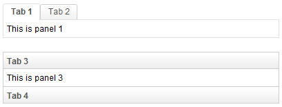
Tab
Tab
Employment/Purpose
A specific tab. Clicking on the tab brings the tab panel to the front. You could put a label and an image on it by label and image properties.
By setting the closable property to true, a close button is shown for the tab, such that user could close the tab and the corresponding tab panel by clicking the button. Once user clicks on the close button, an onClose event is sent to the tab. It is processed by the onClose method of Tab. Then, onClose, by default, detaches the tab itself and the corresponding tab panel.
Example
<tabbox width="400px">
	<tabs>
		<tab label="Tab 1" image="/img/folder.gif" />
		<tab label="Tab 2" image="/img/folder.gif" closable="true" />
	</tabs>
	<tabpanels>
		<tabpanel>This is panel 1</tabpanel>
		<tabpanel>This is panel 2</tabpanel>
	</tabpanels>
</tabbox>
Supported events
| MouseEvent
Description: Denotes user has clicked the component. | |
| MouseEvent
Description: Denotes user has right-clicked the component. | |
| MouseEvent
Description: Denotes user has double-clicked the component. | |
| SelectEvent
Description: Denotes user has selected a tab. onSelect is sent to both tab and tabbox. | |
| Event
Description: Denotes the close button is pressed by a user, and the component shall detach itself. |
Supported Children
*NONE
Use cases
Version History
| Version | Date | Content |
|---|---|---|
| 5.0.1 | 4/21/2010 | Initialization |
