ZK 5: More Flexible Layout
Henri Chen, Principal Engineer, Potix Corporation
September 22, 2009
ZK 5.0.0 and above
Introduction
In ZK 5, we introduce two new properties, vflex and hflex, to all components so you have the maximum flexibility to layout your components. By utilizing these two new features, you can hint the ZK engine how to distribute a parent component's remaining empty space among its child components vertically(vflex) and horizontally(hflex). Thus you can easily do layouts that might not be possible before.
A Simple Example
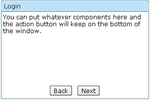
In this example, you can easily keep the operation buttons at the bottom of your window. Simply provide a flexible <separator vflex="1"> and it will push the buttons down for you.
<window title="Login" height="200px" width="300px" border="normal">
	You can put whatever components here and the action button will
	keep on the bottom of the window.
	<separator vflex="1"/>
	<hbox width="100%" pack="center" spacing="10px">
		<button label="Back"/>
		<button label="Next"/>
	</hbox>
</window>
This is a common practice to push things to side. You can also use this technique to separate two groups of components, etc.
Proportional Flexibility
The absolute value of the vflex/hflex is not that important. It is used to determine the proportion among flexible components. That is, you can give different integer to different child components so they will take space proportionally per the given vflex/hflex value. e.g.
<grid width="300px">
	<columns>
		<column label="Name" hflex="1"/>
		<column label="Value" hflex="2"/>
	</columns>
	<rows>
		<row>username:<textbox/></row>
		<row>password:<textbox/></row>
	</rows>
</grid>
As you can see, the width of the column1 is half size of the column2. Note that specifying zero or negative value in vflex/hflex is deemed as not specifying the property at all.
You might see the space on the right side of the textbox. Someone might not like that space. So you can add hflex="1" to textbox and make it expand.
<grid width="300px">
	<columns>
		<column label="Name" hflex="1"/>
		<column label="Value" hflex="2"/>
	</columns>
	<rows>
		<row>username:<textbox hflex="1"/></row>
		<row>password:<textbox hflex="1"/></row>
	</rows>
</grid>
Minimum Flexibility
Sometimes, you might wish that the parent component's size is determined by its children. Or I shall say, the size of the parent component is just high/wide enough to hold all of its child components. We also support that. Just specify vflex/hflex="min".
<borderlayout height="100%">
	<north title="North" collapsible="true" vflex="min">
		<borderlayout  vflex="min">
			<west title="West" size="25%" flex="true" maxsize="250" splittable="true" collapsible="true" vflex="min">
				<div style="background:#B8D335">
					<label value="25%"
						style="color:white;font-size:50px" />
				</div>
			</west>
			<center border="none" flex="true" vflex="min">
				<div style="background:#E6D92C">
					<label value="25%"
						style="color:white;font-size:50px" />
				</div>
			</center>
			<east size="50%" border="none" flex="true" vflex="min">
				<label value="Here is a non-border"
					style="color:gray;font-size:30px" />
			</east>
		</borderlayout>
	</north>
	<center border="0">
		<box pack="center" align="center" width="100%" height="100%">
			<label value="This is the working area"
				style="font-size:30px" />
		</box>
	</center>
</borderlayout>
As you can see, the height of the north region of the outer borderlayout is determined by its child borderlayout. And the height of the inner borderlayout, in this example, is determined by the height of its west child region.
Resizing Flexibility
vflex/hflex of course support resizing. If the parent component changes its size which increase or decrease the extra space, the child components with vflex/hflex will recalculate themselves to accommodate the new size.
<zk>
	<zscript><![CDATA[
		int[] str = new int[100];
		for(int i=0;i<100;i++){
			str[i]=i;
		}
	]]></zscript>

	<div height="100%" width="300px">
		Top of the Tree
		<tree vflex="1">
			<treechildren>
				<treeitem forEach="${str}" label="item${each}"/>
			</treechildren>
		</tree>
		<tree vflex="2">
			<treechildren>
				<treeitem forEach="${str}" label="item${each}"/>
			</treechildren>
		</tree>
		Bottom of the Tree
	</div>
</zk>
Note that the height proportion between the two trees are always 1 : 2 when we change the browser height.
Summary
In this article, we demonstrated the power of the vflex/hflex new feature. Now you can use them to do layouts that might not be possible before. ZK 5 will continue on providing "good things" to improve both the developer and the user experience. As always, we love to hear your feed backs because that is why the ZK can keep on improving.
Download ZK 5
You can download ZK 5 here!
| Copyright © Potix Corporation. This article is licensed under GNU Free Documentation License. |


