Grid
Grid
Employment/Purpose
Components: grid, columns, column, rows and row.
A grid contains components that are aligned in rows like tables. Inside a grid, you declare two things, the columns, that define the header and column attributes, and the rows, that provide the content. To declare a set of rows, use the rows component, which should be a child element of grid. Inside that you should add row components, which are used for each row. Inside the row element, you should place the content that you want inside that row. Each child is a column of the specific row. Similarly, the columns are declared with the columns component, which should be placed as a child element of the grid. Unlike row is used to hold the content of each row, column declares the common attributes of each column, such as the width and alignment, and and optional headers, i.e., label and/or image.
Autopaging
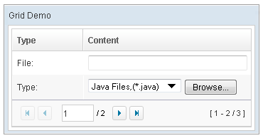
When using the paging mold and vflex, you could also turn on autopaging (Grid.setAutopaging(boolean)) such that the page size will be adjusted automatically based on the available space.
Example
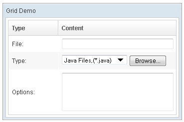
<window title="Grid Demo" border="normal" width="360px">
<zscript>
class Comp implements Comparator {
private boolean _asc;
public Comp(boolean asc) {
_asc = asc;
}
public int compare(Object o1, Object o2) {
String s1 = o1.getChildren().get(0).getValue(),
s2 = o2.getChildren().get(0).getValue();
int v = s1.compareTo(s2);
return _asc ? v: -v;
}
}
Comp asc = new Comp(true), dsc = new Comp(false);
</zscript>
<grid>
<columns sizable="true">
<column label="Type" sortAscending="${asc}" sortDescending="${dsc}"/>
<column label="Content"/>
</columns>
<rows>
<row>
<label value="File:"/>
<textbox width="99%"/>
</row>
<row>
<label value="Type:"/>
<hbox>
<listbox rows="1" mold="select">
<listitem label="Java Files,(*.java)"/>
<listitem label="All Files,(*.*)"/>
</listbox>
<button label="Browse..."/>
</hbox>
</row>
<row>
<label value="Options:"/>
<textbox rows="3" width="99%"/>
</row>
</rows>
</grid>
</window>
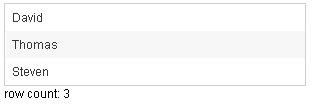
<zk>
	<zscript><![CDATA[
		ListModelList lm = new ListModelList(Arrays.asList(new String[] { "David",
				"Thomas", "Steven" }));
	]]></zscript>

	<grid model="${lm}" width="300px"
		onAfterRender='gridCount.setValue("row count: "+self.getRows().getChildren().size()+"");' />
	<label id="gridCount" />
</zk>
SizedByContent
By default, the widths of columns have to be specified explicitly, or it will be split equally among columns regardless what content they might have. If you want to have the minimal width (that fit the content), you could specify hflex="min" at the column (not the grid).
However, the grid has a special mode called sized-by-content (Grid.setSizedByContent(boolean)). By specifying it to true, the column width will be adjusted automatically. However, it is controlled by the browser, so have have no 100% control of it. For example, if an user resized a column, the final width might not be exactly the same as what he resized.
In general, we suggest to specify hflex in column, rather than specifying sizedByContent at grid for much more predictable result.
Span
By default, when sizedByContent is true, column only take required space.

If wanna to span the width of the columns to occupy the whole grid, you could specify true to this attribute

	<grid sizedByContent="true" width="800px">
		<columns>
			<column label="Time Message" />
			<column label="Level" />
			<column label="Source " />
			<column label="Message" />
		</columns>
		<rows>
			<row>
				<label value="6/28/10 4:19:18 PM" />
				<label value="Info, long content.........................." />
				<label value="Server" />
				<label value="Merging recovery point 52 created 20 6/27/10 10 :11 PM" />
			</row>
		</rows>
	</grid>
Supported Events
| Event: Event
Notifies one that the model's data has been rendered. | |
| Event: RenderEvent
Denotes user has scrolled to the unloaded area. | |
| Event: Event
Denotes user has resized the column of this grid then the inner width of this grid has been changed. | |
| Event: DataLoadingEvent
Notifies one that the unload data has been rendered. | |
| Event: Event
Notifies the paging size has been changed when the autopaging enable and user changed the size of the content. |
Supported Molds
Available molds of a component are defined in lang.xml embedded in zul.jar.

| |

|
Supported Children
* Columns, Rows
Use Cases
| Version | Description | Example Location |
|---|---|---|
Version History
| Version | Date | Content |
|---|---|---|
| 5.0.2 | May 2010 | Support the autopaging |
| 5.0.4 | July 2010 | Support onAfterRender event |
| 5.0.5 | October 2010 | The span property was introduced to span the columns to occupy the whole grid. |
