The Box Model
![]() This documentation is for an older version of ZK. For the latest one, please click here.
This documentation is for an older version of ZK. For the latest one, please click here.
Components: vbox, hbox and box.
The XUL box model is used to divide a portion of the display into a series of boxes. Components inside a box will orient themselves horizontally or vertically. By combining a series of boxes and separators, you can control the layout of the visual presentation.
A box can lay out its children in one of two orientations, either horizontally or vertically. A horizontal box lines up its components horizontally and a vertical box orients its components vertically. You can think of a box as one row or one column from an HTML table.
Some examples are shown as follows.
<zk>
    <vbox>
        <button label="Button 1"/>
        <button label="Button 2"/>
    </vbox>
    <hbox>
        <button label="Button 3"/>
        <button label="Button 4"/>
    </hbox>
</zk>
The hbox component is used to create a horizontally oriented box. Each component placed in the hbox will be placed horizontally in a row. The vbox component is used to create a vertically oriented box. Added components will be placed underneath each other in a column.
There is also a generic box component which defaults to horizontal orientation, meaning that it is equivalent to the hbox. However, you can use the orient attribute to control the orientation of the box. You can set this property to the value horizontal to create a horizontal box and vertical to create a vertical box.
Thus, the two lines below are equivalent:
<vbox>
<box orient="vertical">
You can add as many components as you want inside a box, including other boxes. In the case of a horizontal box, each additional component will be placed to the right of the previous one. The components will not wrap at all so the more components you add, the wider the window will be. Similarly, each element added to a vertical box will be placed underneath the previous one.
The spacing Property
You can control the spacing among children of the box control. For example, the following example puts 5em at both the upper margin and the lower margin. Notice: the total space between two input fields is 10em.
<vbox spacing="5em">
    <textbox/>
    <datebox/>
</vbox>
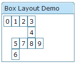
Another example illustrated an interesting layout by use of zero spacing.
<window title="Box Layout Demo" border="normal">
	<hbox spacing="0">
		<window border="normal">0</window>
		<vbox spacing="0">
			<hbox spacing="0">
				<window border="normal">1</window>
				<window border="normal">2</window>
				<vbox spacing="0">
					<window border="normal">3</window>
					<window border="normal">4</window>
				</vbox>
			</hbox>
			<hbox spacing="0">
				<vbox spacing="0">
					<window border="normal">5</window>
					<window border="normal">6</window>
				</vbox>
				<window border="normal">7</window>
				<window border="normal">8</window>
				<window border="normal">9</window>
			</hbox>
		</vbox>
	</hbox>
</window>
The widths and heights Properties
You can specify the width for each cell of the hbox using the widths attribute as follows.
<zk>
	<hbox width="100%" widths="10%,20%,30%,40%">
	    <label value="10%"/>
	    <label value="20%"/>
	    <label value="30%"/>
	    <label value="40%"/>
	</hbox>
</zk>
The value is a comma separated list of widths. If any value is missed, no width is generated for the corresponding cell and the real width is up to the browser.
Similarly, you can specify the heights for each cell of the vbox using the heights attribute. These two properties are the same since the orientation of a box can be horizontal or vertical depending on the orient property.
Splitters
Components: splitter.
There may be times when you want to make two sections of a window resizable. This feature is accomplished by using a component called a splitter. It creates a bar between two sections which allows either side to be resized.
A splitter must be put inside a box. When a splitter is placed inside a horizontal box (hbox), it allows horizontal resizing. When a splitter is placed inside a vertical box (vbox), it allows vertical resizing. For example,
<zk>
	<hbox spacing="0" style="border: 1px solid grey" width="100%">
		<vbox height="200px">
			Column 1-1: The left-top box. To know whether a splitter is collapsed,
			you can listen to the onOpen event.
			<splitter collapse="after" />
			Column 1-2: You can enforce to open or collapse programming by calling
			setOpen method.
		</vbox>
		<splitter collapse="before" />
		Column 2: Whether a splitter allows users to open or collapse depending
		on the collapse attribue.
	</hbox>
</zk>
Note: If you would like to use the original 「os」 style, you can specify the class name of splitter with 「splitter-os」. Example Of splitter-os | Example Of splitter-os
The collapse Property
The collapse property specifies which side of the splitter is collapsed when its grippy (button) is clicked. If this property is not specified, the splitter will not cause a collapse (and the grippy/button won't appear).
Allowed values and their meaning are as follows.
| none | No collapsing occurs. |
| before | When the grippy is clicked, the element immediately before the splitter in the same parent is collapsed so that its width or height is 0. |
| after | When the grippy is clicked, the element immediately after the splitter in the same parent is collapsed so that its width or height is 0. |
The open Property
To know whether a splitter is collapsed, you can check the value of the open property (i.e., the isOpen method). To open or collapse programmatically, you are able to set the value of the open property (i.e., the setOpen method).
The onOpen Event
When a splitter is collapsed or opened by a user, the onOpen event is sent to the application.

