Implementing the View
![]() This article is out of date, please refer to http://books.zkoss.org/zkessentials-book/master/ for more up to date information.
This article is out of date, please refer to http://books.zkoss.org/zkessentials-book/master/ for more up to date information.
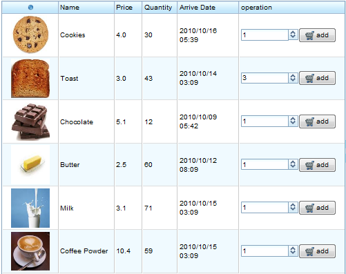
Suppose the figure below is the requirement for the "Product View" in our shopping cart application:

Here we have six columns, each with a header to denote the data field, and six rows with each row containing a single product entry. The product information is listed from column one to five while the last column contains ZK components which allow end users to choose and submit a product's quantity for purchase. To accommodate these requirements, we'll use the ZK Grid component.
Introduction to the ZK Grid
A ZK Grid contains two main constituents, Columns and Rows. The Columns tag is used to divide the Grid with the Column components and display the column headers; while the Rows tag contains the Row components which hold other UI components needed for read (Data Presentations) or write (Form Inputs) purposes.
In the simple example below, we put two Column components in the Columns tag to give our Grid two columns and set their labels to give the Grid column headers. We place two Row components in Rows and assign two Label components in each to show textual data.
<grid width="400px"  >
	<columns>
		<column label="Column Header 1" />
		<column label="Column Header 2" />
	</columns>
	<rows >
		<row >
		     <label value="Row 1 - Item 1"/>
		     <label value="Row 1 - Item 2"/>
		</row>
		<row >
		     <label value="Row 2 - Item 1"/>
		     <label value="Row 2 - Item 2"/>
		</row>
	</rows>
</grid>
A Row component accepts all ZK components as its children components, hence, a Grid component can be treated as a component container for the following:
For our implementation of the "Product View", we could use a Grid to divide product entries into rows, with the first column holding the product's image, second to fifth columns containing the product's properties, and the last column enclosing a Cell component which allows end users to select and submit the quantity of the purchased item.
Grid Configuration
All ZK components can be customized using CSS. In this short snippet, we were able to configure the size of the Grid and its constituents, set alignment, and change text color using minimum attribute declarations.
<grid width="400px" >
	<columns>
		<column label="Column Header 1" width="60%"/>
		<column label="Column Header 2" width="40%"/>
	</columns>
	<rows >
		<row >
		     <label value="Row 1 - Item 1" />
		     <label value="Row 1 - Item 2"/>
		</row>
		<row align="center">
		     <label value="Row 2 - Item 1" style="color:blue"/>
		     <label value="Row 2 - Item 2"/>
		</row>
	</rows>
</grid>

For this particular example, we assigned a percentage value to each Column so their size is shown proportional to the Grid component. Items in a Row are automatically aligned at the center when it's declared in the Row component attribute. The style attribute allows us to specify the CSS for any particular ZK component, for instance, the color of the text is set as blue for the Row 2 -Item 1 label.
The Product View Implementation
For our shopping cart example, the implementation of the "Product View" is placed in the Center section of the Borderlayout. The Grid is encased by a Div component which is applied with a controller class that extends the GenericForwardComposer class. We'll go into the details of this controller class in the next section of this book. We give the Grid component an ID so that we could retrieve the Grid in our controller class and associate the data fields to its inner components. At line 3, we marked the Columns 'sizable="true"' so the end user could adjust the column width by dragging its borders. From line 4 through 9 we decorate the column headers with image(Image) or text(Label) and set the default width for each column. With just several lines of mark up, we've already finished with our UI declaration that will serve as the containers for data to be populated.
<center border="0">
    <div id="PrdoDiv" style="background:#E6D92C; height:100%" apply="demo.web.ui.ctrl.ProductViewCtrl">
	<grid id="prodGrid">
	     <columns sizable="true">
		<column image="/image/Bullet-10x10.png" align="center"  width="100px"/>
		<column label="Name" width="100px"/>
		<column label="Price" width="50px"/>
		<column label="Quantity" width="50px"/>
		<column label="Arrive Date" width="110px" />
		<column label="operation" />
	     </columns>
	</grid>
    </div>
</center>
