New Features of ZK 6 RC2
Timothy Clare, Potix Corporation
December 6, 2011
ZK 6 RC2
ZK 6 brings with it a whole host of changes, using our git repo statistics we have calculated that approximately 100,000 lines have been changed between branches 5 and 6. Below introduces some of the major changes you will find in ZK 6, including the new databinding, generic support and our new templating system.
ZK Bind
ZK Databinding2
ZK Bind is a whole new data binding system with new specifications and implementations. Based on the experiences learned from our version one data binder and feedbacks from users' and contributors' suggestions, we have created this easy to use, flexible, feature rich new data binding system in ZK6.
ZK Bind brings with it a host of new features including EL 2.2, one way load and save only databinding, java annotated dependency tracking and more. For a complete list of changes please take a look here.
ZK MVVM
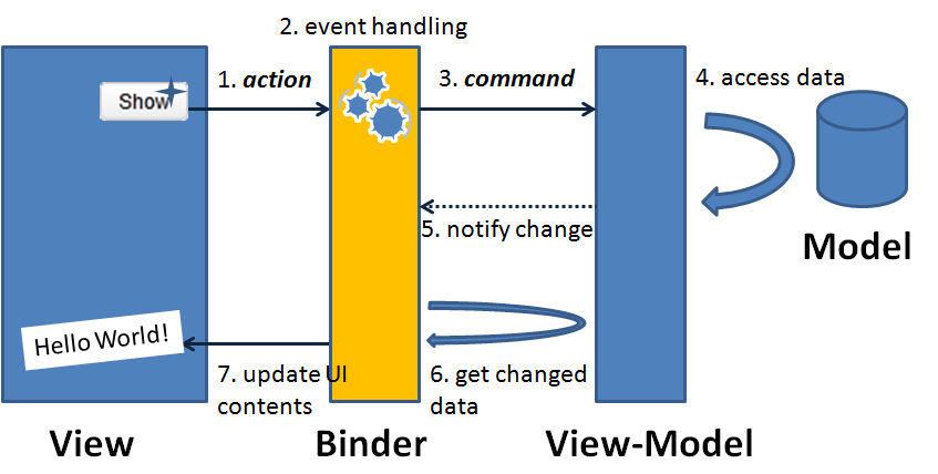
ZK Bind also now supports using the MVVM design pattern. MVVM is a variant of the Model/View/Controller(MVC) design pattern that helps achieve separation of data and logic from presentation easily. It isolates the View layer and the Model layer avoiding tight coupling between the View and Controller layer. UI designers and programmers can do their jobs in parallel and independently. Thus the productivity is enhanced and project schedule is on track.
Below shows an example of hello world using MVVM and a flash demo. For more information please click here.
View: helloMVVM.zul
<window apply="org.zkoss.bind.BindComposer" viewModel="@bind(vm='org.zkoss.mvvm.examples.hello.HelloViewModel')">
	<label value="@bind(vm.message)"/>
	<button label="Show" onClick="@bind('showHello')"/>
</window>
ViewModel: HelloViewModel.java
public HelloViewModel {
	private String message;
	public String getMessage() {
		return message;
	}

	@NotifyChange("message")
	public void showHello() {
		message = "Hello World!";
	}
}
A real world example of MVVM
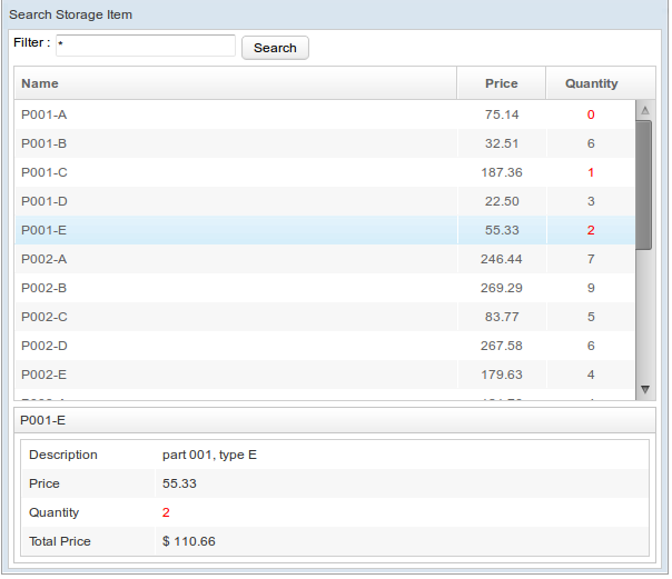
There is also a more substantial example of a MVVM implementation available, done by Dennis Chen.
For more information on this please click here.
Generic enhancements
ZK 6 has introduced the use of generics bringing greater type safety to users. This was a border line feature ZK 5, however due to the large amount of mission critical projects that ZK is used in based on Java 1.4 it was impossible to introduce the feature until now! The benefits of Java generics are quite simple, the compiler provides strong static type checking thus reducing the need for developers to check types and explicitly cast their object.
Our model framework has all been updated to support generics, therefore each of our model now take generic parameters, for example.
SimpleListModel<Person> people = new SimpleListModel<Person>();
Servlet 3 Enhancements
ZK Comet supports Servlet 3 Asynchronous Processing
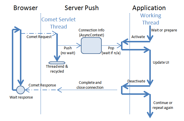
The comet implementation now supports Servlet 3 asynchronous processing. Servlet 3 brings with it the Thread per request model of handling connections meaning that a thread is not needed to keep a connection open and can be recycled. The comet implementation will now push its context to the serverpush queue which is processed using a working thread enabling the original request thread to be recycled.
Another options for developers is to use the inbuilt EventQueue to manage server push transparently. By using this functionality a working thread is not required.
This functionality significantly reduces the number of threads needed.
Servlet 3 pluggability support
Servlet 3's pluggability is now supported meaning it is not necessary to manually edit the web.xml file in every application. By dropping the ZK jar file into the project the web fragment will be loaded which contains definitions for ZK's servlet classes.
This saves developers time when setting up and deploying their applications.
jQuery & CSS 3 style Server side selectors
This unique server-side selector technology affords developers an easy and productive way of selecting and accessing server-side components using annotations. The technology makes it easier for developers to create MVC and MVVM style applications quickly and easily.
What's even better is that the selector technology is similar to that of jQuery and CSS 3, so any skills that you have from there can be transferred into ZK.
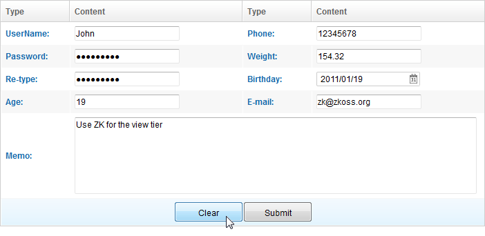
Let's take the following form as an example, this can be driven using 9 lines of code.
import org.zkoss.zk.ui.select.SelectorComposer;
import org.zkoss.zk.ui.select.annoatation.Wire;
import org.zkoss.zk.ui.select.annoatation.Listen;

public class FormController extends SelectorComposer {
   @Wire("textbox, intbox, decimalbox, datebox")
   List<InputElement> inputs;

   @Listen("onClick = button[label='Clear']")
   public void onClear(MouseEvent event) {
       for(InputElement i : inputs) i.setText("");
   }
}
By leveraging this selector technology it will make ZK programming even more productive than before. If you would like more information on this you can take a look at this small talk.
Advanced templates
Before ZK 6.0, when wanting to implement advanced functionality within Grids and Listboxes it was necessary to use a custom renderer using Java. Although using the Java approach is very powerful it can be tedious, having to create an additional class every time you want advanced row functionality is not always feasible. Speaking in terms of the MVC concept, in many cases, it makes much more sense to place ZUL as it is closer to "View" rather than the "Control" in the Java code. With ZK 6.0, a new concept called "template" is introduced. It enables UI designers to specify templates right in a ZUML page, the model can then be rendered based on the template without any Java code.
For example:
<listbox model="${fruits}">
   <listhead>
       <listheader label="Name" sort="auto"/>
       <listheader label="Weight" sort="auto"/>
   </listhead>
   <template name="model">
       <listitem>
           <listcell label="${each[0]}"/>
           <listcell label="${each[1]}"/>
       </listitem>
   </template>
</listbox>
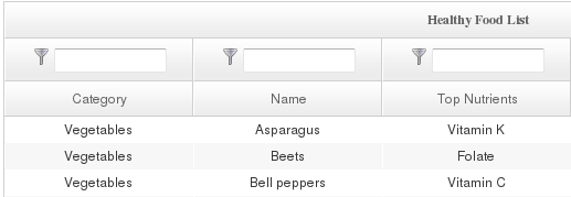
The above code will produce the following output when given an appropriate list:
This demonstrates the basic usage of templates, it is however, possible to implement more advanced layouts. The following example demonstrates a recursive use of templates in a Listbox.
<zk>
   <listbox model="${quarters}">
       <template name="model">
           <listitem>
               <listcell>${each}</listcell>
               <listcell>
                   <listbox model="${months[each]}">
                       <template name="model">
                           <listitem label="${each}"/>
                       </template>
                   </listbox>
               </listcell>
           </listitem>
       </template>
   </listbox>
</zk>
There are a huge number of potential applications for this functionality, for more information please take a look at this small talk.
Upgrade to jQuery 1.6.4
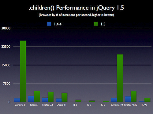
ZK 6 upgrades the base jQuery version from 1.4 to 1.6. This brings about performance improvements within the UI layer such as when traversing the DOM and accessing components attributes. The following graphs are taken from jquery blogs and outline some of the performance improvements.
For more information please see the following jQuery release notes:
ZK 6.0 provides additional navigation of the “Menubar” using the “KeyStroke” method making it more user friendly. The introduction enables users to navigate through the menu bar using the Down, Up, Left, Right, Enter, ESC, and Tab keys. This enhancement is the same behavior pattern found in Microsoft Windows; offering users the the ability to navigate through the ZK application menu bar in an already familiar manner.
As demonstrated in the video, ZK ctrlkeys is used to handle the mapping of keys. In this case “ALT + K” to open up the first menupopup and continue to use the keyboard to navigate through the menu bar.
The follow code snippet demonstrates how to set a shortcut:
<window ctrlkeys="@k" onctrlkey="menubar.firstChild.open();">
...</window>
Note: The open() method of the menu is introduced in the upcoming ZK6.0 RC release. Check out the whole demo file here.
The combobutton
ZK 6 has another brand new ZK component – “combobutton” which is effective in providing multi-function button enabling the developer to provide the user with one click actions as well as the ability to initiate further actions using the popup menu. The functionality brings desktop style functionality to the web.
The video provided below demonstrates how a “combobutton” works.
For more details, please refer to the ZK Component Reference.
ZK Breeze now default
Breeze is a ZK theme which features a light, relaxed look and feel that brings you coolness in the summer. It is extremely easy to use and supports dynamic theme switching between Breeze, Silver Gray and Classic Blue.
This theme is now the default for ZK 6. For more examples on this theme please visit our demo.
The Selectbox, Absolutelayout, Anchorlayout now in CE
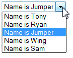
The Selectbox was created by Jumper Chen and is a lightweight version of a combobox saving memory by not creating objects for each row. For more information on the selectbox please visit the ZK Component Reference.
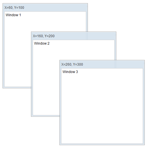
The Absolutelayout component was created by Ashish Dasnurkar and allows developers to position their components using a x,y co-ordinate system. For more information on the layout component please visit the ZK Component Reference.
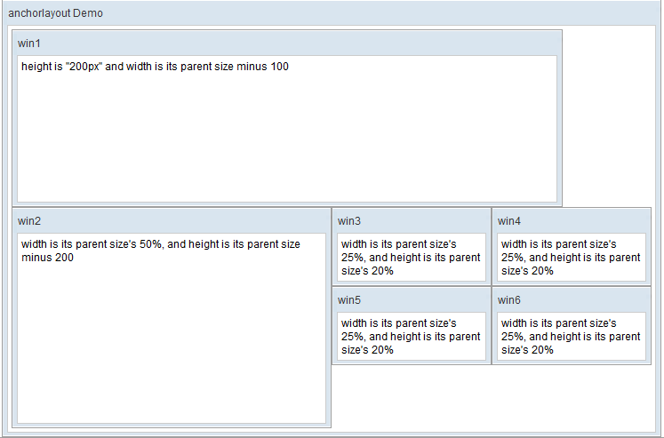
The Anchorlayout was written by Peter Kuo and enables developers to define the size of components relative to their parents. For more information on this component please visit the ZK Component Reference.
Originally Selectbox, Absolutelayout and Anchorlayout started out as community components and were not available in the core. However, due to the popularity of these components we are very pleased to say that they have been made into official ZK components and have been added to ZK 6 CE.
We wanted to say a big thank you to their respective authors Jumper, Peter and Ashish for their great contributions. If other community members have their favourite components please let us know!
The import directive
When prototyping applications using zul, you may want to access some code quickly in an attribute. Previously you were limited as it was tough to import classes without using zscript. This problem is now solved using the import directive. Using the directive you can import any class you want in a quick and efficient manner.
<?import org.zkoss.zktest.test2.*?>
<?import org.zkoss.zul.*?>
<?import org.zkoss.zktest.test2.*?>
<?import java.lang.*?>
EventListener priority
In ZK 6 it is now possible to set the priority of EventListener, this is done in conjunction with ZK's batch update system and dictates whether the event immediately or will be deferred.
EventListener li;

//normal priority
b.addEventListener("onClick", li = new EventListener() {
	public void onEvent(Event event) {
		b.parent.appendChild(new Label("Normal Priority"));
	}
});

//low priority
b.addEventListener(-1, "onClick", new EventListener() {
	public void onEvent(Event event) {
		b.parent.appendChild(new Label("Low Priority"));
	}
});

//high priority
b.addEventListener(1, "onClick", new EventListener() {
	public void onEvent(Event event) {
		b.parent.appendChild(new Label("High Priority"));
	}
});
Messagebox improvements
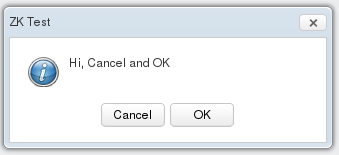
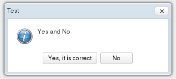
The Messagebox has been upgraded to make it easier for people to use. Changes include enums to define buttons, buttons rendered in the order they are passed and custom label support.
Buttons rendered in user order
Messagebox.show(btn.getLabel(), new Button[] {Button.CANCEL, Button.OK}, _listener);
Custom label support
Messagebox.show("Yes and No", "Test", new Messagebox.Button[] {Messagebox.Button.YES, Messagebox.Button.NO},
    new String[] {"Yes, it is correct"}, Messagebox.INFORMATION, null, null);
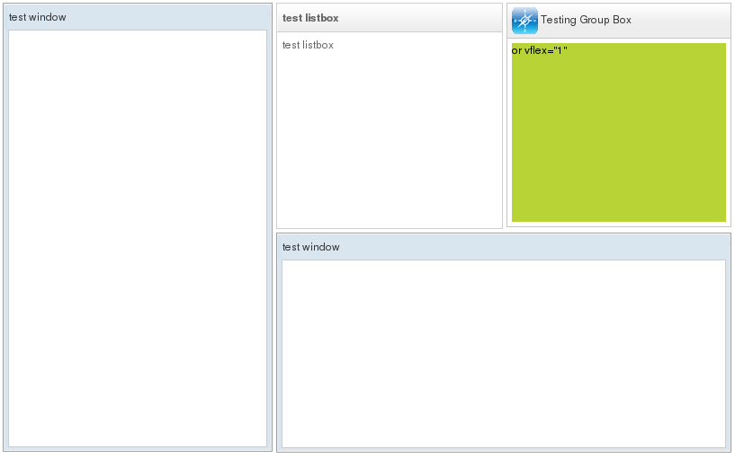
Table and Column layouts support any child
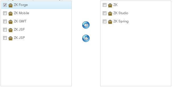
Both the Table and Column layouts now support any child component. Previously one could only use the Panel as a child, however, this has now been changed to give developers added flexibility.
	<tablelayout columns="3">
		<custom-attributes org.zkoss.zul.image.preload="true"/>
	    <tablechildren rowspan="2">
	        <window width="300px" height="500px" title="test window" border="normal" />
	    </tablechildren>
	    <tablechildren>
	        <listbox height="250px" width="250px">
	        	<listhead>
	        		<listheader label="test listbox" />
	        	</listhead>
	        	<listitem>
	       			<listcell> test listbox</listcell>
	       		</listitem>
	        </listbox>
	    </tablechildren>
	    <tablechildren>
			<groupbox mold="3d" height="250px" width="250px" open="true">
				<caption image="/test2/img/inet.png" label="Testing Group Box" />
				<div style="background:#B8D335" vflex="1"> or vflex="1"</div>
			</groupbox>
	    </tablechildren>
	    <tablechildren colspan="2">
	        <window height="245px" title="test window" border="normal" />
	    </tablechildren>
	</tablelayout>
	   <columnlayout>
	        <columnchildren width="50%">
	            <listbox id="left" multiple="true" height="300px"
	                oddRowSclass="non-odd" fixedLayout="true" checkmark="true">
	                <listitem selected="true">
	                    <listcell label="ZK Forge"
	                        src="/img/Centigrade-Widget-Icons/Briefcase-16x16.png" />
	                </listitem>
	                <listitem>
	                    <listcell label="ZK Mobile"
	                        src="/img/Centigrade-Widget-Icons/Briefcase-16x16.png" />
	                </listitem>
	                <listitem>
	                    <listcell label="ZK GWT"
	                        src="/img/Centigrade-Widget-Icons/Briefcase-16x16.png" />
	                </listitem>
	                <listitem>
	                    <listcell label="ZK JSF"
	                        src="/img/Centigrade-Widget-Icons/Briefcase-16x16.png" />
	                </listitem>
	                <listitem>
	                    <listcell label="ZK JSP"
	                        src="/img/Centigrade-Widget-Icons/Briefcase-16x16.png" />
	                </listitem>
	            </listbox>
	        </columnchildren>
	        <columnchildren width="100px">
	        	<div style="margin: 70px 34px;">
		            <image sclass="pointer" tooltiptext="Add Project"
		                src="/img/Centigrade-Widget-Icons/ButtonArrowRightDouble-32x32.png">
		            </image>
		            <separator height="15px"/>
		            <image sclass="pointer" tooltiptext="Remove Project"
		                src="/img/Centigrade-Widget-Icons/ButtonArrowLeftDouble-32x32.png">
		            </image>
		        </div>
	        </columnchildren>
	        <columnchildren width="50%">
	            <listbox id="right" multiple="true" height="300px"
	                oddRowSclass="non-odd" fixedLayout="true" checkmark="true">
	                <listitem>
	                    <listcell label="ZK"
	                        src="/img/Centigrade-Widget-Icons/Briefcase-16x16.png" />
	                </listitem>
	                <listitem>
	                    <listcell label="ZK Studio"
	                        src="/img/Centigrade-Widget-Icons/Briefcase-16x16.png" />
	                </listitem>
	                <listitem>
	                    <listcell label="ZK Spring"
	                        src="/img/Centigrade-Widget-Icons/Briefcase-16x16.png" />
	                </listitem>
	            </listbox>
	        </columnchildren>
	    </columnlayout>
Hlayout supports valign
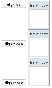
Hlayout now supports valign enabling developers to quickly and easily position controls within the hlayout.
<hlayout id="hlOne" height="100px">
    	<button id="lbOne" label="align top" width="89px" />
    	<window height="100px" title="test window" border="normal" />
</hlayout>
<hlayout id="hlTwo" valign="middle" height="100px">
    	<button id="lbTwo" label="align middle" />
    	<window height="100px" title="test window" border="normal" />
</hlayout>
<hlayout id="hlThree" valign="bottom" height="100px">
    	<button id="lbThree" label="align bottom" />
    	<window height="100px" title="test window" border="normal" />
</hlayout>
New idspace component
ZK 6 has introduced a highly requested feature from ZK's community. Many people have requested a light component similar to a div but which implements an idspace to offer greater and lighter separation of components.
<idspace>
     ...
</idspace>
Download & other resources
Comments
| Copyright © Potix Corporation. This article is licensed under GNU Free Documentation License. |
