Packaging Themes Inside Folders in ZK 6.5.2
Neil Lee, Engineer, Potix Corporation
January 15, 2013
6.5.2
Introduction to ZK Themes
ZK provides an extensive component set that allow web developers to use as building blocks for easy web page UI construction. The default styling out-of-the-box gives a look-and-feel that imitates the breeze of the Spring season. While this may suit some perfectly, some may want to have a complete make-over for a unique visual presentation that better matches their sites' thematic flavor or their company's corporate style. In ZK, switching to another 'theme' gives them a way to do just that.
In ZK's term, a 'theme' is a collection of stylesheets and associated images for its component set. Prior to 6.5.1, additional themes could only be packaged and made available to web application inside jar files. Sapphire and silvertail are the two official examples [1]. Starting from ZK 6.5.2[2], however, themes could be packaged inside a folder. A new theme can be created by first cloning the folder containing an existing theme and then making the necessary changes to the stylesheets and images.
Previous articles [3][4] have demonstrated the customization of components' visual aspects using CSS3. This article will illustrate the new theming support in upcoming ZK 6.5.2[2] by going through the process of packaging that style customization into a folder and installing the folder-based theme into a sample application.
Anatomy of ZK Themes
Before creating a new ZK theme, web designers need to understand its directory structure, let's start off by discovering where the default theme (a.k.a. breeze) is. Basically, the default theme is contained inside three java archive files: zul.jar (ZK CE), zkex.jar (ZK PE) and zkmax.jar (ZK EE). Note: freshly or evaluation versions will have special suffix to indicate the zk version and the build date. (e.g. zul-6.5.1.FL.20121204.jar).
As mentioned previously, a 'theme' is a collection of stylesheets and associated images for ZK's component set. Stylesheets are the files with extension of ".css.dsp". Think of them as normal CSS files that could utilize JSP taglib functionality. Associated images all have file extension either of ".gif" or ".png".
- Available for ZK:
-

In ZK EE, users will also have access to tablet-enhanced theme in zkmax.jar. In addition to the stylesheets and associated images, the tablet-enhanced theme also contains a property file (default.theme-properties) that could be used to easily customize attributes such as font-sizes and color values.
Once those resources are extracted from the respective java archives while preserving the original directory structure, they can be placed inside a folder, and become a basis for a new theme.
The top level subdirectories for this folder should look similar to the figure below.
Create a Folder-based Theme
Introduced in the upcoming ZK 6.5.2[2], the embodiment of a theme can come from a sub-folder under the web application's context root. Creating a folder-based theme can be broken down into the following steps.
- Create a theme folder skeleton
- Modify the theme resources
Create a theme folder skeleton
The general idea is described in Anatomy of ZK Themes. However, it is tedious and error-prone to do this step manually. Hence, these steps should be performed using a tool such as the ZK Default Theme Extractor Utility (ztx.bat)[5].
Following are the steps:
- Download ZK library into a directory.
Note: ZK library can also be found inside an existing ZK project. - Execute ztx.bat to extract the default theme into an archive
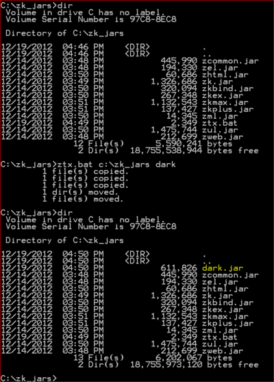
Assume ZK library can be found inside C:\zk_jars, and the new theme is to be named dark. After a typical ztx session depicted by the following figure, dark.jar archives the exact replica of the default theme in the folder structure required by ZK theming support. Once this archive is generated, it becomes the basis where the new theme could be derived.
Modify the theme resources
In previous articles [3][4], a dark theme has been developed using CSS3 technology to customize the look-and-feel of button, window, combobox and listbox components. This section will leverage those examples and illustrate how to turn that customization into a bona fide folder-based theme.
Setting up the environment:
- Create a ZK Application Project [6] (This demo uses Eclipse and Maven.)
- Create a folder named theme under the root folder of the web content.
- Unpack dark.jar under the folder theme
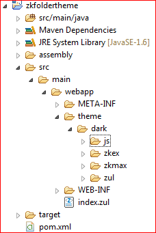
After the environment is set up, the ZK Application Project should look like the following.
Next, the new theme will need to be registered first before it could be used by the ZK application. Since the origin of the new theme is from a folder, ZK 6.5.2[2] extends the theme registration API for this purpose. ThemeOrigin is an enum defined to specify the origin of the registered theme. It has two valid values: JAR (default) and FOLDER. Since ThemeOrigin.JAR is the default value, the extended theme registration API is only needed in the case of folder-based themes. In the demo, theme registration is done in the initialization code of the view model.
 1 ...
 2 import org.zkoss.zul.theme.Themes;
 3 import org.zkoss.web.theme.StandardTheme.ThemeOrigin;
 4 ...
 5 public class MainViewModel {
 6 	...
 7 	@Init
 8 	public void init() {
 9 		...
10 		Themes.register("dark", ThemeOrigin.FOLDER);
11 		...
12 	}
13 	...
14 }
Now, let the component style modifications begin. Please refer to ZK Style Guide [7] for more information on styling ZK components.
General steps for component style modification:
- Locate the stylesheet for a given component
- Modify existing images or add new images as needed
- Customize the component style by tweaking the stylesheet located in step 1
If a component style rule needs to refer to images within the theme folder, please use the zk core taglib function encodeThemeURL for path resolution. For example, to refer to zul/img/input/combo-btn.png under the dark theme folder, use the following syntax.
1 <%@ taglib uri="http://www.zkoss.org/dsp/web/core" prefix="c" %>
2 ...
3 .z-combobox {
4 	background-image: url(${c:encodeThemeURL('~./zul/img/input/combo-btn.png')});
5 }
Note: The special prefix ~./ will be interpreted as the theme folder root (e.g. /theme/dark/).
General steps as applied to the dark theme will be described below for each component in turn.
Button Component:
- The stylesheet for button component is located in ~./js/zul/wgt/css/button.css.dsp
- No additional images are required
- Replace the stylesheet's content with this custom style
Window Component:
- The stylesheet for window component is located in ~./js/zul/wnd/css/window.css.dsp
- Replace the maximize, minimize, close icons in ~./zul/img/wnd-icon.png with the image
 .
. - Replace the stylesheet's content with this custom style
- Modify any reference to wnd-icon.png by wrapping it with encodeThemeURL()
1 background: url(${c:encodeThemeURL('~./zul/img/wnd/wnd-icon.png')}) ...;
Combobox Component:
- The stylesheet for combo component is located in ~./js/zul/inp/css/combo.css.dsp
- Replace the combobox's dropdown button in ~./zul/img/input/combo-btn.png with the image

- Replace the stylesheet's content with this custom style.
Note: combo.css.dsp also contains style definitions for other combo-like components such as bandbox, datebox, timebox, spinners, etc. However, for simplicity, this demo just replaces the entire stylesheet. - Modify any reference to combo-btn.png by wrapping it with encodeThemeURL()
1 background: url(${c:encodeThemeURL('~./zul/img/input/combo-btn.png')}) ...;
Listbox Component:
- The stylesheet for listbox is located in ~./js/zul/sel/css/listbox.css.dsp
- Replace the listbox's group expand/collapse button in ~./zul/img/tree/arrow-toggle.png with the image

- Replace the stylesheet's content with this custom style.
- Modify any reference to arrow-toggle.png by wrapping it with encodeThemeURL()
1 background: url(${c:encodeThemeURL('~./zul/img/tree/arrow-toggle.png')}) ...;
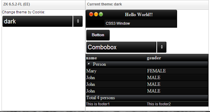
After all this has been done, button, window, combobox, and listbox components will look like the figure below when switched to the dark theme. Please refer to ZK Themes: Getting Started [8] for how to switch themes dynamically within the ZK application.
- Available for ZK:
-

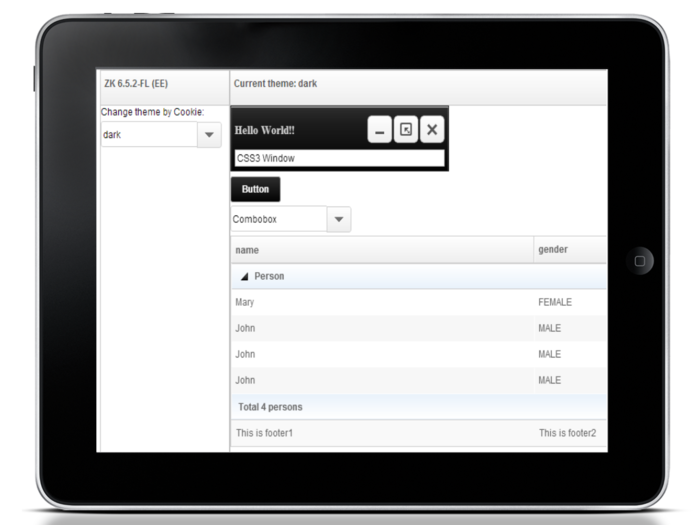
Developers could also follow the same process described above to tailor the appearance of ZK components when viewed on tablets. When locating the stylesheets to modify, look inside the ~./zkmax/css/tablet folder instead.
For ZK EE users, custom themes could support styling for desktop-only, tablet-only, or both. Web application needs to know about the platforms a custom theme may support. This is also accomplished through theme registration. When a custom theme overrides the default tablet theme, its theme name must be prefixed with "tablet:" before making registration. For example, to notify the web application that dark' theme is tablet-capable, please use the following code snippet.
1 Themes.register("tablet:dark", ThemeOrigin.FOLDER);
In addition, the default tablet-enhanced theme has refactored many attributes such as color values, font-sizes, border-widths, ... into a property file in ~./zkmax/default.theme-properties. Changing the attribute values inside this property file could quickly alter the appearance of the components without touching their stylesheets. Nevertheless, developers may also combine these two approaches to suit their needs.
Beneath are some simple editings that could be performed to darken the color scheme of button and window components.
Button component (for tablet):
- Modify the highlighted attributes in ~./zkmax/css/default.theme-properties
			...
			Button_Color = #FFFFFF
			...
			Button_FontWeight = bold
			...
			Button_Background = ${t:gradient('ver', '#2E2E2E 0%; #030303 100%')}
			...
Window component (for tablet):
- Modify the highlighted attributes in ~./zkmax/css/default.theme-properties
			...
			G_TextShadow = text-shadow: none;
			...
- Edit the highlighted lines in ~./zkmax/css/tablet/window.css.dsp
			...
			.z-window-modal-header,
			.z-window-popup-header,
			.z-window-highlighted-header,
			.z-window-overlapped-header,
			.z-window-embedded-header {
  				line-height: 36px;
				padding: 6px 0;
				font-size: ${fontSizeS};
				color: #D0D0D0;
				font-weight: bold;
				${G_TextShadow}
			}
			...
			.z-window-embedded,
			.z-window-modal,
			.z-window-highlighted,
			.z-window-overlapped,
			.z-window-popup {
				background: ${t:gradient('ver', '#2f2f2f 0%; #1d1d1d 25%; #020202 100%')}
				padding: 5px;
				border: 1px solid rgba(17, 17, 17, 0.3);
				${t:boxShadow('inset 0px 1px 1px #FFFFFF')}
				overflow: hidden;
				${t:applyCSS3('box-sizing','border-box')}
			}
			...
With only a few modifications, button and window components already match the dark thematic feel as seen from tablet devices though more finer adjustments may be necessary.
To simplify the demo, the dark theme only includes the style customization of four components. Tablet-enhanced theme also barely scratches the surface. For real-life theme development, every components in all their possible states (e.g. disabled, selected, mouse over, ...) must be considered. Moreover, the look-and-feel from both the PC and Tablet perspectives must also be taken into account.
After the new theme is developed, the entire theme folder can be exported as a zip file for distribution, say dark.zip.
Use a Folder-based Theme
Using a folder-based theme in a ZK Application is simple and versatile. Simply adopt the same environment as the one for developing a new folder-based theme. Furthermore, the ZK Application must be informed of the existence of the newly installed theme.
The process can be summarized as follows:
- Create a theme root folder
- Install the folder-based theme
- Register the folder-based theme
Let's walk through an example of using the folder-based theme dark.zip in another ZK application
Create a theme root folder
Theme root folder is where a ZK Application stores all its folder-based themes. By default, this folder is assumed to be named 'theme' and is directly under the application's root directory for its web content. This default location can be changed via the library property org.zkoss.theme.folder.root. For example, to move the theme root folder to /view/themes, the web developer would make the following configuration setting in WEB-INF/zk.xml. Please note that the value for the theme root folder cannot have leading and trailing forward slashes.
<library-property>
	<name>org.zkoss.theme.folder.root</name>
	<value>view/themes</value>
</library-property>
Install the folder-based theme
Suppose the theme root folder is changed to /view/themes through the configuration setting and that directory has been created. Simply extract the theme folder under this directory would finish this step. Since the name of the theme folder is also the name of the theme, renaming the theme folder would also rename the theme. For instance, to change the theme name from dark to darkstar, one would rename the folder accordingly.
Register the folder-based theme
Before the folder-based theme can be used, it must be registered first. The relevant code is as follows.
Themes.register("darkstar", ThemeOrigin.FOLDER);
// For ZK EE, also make customized tablet theme available
if ("EE".equals(WebApps.getEdition()))
    Themes.register("tablet:darkstar", ThemeOrigin.FOLDER);
This code fragment can be written in several places. For an example incorporating MVVM, please refer to the section Modify the theme resource. To make the folder-based theme available at application startup, write a class implementing the WebAppInit interface and place the above code inside the init() function.
public class DarkstarThemeWebAppInit implements WebAppInit {
	public void init(WebApp webapp) throws Exception {
		Themes.register("darkstar", ThemeOrigin.FOLDER);
		// For ZK EE, also make customized tablet theme available
		if ("EE".equals(WebApps.getEdition()))
		    Themes.register("tablet:darkstar", ThemeOrigin.FOLDER);
	}
}
The configuration file WEB-INF/zk.xml must also include the following configuration item.
<listener>
	<listener-class>DarkstarThemeWebAppInit</listener-class>
</listener>
Partial Override
Usually, the reason for creating a new theme is to completely change the appearance of each and every ZK components. In the case where only a few components have their visual styles altered, creating a new theme may be an overkill. In such a case, partial override may be a better solution.
Partial override refers to the mechanism allowing the developer to supply additional stylesheets that supplement and/or override the style rules defined in the current theme. The additional stylesheets are specified in WEB-INF/zk.xml.
For a concrete example, let's suppose that our application only wants the window and the button components to look like the ones in the dark theme. First of all, copy the relevant stylesheets and associated images to our application. Next, specify the stylesheets' locations in WEB-INF/zk.xml. Then, correct the urls for the associated images, if necessary.
<desktop-config>
	<theme-uri>/styles/window.css.dsp</theme-uri>
	<theme-uri>/styles/button.css.dsp</theme-uri>
</desktop-config>
Another solution would be to use a custom ThemeProvider like the following to override the styling defined in the current theme with the ones placed inside the folder /styles under the context root. Notice that the overriding paths are not wrapped by ServletFns.encodeThemeURL(). Consequently, for this example, window.css.dsp and button.css.dsp would always be overridden no matter which theme the user switches to.
 1 WebApps.getCurrent().getConfiguration().setThemeProvider(new StandardThemeProvider() {
 2
 3 	@Override
 4 	public String beforeWidgetCSS(Execution exec, String uri) {
 5 		if (uri.endsWith("window.css.dsp"))
 6 			return "/styles/window.css.dsp";
 7 		else if (uri.endsWith("button.css.dsp"))
 8 			return "/styles/button.css.dsp";
 9 		else
10 			return super.beforeWidgetCSS(exec, uri);
11 	}
12 });
Summary
In the past, additional themes are created and packaged inside Java archives. In the future, ZK 6.5.2[2] will introduce a new approach where theme could be packaged folder-based. This small talk describes the new approach in detail and explains the process the web developer would follow for theme creation and usage. In cases where only a few components need their visual presentation modified, web developer could choose to perform partial override.
Downloads
- Download the sample application (war with source): folder-based theme
- Download the sample application (war with source): partial override
References
- ↑ ZK Themes[1]
- ↑ 2.0 2.1 2.2 2.3 2.4 Please download ZK 6.5.2 Freshly before it is officially released
- ↑ 3.0 3.1 Customize Look and Feel of ZK Components Using CSS3 [2]
- ↑ 4.0 4.1 Customize Look and Feel of ZK Components Using CSS3 - Part 2 [3]
- ↑ ZK Default Theme Extractor Utility. Please download at github.
- ↑ Please refer to ZK Installation Guide
- ↑ ZK Style Guide describes in detail about the style customization of ZK components
- ↑ ZK Themes: Getting Started
Comments
| Copyright © Potix Corporation. This article is licensed under GNU Free Documentation License. |


