Window
From Documentation
Revision as of 08:16, 22 November 2013 by Southerncrossie (talk | contribs)
Component Reference
Component Reference: Window
DOM Structure
<div class="z-window z-window-mode">
    <div class="z-window-header">
        <div class="z-window-icon z-window-close">
            <i class="z-icon-remove"></i>
        </div>
        <div class="z-window-icon z-window-maximize">
            <i class="z-icon-resize-full"></i>
        </div>
        <div class="z-window-icon z-window-minimize">
            <i class="z-icon-minus"></i>
        </div>
    </div>
    <div class="z-window-content"></div>
</div>
- Line 1: z-window-mode represents window mode (z-window-embedded, z-window-overlapped, z-window-popup, z-window-modal or z-window-highlighted)
- Line 4: Close Icon Font used.
- Line 7: Resize-full Icon Font used.
- Line 10: Minus Icon Font used.
LESS Source
Basically, LESS source is correspondent to its DOM structure, and each mode have different styles.
.z-window {
    /* basic style */

    /* header style */
    &-header {
    }
    /* icon style */
    &-icon {
    }
    /* content style */
    &-content {
    }

    /* Embedded mode */
    &-embedded {
    }
    /* Overlapped mode */
    &-overlapped {
    }
    /* Pop-up mode */
    &-popup {
    }
    /* Modal mode */
    &-modal {
    }
    /* Highlighted mode */
    &-highlighted {
    }
}
Check complete LESS source for Window from Github.
LESS Variables
The following LESS variables are used for Window component. Check other variables from Github.
| Variables | Default Value |
|---|---|
| @windowBorderColor | #9C9C9C |
| @windowBackgroundColor | #D9E5EF |
| @windowFramePadding | 4px |
Customize Sample
Target Design
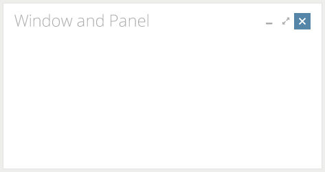
Assume the image below is our target design for Window component. No border, gradient background, rounded corner or shadow effects.
Implementation Details
Setup environment and Analyze design
- Check the instruction to setup component customization environment.
- Analyze the design
- Used Color
- Title Text: 24px, #ACACAC
- Border: #E3E3E3
- Background: #FFFFFF
- Icon: 12px, #ACACAC
- Icon Hover: 12px #FFFFFF
- Icon Hover Background: #5687A8
- Size
- Title Height: 40px
- Title Padding: 8px 8px (horizontal vertical)
- Outer Padding: 8px 8px (horizontal vertical)
- Icon: 24px * 24px
- Used Color
Modify window.less file to achieve target design
Refer here for built-in zk less functions.
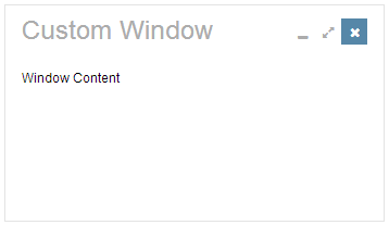
Final result
Version History
| Version | Date | Content |
|---|---|---|

