Customize Component
From Documentation
We have introduced how to execute partial customization with sclass for specific components. Now we will introduce how to customize component style by LESS and make it the default style inside a project. Subsections are detailed samples on how you can customize components.
Step to Customize Component by LESS
Here we will use Window component as an example to demonstrate how to customize a component.
- 1. Link to Window Component page to check the DOM structure.
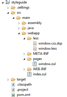
- 2. Create window.less file under less folder in ZK web project.
- The project structure (here we use maven project)
- Copy LESS content into window.less file from Github.
- 3. Tweak window style and Check window style at runtime by ZK Less Servlet.
- Modify window.less to customize look and feel of the Window component, for example, change its background color and padding by re-defining LESS variables as follows:
@import "~./zul/less/_header.less";

@windowBackgroundColor: #D9E5EF;
@windowFramePadding: 8px;

/* omitted */
- Follow this instruction to add ZKLessServlet to web.xml to compile less at runtime.
- Use window.less in window.zul page as follows to check the style modification.
<?link rel="stylesheet" href="../less/window.less"?>
<zk>
    <window title="Customize Window">
        Window Content
    </window>
</zk>
- Once the server is started, window.less will be compiled into window.css.dsp in the same folder.
- Continue to customize Window component and check the style changes by simply refreshing the browser.
- 4. Use final style in production.
- Remove
<?link rel="stylesheet" href="../less/window.less"?>in window.zul page. - Remove ZK Less Servlet settings in web.xml.
- Enable DSP Loader Servlet in web.xml
- Put window.css.dsp files (can be found under less folder) wherever you want. Then add the following settings in zk.xml file.
- Remove
<desktop-config>
    <theme-uri>/less/window.css.dsp</theme-uri>
</desktop-config>
