Chapter 3: User Interface and Layout
![]() This article is out of date, please refer to http://books.zkoss.org/zkessentials-book/master/ for more up to date information.
This article is out of date, please refer to http://books.zkoss.org/zkessentials-book/master/ for more up to date information.
Design the Layout
In the beginning, we will build the user interface which usually starts from designing the layout. ZK provides various components for different layout requirements, and you can even configure a component's attribute to adjust layout details.
Layout Requirement
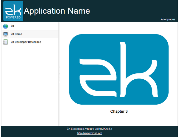
The image above is the target layout we are going to create in this chapter and this kind of design is very common in web applications. The banner at the top contains application icon, title, and user's name at the right most corner. The footer at the bottom contains general information. The sidebar on the left contains 3 links that direct you to 3 different URLs. The central area displays the current function.
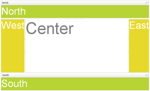
ZK provides various layout components [1], and each of them has different styles. You can use a layout component alone or combine them to build a more complex layout. According to our requirement, Border Layout[2] fits the requirement most since it has 5 areas: north, west, center, east, and south. We can use the north as a banner, west as a sidebar, south as a footer, and the center as the main function display.
Build the View
Building the View in ZK is basically creating components and there are two ways to do it: Java (programatic) and XML-based (declarative) approach. You can even mix these two approaches.
ZK allows you to compose a user interface in Java programmatically which is a feature called richlet, but we don't use this approach in this book.
ZK also provides a XML-formatted language called ZK User Interface Markup Language (ZUML). Each XML element instructs ZK Loader to create a component. Each XML attribute describes what value to be assigned to the created component. We will use this approach mainly in our example.
Write a ZUL
To create a component in ZK, we need to use a XML-based language named ZUL and all files written in ZUL should have the file extension ".zul". In zul files, one component can be represented as an XML element (tag) and you can configure each component's style, behavior, and function by setting the element's attributes.[3] First, create a new text file with name index.zul, and type the following content:
Extracted from chapter3/index.zul
<zk>
	<borderlayout hflex="1" vflex="1">
		<north height="100px" border="none" >
			<label style="font-size:50px">North for header</label>
		</north>
		<west width="260px" border="none" collapsible="true"
			  splittable="true" minsize="300">
			<label style="font-size:50px">West for sidebar</label>
		</west>
		<center id="mainContent" autoscroll="true">
			<label style="font-size:50px">Center for content</label>
		</center>
		<south height="50px" border="none">
			<label style="font-size:50px">South for footer</label>
		</south>
	</borderlayout>
</zk>
- Line 2: Each XML tag represents one component, and the tag name is equal to the component name. The attribute "hflex" and "vflex" controls the horizontal and vertical size flexibility of a component. We set them to "1" which means Fit-the-Rest flexibility. Hence, the Border Layout will stretch itself to fill all available space of whole page in width and height because it is a root component. Only one component is allowed inside North in addition to a Caption.
- Line 3: North is a child component that can only be put inside a Border Layout. You can also fix a component's height by specifying a pixel value to avoid its height changing due to browser sizes.
- Line 6, 7: Setting collapsible to true allows you to collapse the West area by clicking an arrow button. Setting splittable to true allows you to adjust the width of West and minsize limits the minimal size of width you can adjust.
- Line 10: Setting autoscroll to true will decorate the Center with a scroll bar when Center contains lots of information that exceed the its height.
- Line 4,8,11,14: These Labels are just for identifying BorderLayout's areas and we will remove them in the final result.
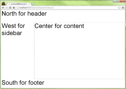
Then, you can view the result from your browser as below:
Construct User Interface with Components
Now we have a skeleton of the application, the next we need to do is to fill each area with components. We will create a separate zul file for each area and then combine them together.
chapter3/main.zul
			<vbox vflex="1" hflex="1" align="center"
					pack="center" spacing="20px" >
				<image src="/imgs/zklogo2.png" />
				<label value="Chapter 3" sclass="head1"/>
			</vbox>
- Line 1: The spacing controls the space between child components it contains.
In the banner, there's an image with a hyperlink, title, and user name. Let's see how to construct these elements with existing ZK components:
chapter3/banner.zul
<div hflex="1" vflex="1" sclass="banner">
	<hbox hflex="1" vflex="1" align="center">
		<a href="http://www.zkoss.org/">
			<image src="/imgs/zklogo.png" width="90px" />
		</a>
		<div width="400px">
			<label value="Application Name" sclass="banner-head" />
		</div>
		<hbox hflex="1" vflex="1" pack="end" align="end">
			Anonymous
		</hbox>
	</hbox>
</div>
- Line 1: The sclass, we can specify CSS class selector, and we will talk about it later.
- Line 2: The Hbox which is a layout component can arrange its child components in a row horizontally. Its align attribute controls the vertical alignment.
- Line 3: The A creates a hyperlink the same as an HTML <a> element.
- Line 4: The Image is similar to HTML <img> which can display an image.
- Line 9: The pack controls the horizontal alignment. We specify "end" on both pack and align to make the text "Anonymous" display at the bottom right corner.
- Line 10: Here we still don't implement authentication yet, so we use static user name "Anonymous" here.
For the sidebar, we want to arrange navigation items one by one vertically. There are more than one way to achieve this. Here, we use a Grid which is suitable for arranging child components in a matrix layout.
chapter3/sidebar.zul
<grid hflex="1" vflex="1" sclass="sidebar">
	<columns>
		<column width="36px"/>
		<column/>
	</columns>
	<rows>
		<row>
			<image src="/imgs/site.png"/>
			<a href="http://www.zkoss.org/">ZK</a>
		</row>
		<row>
			<image src="/imgs/demo.png"/>
			<a href="http://www.zkoss.org/zkdemo">ZK Demo</a>
		</row>
		<row>
			<image src="/imgs/doc.png"/>
			<a href="http://books.zkoss.org/wiki/ZK_Developer's_Reference">
			ZK Developer Reference
			</a>
		</row>
	</rows>
</grid>
- Line 1: Some components like Grid supports limited child components and you should also notice hierarchical relations between child components, e.g. Rows can only contain Row. Please refer to ZK_Component_Reference/Data for detail.
- Line 3: You can only put Column inside Columns.
- Line 8: Since we define two Columns, each Row can have two components, and each one belongs to a column.
We usually put some contact information in the footer and make it aligned to the center.
chapter3/footer.zul
<div hflex="1" vflex="1" sclass="footer">
	<vbox hflex="1" vflex="1" align="center">
		ZK Essentials, you are using ZK ${desktop.webApp.version}
		<a href="http://www.zkoss.org">http://www.zkoss.org</a>
	</vbox>
</div>
- Line 2: The Vbox, like Hbox, arranges child components vertically. We specify "center" at align to align those texts horizontally in the center.
- Line 3: You can use EL expressions in the tag element's body or an attribute. There are also many implicit objects, and desktop is one of them. Refer to Desktop's Javadoc to find out available properties.
Next, we will combine these separated zul pages into chapter3/index.zul.
Include a Separate Page
To complete the page, we need to put those individual pages into corresponding area of the Border Layout.
For all areas, we use Include component to combine separated pages. This component can combine a separated zul for you when the parent zul is visited. This usage is presented below:
chapter3/index.zul
<?link rel="stylesheet" type="text/css" href="/style.css"?>
<zk>
	<borderlayout hflex="1" vflex="1">
		<north height="100px" border="none" >
			<include src="/chapter3/banner.zul"/>
		</north>
		<west width="260px" border="none" collapsible="true"
				splittable="true" minsize="300">
			<include src="/chapter3/sidebar.zul"/>
		</west>
		<center id="mainContent" autoscroll="true">
			<include src="/chapter3/main.zul"/>
		</center>
		<south height="50px" border="none">
			<include src="/chapter3/footer.zul"/>
		</south>
	</borderlayout>
</zk>
- Line 1: This directive links a external style sheet under root folder.
- Line 5, 8,11, 14: Specify a separated zul path at src attribute to include a page into current page.
After including 4 separated zul pages, we complete the example of this chapter. You can visit http://localhost:8080/essentials/chapter3 to see the result. Since we set welcome file to "index.zul" in web.xml, http://localhost:8080/essentials/chapter3/index.zul will be visited by default.
Apply CSS
In addition to setting a component's attribute, we can also change a component's style by CSS (Cascading Style Sheet). There are two attributes to apply CSS:
1. style attribute. Like style attribute on HTML element, you can directly write CSS syntax as the attribute's value.
<label value="Chapter 3" style="font-weight: bold;"/>
2. sclass attribute. You should specify a CSS class selector name as the attribute value.
<div sclass="banner">
To use a CSS class selector, you should define it first in a ZUL. There are 2 ways to define a CSS class selector.
1. <style> tag.
<zk>
	<style>
		.banner {
			background-color:#102d35;
			color: white;
			padding: 5px 10px;
		}
	</style>
	...
</zk>
2. <?link ?> directive. It can link to a external style sheet which can apply to many pages. We use this way in the example to define CSS.
<?link rel="stylesheet" type="text/css" href="/style.css"?>
<zk>
	...
</zk>
References
- ↑ ZK Demo Layout. ZK releases multiple editions. Some layout components are only available in a specific edition, please refer to Feature & Edition
- ↑ Border Layout Demo
- ↑ ZK Component Reference
Source Code


