ZK8 Series: UI Template Injection
Jumper Chen, Senior Engineer, Potix Corporation
February 3, 2015
ZK 8.0.0.FL.20150205
ZUTI 1.0.0.FL.20150205
Introduction
ZK 8 is moving to a next generation framework for application developer and web designer to cooperate with each other on a different aspect of the view while develop a webapp or website. The main feature of ZK 8 is to introduce a new Shadow Element concept, which is inspired from Shadow DOM to enable better composition of the ZK components and support with ZK DataBinding (MVVM) mechanism. In other words, ZK 8 is more effort-less on theme or styling customization and application developer or web designer can apply their own HTML based layout to coexist with ZK data driven power.
The built-in shadow elements are:
- Apply: an executable tags to allows you to choose which template to be applied, it will lookup the template inside-out recursively.
- ForEach: allows you to iterate over a collection of objects. Specifying the collection by using the items attribute, and the current item is available through a variable named by the var attribute.
- Choose/When/Otherwise: performs conditional block execution by the embedded <when> subtags. It renders the body of the first <when> tag whose test condition evaluates to true. If none of the test conditions of nested <when> tags evaluates to true, then the body of an <otherwise> tag is evaluated, if present.
- If: allows the conditional execution of its body according to the value of the test attribute.
Note: you can customize your own shadow element if required.
Shadow Element Concept
Before diving into the demo example, we are about to quickly introduce the new concept Shadow Element here. A shadow element is like a boilerplate code to help application developer to compose the html layout with some dynamic data, and the other hand the web designer can predefine the template based on HTML syntax for application developer to use. Technically, the shadow elements are not visible while application developer to manipulate ZK components tree as explaining below.
For example,
<div>
    <if test="${user.editable}">
        User Name: <textbox value="${user.name}"/>
        <forEach items="${user.phones}" var="phone">
            <label value="${phone.number}"/>
        </forEach>
    </if>
</div>
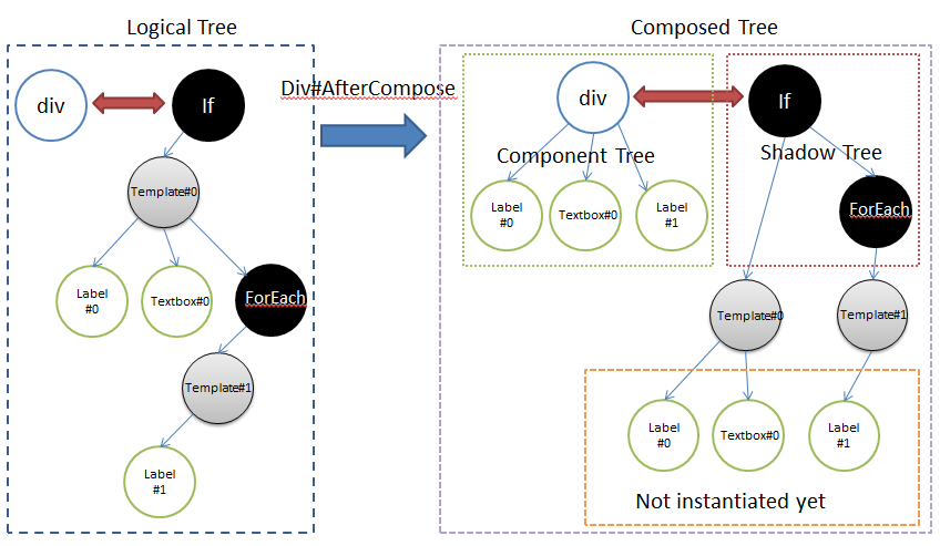
As the diagram shown above, there are separated into two parts "Logical Tree" and "Composed Tree".
- Logical Tree is created by ZK page parser to construct a page definition tree and then instantiate it into a "Composed Tree".
- Composed Tree is also separated into two parts, one is component tree (green area) that used as same as usual before, and the other is the new concept (red area) shadow tree, which is not visible for application developer but component developer.
The shadow tree in the example above with EL expression won't be alive once the ouput is rendered to the client, that is because the shadow elements are not applied with dynamic data (like @load expression), so there is no reason to store them in the server side to save the memory consumption.
Demo
In this demo, we will demonstrate how to layout 3 kind of data views (grid, list, and tree) with the same data set and codebase.
- [/_w/images/a/aa/2015-02-04_1629.swf for full size video]
There are three classes used for this demo, DataListViewModel, Item, and Author as follows.

They are all as normal as POJO objects except the DataListViewModel that provides two commands doChangeMode() and doFilterItem() for the "View" to use.
Main Layout Design
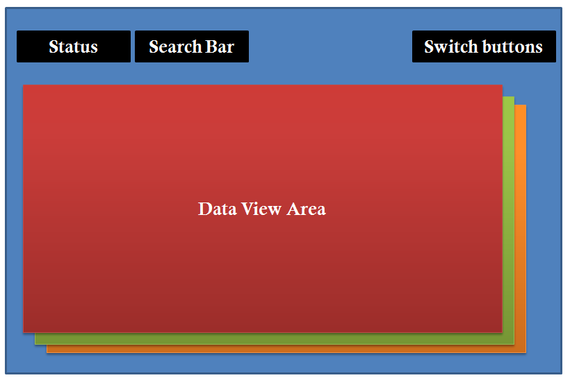
In ZK 8, we enhanced the new HTML parser to make it work with HTML or XHTML structure seamlessly. As the demo video, we designed the main view into 4 parts, Status, Search Bar, Switch Buttons, and Data View Area, and the designer can separately design the layout into a pure HTML if he/she likes to. In the other hand the application developer can more focus on the business logical , once the designed page is ready, they can simply utilize the shadow element with data binding annotation (i.e. ZK MVVM). We will explain it later.
Layout Injection Parts
The following fragment code we used is for the Data View Area to switch the three kind of the views within less than 12 lines.
<div sclass="data-container">
	<choose>
		<when test="@load(vm.mode ne 'tree')">
			<forEach items="@load(vm.dataList)">
				<apply template="@load(vm.mode)" item="@ref(each)"/>
			</forEach>
		</when>
		<otherwise>
			<apply template="@load(vm.mode)" item="@ref(each)"/>
		</otherwise>
	</choose>
</div>
In this fragment code above, we use <choose>|<when>|<otherwise> tags (JSP-like) to switch the template with the new shadow element <apply> and you can declare which dynamic property you like to pass through into the applied template, like line 5 with item="@ref(each)" and then we can use the variable item in that template.
Grid View Template
We can also apply the template from another page, for example it's a HTML based page (dataList_grid.zhtml).
<template name="grid" src="/templates/dataList_grid.zhtml"/>
Note: you can also apply the external template from <apply> shadow element directly. For example,
<apply templateURI="/templates/dataList_grid.zhtml"/>
Here is the content of the dataList_grid.zhtml file.
<div sclass="item mix" xmlns:n="native">
	<img sclass="center-block"
		src="@load(c:cat3('/image/Centigrade-Widget-Icons/' , each.name , '-128x128.png'))" />
	<n:div sclass="item-info">
		<n:div>
			<label sclass="item-name center-block" textContent="@load(each.name)" />
			<n:span style="text-align: left" sclass="pull-left">
				<img sclass="@load(c:cat('author-icon ', c:toLowerCase(each.author.name)))"
					src="~./img/spacer.gif" />
				<label textContent="@load(each.author.name)"
					sclass="author-name z-label" />
			</n:span>
		</n:div>
	</n:div>
</div>
In the zhtml page, the default page namespace is XHTML which is used for dynamic data, and the other is Native for static layout like line 1. Native component is transient alive in server side, so we cannot use it for data binding like these expressions, @load, @bind, @save, and so on.
In the example above, there are three new features added since ZK 8.
- Native component support sclass attribute as same as class attribute like line 4.
- XHTML component support to encode url for src attribute like line 3.
- c:cat3 is a EL function, for more details please see here. In ZK 8, you can replace it with EL 3.0 string concatenation. (another new feature in ZK 8)
- XHTML component support textContent for data binding to apply the text value like line 6.
List View Template
<template name="list">
	<div sclass="item-list mix">
			<n:span sclass="item-thumb">
			<image sclass="item-icon" src="@load(c:cat3('/image/Centigrade-Widget-Icons/',
					 each.name , '-128x128.png'))" />
			</n:span>
			<n:span sclass="item-info">
				<label sclass="item-name" value="@load(each.name)" />
			</n:span>
			<span style="text-align: left" sclass="pull-right">
				<image
					sclass="@load(c:cat('author-icon ', c:toLowerCase(each.author.name)))" />
				<label value="@load(each.author.name)"
					sclass="author-name" />
			</span>
	</div>
</template>
As the example shown above, the namespace with template list is ZUL, because it is defined in index.zul, so it will apply the same default namespace as the page definition. Like line 8, the <label> is the ZUL component not like in grid view template, which is a XHTML component.
Tree View Template
In the tree view, we use two <forEach> with <if> to group the data item by the same author name as the highlight lines below.
<template name="tree">
		<forEach items="@load(vm.authors)" var="author">
			<n:div sclass="mix" style="display:block">
				<span sclass="author-outline">
					<image
						sclass="@load(c:cat('author-icon ',
							c:toLowerCase(author.name)))" />
				</span>
				<label value="@load(author.name)"
					sclass="author-name" />
				<n:div sclass="item-tree-items">
					<n:div sclass="author-connector pull-left"/>
					<forEach items="@load(vm.dataList)" var="item">
						<if test="@load(item.author.name eq author.name)">
							<n:div sclass="pull-left">
								<n:span sclass="item-thumb">
									<image sclass="item-icon"
											src="@load(c:cat3('/image/Centigrade-Widget-Icons/',
												item.name , '-128x128.png'))" />
								</n:span>
								<n:span sclass="item-info">
									<label sclass="item-name" value="@load(item.name)" />
								</n:span>
							</n:div>
						</if>
					</forEach>
				</n:div>
			</n:div>
		</forEach>
		<if test="@load(not empty vm.authors)">
			<span sclass="author-outline author-empty"></span>
		</if>
</template>
More Advanced Usage
ZK 8 also provides some useful client side data binding API for application developer to use.
- Command publish: There are two ways to publish a command from client to server.
- With native component or native namespace:
<xhtml:button n:onClick="@command('doClick', {key:value, key1:valul1})"/>The arguments of the command here is a JS code, unlike the @command annotation syntax with server side parameters. - JS method invocation directly:
wgt.$binder().command('doClick', args);
- With native component or native namespace:
- Command subscribe:
wgt.$binder().after('commandName', callbackFuncation);
As an example below, we apply a MinItUp animation with our demo case after both commands "changeMode" and "filter" triggered. (line 21)
zk.afterMount(function(){

	// Instantiate MixItUp:
	$('.data-container').mixItUp({layout:{display: 'block'}});

	// get the current widget from the given selector.
	var wgt = zk.Widget.$('.data-container');

	// get the current binder
	var binder = wgt.$binder();

	// define the animation function
	var anima = function () {
		if (wgt.firstChild && jq(wgt.firstChild).hasClass('mix')) {
			$('.data-container').data('mixItUp').sort('random');
		}
	};
	anima();

	// do the animation function after both commands 'changeMode' and 'filter'
	binder.after('changeMode', anima).after('filter', anima);
});
Summary
In ZK 8, we introduced more easy, clever, and powerful way for application developer to coexist with a hotest world HTML5 seamlessly, and they can do effort-less with the theme and styling customization based on their application requriement. In the other hand, the web designer can design more fashion layout without understanding ZK Component or ZK technology. And we also appreciate you to give us more information about your thought and idea with the new ZK 8 concept coming.
Download
You can download the demo war file and all of the source code for this demo in Github
Comments
| Copyright © Potix Corporation. This article is licensed under GNU Free Documentation License. |

