Template Examples - Toggle Switch
Robert Wenzel, Engineer, Potix Corporation
May 2017
ZK 8.0
Introduction
The web is full of html5/css based layout examples ...
e.g. this: css-toggle-switch-examples
In case you wonder how to integrate this or similar examples in ZK, this article tries to guide through simple and more advanced approaches.
Using the original markup and styles
A very basic way to integrate a 3rd party layout is to re-use the markup as-is. Here the original source html example.
	<div class="settings">
		<div class="row">
			<div class="switch">
				<input id="cmn-toggle-1" class="cmn-toggle cmn-toggle-round" type="checkbox">
				<label for="cmn-toggle-1"></label>
			</div>
		</div>
...
	</div>
ZK's xhtml component set can be combined with ZUL components - using the xhtml namespace LINKME.
LINKME source file:
<zk xmlns:x="xhtml">
	<div sclass="settings"><!-- zul-div -->
		<x:div class="row"><!-- xhtml-div -->
			<x:div class="question" textContent="Enable Cookies" />
			<x:div class="switch">
				<x:input id="cmn-toggle-1" class="cmn-toggle cmn-toggle-round" type="checkbox" checked="true" />
				<x:label for="cmn-toggle-1" />
			</x:div>
		</x:div>

		<x:div class="row">
			<x:div class="question" textContent="Share Location" />
			<x:div class="switch">
				<x:input id="cmn-toggle-2" class="cmn-toggle cmn-toggle-round-flat" type="checkbox" />
				<x:label for="cmn-toggle-2" />
			</x:div>
		</x:div>
...
	</div>
</zk>
There you are.
Streamlining with templates
Assume there were no surprises in the previous paragraph, it only looks a bit repetitive. Let's make our lives a little easier writing less code using a template, for the actual toggle switch.
LINKME source file:
<zk xmlns:x="xhtml">
	<x:div class="switch">
		<x:input class="cmn-toggle cmn-toggle-${toggleClass}" type="checkbox" checked="${checked}" /><!-- no whitespace
	 --><x:label for="${self.previousSibling.uuid}" data-on="${labelOn}" data-off="${labelOff}" />
	</x:div>
</zk></zk>
- Line 3: Avoiding the whitespace to keep both nodes direct siblings otherwise there would be a Text containing whitespace between them
As xhtml elements create a server side component for each usage this can be further optimized using native elements for the non dynamic surrounding element and the static label. Only the input remains a zk component available at server side as we are only interested in the actual value.
<zk xmlns:x="xhtml" xmlns:n="native">
	<n:div class="switch">
		<x:input class="cmn-toggle cmn-toggle-${toggleClass}" type="checkbox" checked="${checked}"/>
		<n:label for="${self.firstChild.uuid}" data-on="${labelOn}" data-off="${labelOff}" />
	</n:div>
</zk>
- Line 4: Seems weird at first: Since the native elements optimize by joining into a single component, the n:label gets combined with the surrounding n:div leaving the input the firstChild of the combined surrounding element (just a little trick to avoid having to hard code IDs)
Once we have a template we can declare and use it in our page layout as often as needed.
LINKME source file:
<?component name="toggle" templateURI="template/cmn-toggle-template.zul"?>

<zk xmlns:x="xhtml">
	<div sclass="settings">
		<x:div class="row">
			<x:div class="question" textContent="Enable Cookies"/>
			<toggle toggleClass="round" checked="true"/>
		</x:div>

		<x:div class="row">
			<x:div class="question" textContent="Share Location"/>
			<toggle toggleClass="round-flat" />
		</x:div>
...
	</div>
Or even combine with an inline template to apply the settingsRow multiple times with different parameters:
LINKME source file:
<?component name="toggle" templateURI="template/cmn-toggle-template.zul"?>

<zk xmlns:x="xhtml" xmlns:n="native">
	<div sclass="settings">
		<apply template="settingsRow" question="Enable Cookies" toggleClass="round" checked="true"/>
		<apply template="settingsRow" question="Share Location" toggleClass="round-flat"/>
...

		<template name="settingsRow">
			<n:div class="row">
				<n:div class="question">${question}</n:div>
				<toggle/><!-- inherits the parameters passed into the settingsRow template -->
			</n:div>
		</template>
	</div>
</zk>
It won't get much shorter ... or does it?
Customize ZK's <checkbox> component
In this case we are lucky and the generated HTML markup structure for a ZK checkbox almost matches the css styles provide. With a few adjustments ZK's default checkbox can look the same and provide almost all features (except for the dynamic yes/no labels).
ZK:
	<span id="i8iY9" class="z-checkbox">
		<input type="checkbox" id="i8iY9-real">
		<label for="i8iY9-real" id="i8iY9-cnt" class="z-checkbox-content"></label>
	</span>
cmn-toggle:
	<div class="switch">
		<input id="cmn-toggle-1" class="cmn-toggle cmn-toggle-round" type="checkbox">
		<label for="cmn-toggle-1"></label>
	</div>
After adding a zclass/sclass like this:
<checkbox zclass="cmn-toggle" sclass="switch cmn-toggle-round"/>
We get this:
	<span id="nECY2" class="switch cmn-toggle-round cmn-toggle">
		<input type="checkbox" id="nECY2-real" checked="checked">
		<label for="nECY2-real" id="nECY2-cnt" class="cmn-toggle-content"></label>
	</span>
Now the cmn-toggle styles require only little adjustment to fit this structure (LINKME) (this is not a CSS tutorial so I'll spare you the details) and then we can build the same settings UI even without the cmn-toggle-template.zul.
<zk xmlns:n="native">
	<div sclass="settings">
		<apply template="settingsRow" question="Enable Cookies" toggleClass="round" checked="true"/>
		<apply template="settingsRow" question="Share Location" toggleClass="round-flat"/>
		<apply template="settingsRow" question="Do you agree?" toggleClass="yes-no" />
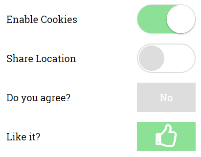
		<apply template="settingsRow" question="Like it?" toggleClass="yes-no large-icon thumbs" checked="true"/>

		<template name="settingsRow">
			<n:div class="row">
				<n:div class="question">${question}</n:div>
				<checkbox zclass="cmn-toggle" sclass="switch cmn-toggle-${toggleClass}" checked="${checked}"/>
			</n:div>
		</template>
	</div>
</zk>
Without changing ZK's markup structure we can't use the data-on/-off attributes directly. Instead we can define additional css classes for different labels. If that's too limiting it is still possible to provide a custom mold LINKME to adapt the ZK checkbox to render the same markup as required by the cmn-toggle-switch.
Summary
As demonstrated above there are many options in ZK you can choose from depending on your requirements, personal preference or experience. I hope you enjoyed this little smalltalk and I wish you happy styling.
Example Sources
The code examples are available on github in the zk-template-examples repository
Running the Example
Clone the repo
git clone git@github.com:zkoss-demo/zk-template-examples.git
The example war file can be built using the gradle-wrapper (on windows simply omit the prefix './'):
./gradlew war
Execute using jetty:
./gradlew appRun
Then access the example http://localhost:8080/zk-template-examples/css-toggle-switch/
Comments
| Copyright © Potix Corporation. This article is licensed under GNU Free Documentation License. |
