Template Examples - Toggle Switch
Robert Wenzel, Engineer, Potix Corporation
May 2017
ZK 8.0
Introduction
The web is full of html5/css based layout examples ...
e.g. this: css-toggle-switch-examples
In case you wonder how to integrate this or similar examples into a ZK application, this article tries to guide through simple and more advanced approaches.
Using the original markup and styles
A very basic way to integrate a 3rd party layout is to re-use the markup as-is. Here the original source html example.
	<div class="settings">
		<div class="row">
			<div class="switch">
				<input id="cmn-toggle-1" class="cmn-toggle cmn-toggle-round" type="checkbox">
				<label for="cmn-toggle-1"></label>
			</div>
		</div>
...
	</div>
ZK's xhtml component set can be combined with ZUL components - using the xhtml namespace.
<zk xmlns:x="xhtml">
	<div sclass="settings"><!-- zul-div -->
		<x:div class="row"><!-- xhtml-div -->
			<x:div class="question" textContent="Enable Cookies" />
			<x:div class="switch">
				<x:input id="cmn-toggle-1" class="cmn-toggle cmn-toggle-round" type="checkbox" checked="true" />
				<x:label for="cmn-toggle-1" />
			</x:div>
		</x:div>

		<x:div class="row">
			<x:div class="question" textContent="Share Location" />
			<x:div class="switch">
				<x:input id="cmn-toggle-2" class="cmn-toggle cmn-toggle-round-flat" type="checkbox" />
				<x:label for="cmn-toggle-2" />
			</x:div>
		</x:div>
...
	</div>
</zk>
There you are. Layout integrated ... but wait ...
Streamlining with templates
Assume there were no surprises in the previous paragraph, it only looks a bit repetitive. Let's make our lives a little easier writing less code using a template, for the actual toggle switch.
LINKME source file:
<zk xmlns:x="xhtml">
	<x:div class="switch">
		<x:input class="cmn-toggle cmn-toggle-${toggleClass}" type="checkbox" checked="${checked}" /><!-- no whitespace
	 --><x:label for="${self.previousSibling.uuid}" data-on="${labelOn}" data-off="${labelOff}" />
	</x:div>
</zk></zk>
- Line 3: Avoiding the whitespace to keep both nodes direct siblings otherwise there would be a Text containing whitespace between them
As xhtml elements create a server side component for each usage this can be further optimized using native elements for the non dynamic surrounding element and the static label. Only the input remains a zk component available at server side as we are only interested in the actual value.
<zk xmlns:x="xhtml" xmlns:n="native">
	<n:div class="switch">
		<x:input class="cmn-toggle cmn-toggle-${toggleClass}" type="checkbox" checked="${checked}"/>
		<n:label for="${self.firstChild.uuid}" data-on="${labelOn}" data-off="${labelOff}" />
	</n:div>
</zk>
- Line 4: Seems weird at first: Since the native elements optimize by joining into a single component, the n:label gets combined with the surrounding n:div leaving the input the firstChild of the combined surrounding element (just a little trick to avoid having to hard code IDs)
Once we have a template we can declare and use it in our page layout as often as needed.
LINKME source file:
<?component name="toggle" templateURI="template/cmn-toggle-template.zul"?>

<zk xmlns:x="xhtml">
	<div sclass="settings">
		<x:div class="row">
			<x:div class="question" textContent="Enable Cookies"/>
			<toggle toggleClass="round" checked="true"/>
		</x:div>

		<x:div class="row">
			<x:div class="question" textContent="Share Location"/>
			<toggle toggleClass="round-flat" />
		</x:div>
...
	</div>
Or even combine with an inline template to apply the settingsRow multiple times with different parameters:
LINKME source file:
<?component name="toggle" templateURI="template/cmn-toggle-template.zul"?>

<zk xmlns:x="xhtml" xmlns:n="native">
	<div sclass="settings">
		<apply template="settingsRow" question="Enable Cookies" toggleClass="round" checked="true"/>
		<apply template="settingsRow" question="Share Location" toggleClass="round-flat"/>
...

		<template name="settingsRow">
			<n:div class="row">
				<n:div class="question">${question}</n:div>
				<toggle/><!-- inherits the parameters passed into the settingsRow template -->
			</n:div>
		</template>
	</div>
</zk>
It won't get much shorter ... or does it?
Customize ZK's <checkbox> component
In this case we are lucky and the generated HTML markup structure for a ZK checkbox almost matches the css styles provide. With a few adjustments ZK's default checkbox can look the same and provide almost all features (except for the dynamic yes/no labels).
ZK:
	<span id="i8iY9" class="z-checkbox">
		<input type="checkbox" id="i8iY9-real">
		<label for="i8iY9-real" id="i8iY9-cnt" class="z-checkbox-content"></label>
	</span>
cmn-toggle:
	<div class="switch">
		<input id="cmn-toggle-1" class="cmn-toggle cmn-toggle-round" type="checkbox">
		<label for="cmn-toggle-1"></label>
	</div>
After adding a zclass/sclass like this:
<checkbox zclass="cmn-toggle" sclass="switch cmn-toggle-round"/>
We get this:
	<span id="nECY2" class="switch cmn-toggle-round cmn-toggle">
		<input type="checkbox" id="nECY2-real" checked="checked">
		<label for="nECY2-real" id="nECY2-cnt" class="cmn-toggle-content"></label>
	</span>
Now the cmn-toggle styles require only little adjustment to fit this structure (LINKME) (this is not a CSS tutorial so I'll spare you the details) and then we can build the same settings UI even without the cmn-toggle-template.zul.
<zk xmlns:n="native">
	<div sclass="settings">
		<apply template="settingsRow" question="Enable Cookies" toggleClass="round" checked="true"/>
		<apply template="settingsRow" question="Share Location" toggleClass="round-flat"/>
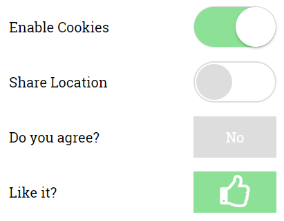
		<apply template="settingsRow" question="Do you agree?" toggleClass="yes-no" />
		<apply template="settingsRow" question="Like it?" toggleClass="yes-no large-icon thumbs" checked="true"/>

		<template name="settingsRow">
			<n:div class="row">
				<n:div class="question">${question}</n:div>
				<checkbox zclass="cmn-toggle" sclass="switch cmn-toggle-${toggleClass}" checked="${checked}"/>
			</n:div>
		</template>
	</div>
</zk>
Without changing ZK's markup structure we can't use the data-on/-off attributes directly. Instead we can define additional css classes for different labels. If that's too limiting it is still possible to provide a custom mold LINKME to adapt the ZK checkbox to render the same markup as required by the cmn-toggle-switch.
Summary
As demonstrated above there are many options in ZK you can choose from depending on your requirements, personal preference or experience. I hope you enjoyed this little smalltalk and I wish you happy styling.
Example Sources
The code examples are available on github in the zk-template-examples repository
Running the Example
Clone the repo
git clone git@github.com:zkoss-demo/zk-template-examples.git
The example war file can be built using the gradle-wrapper (on windows simply omit the prefix './'):
./gradlew war
Execute using jetty:
./gradlew appRun
Then access the example http://localhost:8080/zk-template-examples/css-toggle-switch/
Comments
| Copyright © Potix Corporation. This article is licensed under GNU Free Documentation License. |
