Responsive Design in ZK Part 2
Introduction
In continuation of Responsive Design in ZK Part1, we will look at responsiveness and integration between fluid and responsive design approaches.
Responsive Design
While providing a fluid layout make a UI usable in any screen resolution, some user experiences may require widely different layouts and designs depending on the type or size of the device used to browse the application. In this case, a responsive design can be used to switch between layouts based on browser width.
This is different from fluid design as the page structure is altered. A fluid page will simply change the display properties of its content without changing the content organization or nature. Responsiveness requires more design work to generate all full page states, but in turn it provides a much wider range of possibilities to adapt the page design to be relevant on any device type and size.
2.1 MVC Client Info event and composer
The onClientInfo event is used to relay client information such as device dimensions and orientation to the server, and update them if they change during browsing. This event will fire during page initialization and whenever client properties changes, such as tablet orientation or desktop browser resizing. More information of this event can be found here:
https://www.zkoss.org/wiki/ZK_Component_Reference/Tablet_Devices/Events/ClientInfoEvent
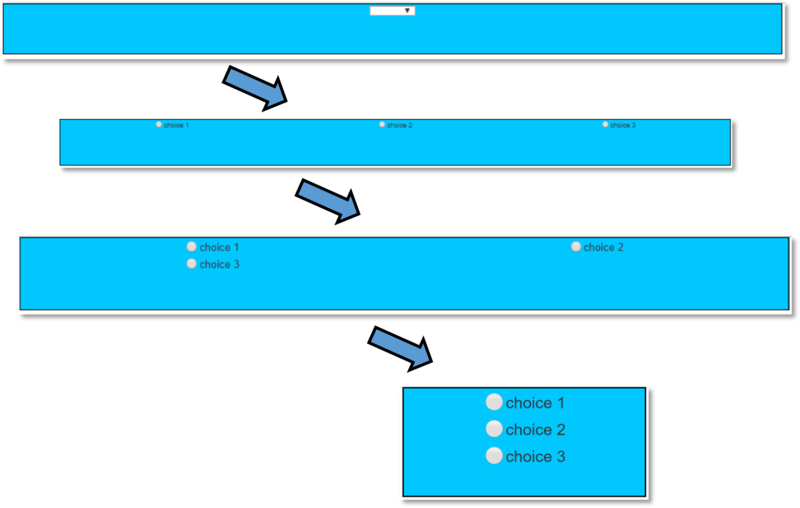
This event can be leveraged in the MVC pattern, using a controller to alter the page structure based on the information returned from the client. For example, we may want to create a design where a drop component to select one of 3 options will displayed on “large” devices (width >= 1200px), but will be replaced by 3 radio buttons on smaller devices. The underlying data model is reused between these two UI states. When transitioning to a different state we can use this technique to initialize the new UI objects based on the previous UI state data.
In the MVC pattern, the component tree is modified directly by the composer. When the onClientInfo listener is triggered, the composer will test if the responsive state has changed. If necessary, it will remove children from the anchor component and add the relevant new structure to the page.
2.2 MVVM media queries and Shadow components
The same structure can be created following the MVVM pattern using the @MatchMedia annotation introduced in ZK 8.0.2 and shadow elements introduced in ZK 8.0.0
More information on ZK MatchMedia
More information on ZK Shadow Elements
The MVVM is a natural fit for this task, since it already provides a clear separation between data and view. On the ViewModel side, the @MatchMedia annotation will trigger whenever the associated media query condition is fulfilled.
More information on Media Queries
The UI state is represented by a single ViewModel field and control the view. On the view side, Shadow elements are used to instantiate and cleanup the relevant UI elements for each state.
The MVVM design pattern provide a clear separation between the View (the different UI templates to be used) and the ViewModel (the state of the page). As the ViewModel is not replaced when switching between templates, this greatly simplify maintaining the client state. Any bound value stored in the ViewModel is available to every possible template.
2.3 Integrating fluid design elements
Fluid and responsive design can be integrated to create a more granular UI experience. A template generated using responsive design can incorporate fluid design elements to subdivide this template’s display options.
For example, based on the previous case we can add bootstrap grid entries for extra-small, small and medium states to the small layout generated in ZK.
In this case, we add fluid transitions to the MVVM responsive example to build three fluid state on top of two responsive states. The same responsive code is implemented to switch between a large template using dropdown and a small template using radio buttons.
In turn, the small template is subdivided into 3 fluid states based on Bootstrap Grid. These three states are extra small, small and medium and use the notation xs, sm and md.
This effectively creates four adaptive states: Big template, Small template - bootstrap medium, Small template - bootstrap small, Small template - bootstrap extra small. The transition between these states is handled either by requesting page information from the server (responsive) or by rearranging view elements at client side (fluid). The responsive transition is more powerful, as the page structure and components can be completely recreated to match the device needs. However, doing so requires a round-trip to the server. On the other hand, fluid transition have localized effects but is performed entirely at client side.


