WCAG handling of client feedback with za11y
Matthieu Duchemin, Engineer, Potix Corporation
Oct. 22, 2020
ZK 9.5.0
Introduction
Accessible web development is based on appropriate designs. It also requires setting attributes and values to guide the assistive readers into providing the best user experience for the end-user. We will explore a few patterns used to give feedback to the end-user in a dynamic page.
General (non-ZK-specific) patterns
WCAG compliant patterns are standard in many web applications. Some patterns commonly used in general web application development can be applied to a ZK page.
Using browser dialogs
When displaying a browser alert, the screen reader will automatically focus the alert popup. This is convenient for a small “read and forget” information such as “transaction successful” or “save complete”. Any information that stays relevant until modified, such as error states, or navigation information should be displayed in a permanent pattern instead. It should also be noted that moving the focus of the screen reader can be disorienting for the user, so these alerts shouldn’t be used as the primary interaction with the user.
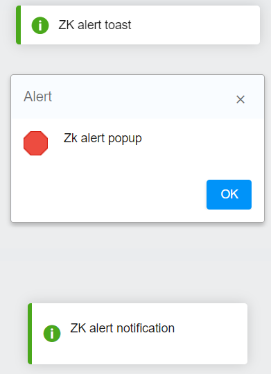
From a ZK application, the Clients.alert("Zk alert popup","Alert",null); API will work the same way. A popup will be displayed and received focus. Once the user closes the popup, the focus will return to the main document.
Using page title
Using the page title is a common accessibility pattern for applications that use multiple pages. Screen readers will read the title of the page after loading it, which makes it a cheap way to convey a status information on your page’s content. This is a common pattern when submitting a pure html form and displaying the result in a new page. This said, it is not suited to a single page web application. If the user does not navigate from page to page when performing actions, the screen readers usually will not announce the new page title. In a ZK application there may be cases in which this pattern is applicable, but generally it will be less useful due to ZK allowing for updates to an existing page without having to navigate to a different target.
ZK specific patterns
With the za11y(zk-accessibility) package loaded, ZK will automatically apply WCAG elements and attributes to help screen readers process the page. Some of these features can be used out-of-the-box, and some can be customized to match a specific target.
A demo of the code used in these examples is available on github
Using ZK notification APIs
ZK APIs dedicated to display notifications to users are WCAG-enabled when the za11y package is loaded.
Toast.show("ZK alert toast",null,null,2000,false);
Clients.alert("Zk alert popup","Alert",null);
Clients.showNotification("ZK alert notification", Clients.NOTIFICATION_TYPE_INFO, null, null, 4000);
These notification and toast options will display a temporary message, without changing the focus position or blocking the UI. The content of the message will be announced by the screen-reader.
Usability-wise, these should be treated much in the same way as alerts. They are a convenient way to indicate that an even has occurred but are not suited to provide an ongoing status. The examples above use the “duration” attribute with a value of 4000ms. It is important to note that screen-reader users do not necessarily rely on screen-reader alone. Some may use it as a browsing aid to make reading easier, but also use the default mouse behavior to navigate the screen content. As such, when designing for accessibility, it is necessary to allow a reasonable amount of time to locate and process the notifications before they are closed. For Important message consider using the “closable” attribute instead of using the “duration” attribute. This will allow the user to decide when they are ready to dismiss the message.
Notification example on github
Using ZK updates to update inline validation messages in MVVM
For this discussion, we will focus on the MVVM pattern. In the MVC pattern, the controller will have direct authority over the content of the page. In contrast, the View-Model layer is agnostic of the page structure and content, so the View layer (the zul page) must implement the validation messages returned by the View-Model.
The two most common patterns to display validation messages in an accessible application are to either make a notification block near the beginning of the page displaying the current state, or to display the validation messages near each relevant control.
Both patterns have benefits.
Listing errors at the top of the page makes the update non-intrusive and allow for more freedom in the display process.
Displaying error messages near each component can make it easier to relate to the specific component.
Listing errors in a dedicated container in ZK MVVM
During View-Model declaration, we can declare an ID for the validation messages holder.
<idspace viewModel="@id('feedbackvm')@init('zk.demo.a11y.FeedbackViewModel')" validationMessages="@id('feedbackvmsgs')">
This holder contains the collection of currently existing validation messages provided during validation by the Binder. We can simply iterate over these messages to display them.
<forEach items="@load(feedbackvmsgs.texts)">
    <label sclass="alert-message" value="${each}"/>
</forEach>
Of course, we should also prepare a container for these validation messages to display and provide WCAG attributes.
In this case, we will first declare the “ca” namespace: xmlns:ca="client/attribute"
This namespace can be used to output attributes directly to the client’s DOM tree. This is a very cheap way to add attributes to an existing component.
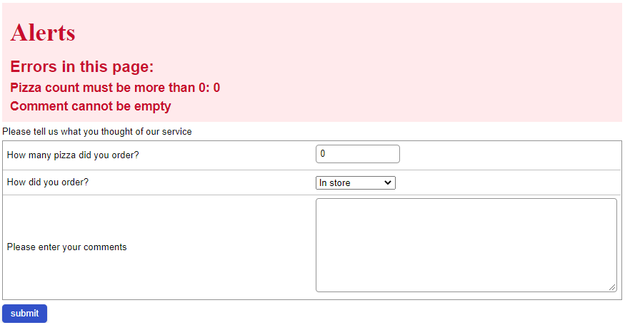
<vlayout ca:role="alert" sclass="@load(empty feedbackvmsgs.texts ? 'alert-container-empty':'alert-container')">
       <n:h1>Alerts</n:h1>
       <label sclass="alert-title" value="Errors in this page:"/>
       <forEach items="@load(feedbackvmsgs.texts)">
	       <label sclass="alert-message" value="${each}"/>
       </forEach>
</vlayout>
Example on github
The ca:role="alert" attribute on the container will mark it to be announced by the screen readers when the content change. You can choose whether this announce should be “polite” (added at the end of the current reader content) or “assertive” (immediately read when a change happens) by adding an additional attribute aria-live="polite" or aria-live="assertive".
The sclass attribute in this example will be updated depending on the content of feedbackvmsgs.texts. If the error message list is empty, the sclass for this container will be “alert-container-empty”. If there is one or more error messages in the list, the sclass will become “alert-container”. With this, we can finally define some CSS classes to accentuate the visibility of our error block.
.alert-container-empty{
	display: none;
}
.alert-container{
	background-color: #FFEAEC;
	color: #C90D2C;
	padding: 10px;
	display: block;
}
.alert-message, .alert-title{
	font-weight: bold;
}
.alert-message{
	font-size: 16px;
}
.alert-title{
	font-size: 20px;
}
Notifications displayed using the dedicated container pattern.
Listing errors inline with MVVM components
The last common pattern consists in displaying error messages next to the relevant component.
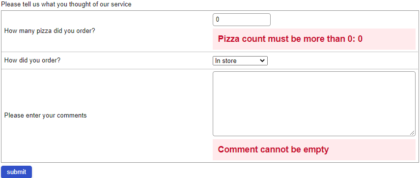
With this pattern, the end user will see error messages as they navigate over each field. This can be more usable if the page contains many fields. On the other hand, this pattern does not provide a list of errors in a single place, which can help the user to organize the actions they should take.
To create an information label using this pattern, we can bind the value of the label to the matching validation message entry in the vmsg list. If there is no error message, the entry will render as an empty string. If there is a message, the label will render the content of the message.
<intbox id="countIntbox />
<label value="@load(feedbackvmsgs[countIntbox])"/>
Example on github
On the field itself, we will add the ca:aria-describedby attribute. This attribute indicates to the screen reader that it should add the content of the label to the description of the field itself when the user navigate over this field.
As we did before, we can add sclasses and CSS rules to mark these messages are clearly defined errors to highlight them visually, in addition of using their WCAG functionality.
Notifications displayed using the inline pattern.
In conclusion
The za11y package is a powerful option to quickly raise the accessibility level of a ZK page. While accessibility is partly achieve with design choices, the minutia of setting WCAG patterns and attributes is greatly reduced by the inclusion of default values by the library on common components.
For a direct preview of the concepts explored in this smalltalk, please visit the Feedback page in the Za11y demo. You will find the source code implementing these patterns on the demo's github project
Further reading
The most important requirement of an accessible page is accessible design. ZK's customizable nature makes it easy to implement any existing general pattern. Here's a reading list of general topics on accessible design and accessible web design.
Accessible page titles in a Single Page App
w3.org Introduction to Accessibility
w3.org Notifications and feedback
w3.org WCAG navitation and titles
w3.org Using ARIA role=alert or Live Regions
MDN Accessibility general information
Comments
| Copyright © Potix Corporation. This article is licensed under GNU Free Documentation License. |


