Panel
![]() This documentation is for an older version of ZK. For the latest one, please click here.
This documentation is for an older version of ZK. For the latest one, please click here.
Panel is a container that has specific functionality and structural components that make it the perfect building block for application-oriented user interfaces. Unlike window, Panel is not an independent ID space (by implementing IdSpace), so the ID of each child can be used throughout the panel.
title, border, and frameable
A panel might have a title and a border. The title is specified by the title property. And Use border property to define the border style of panel.
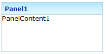
<panel height="100px" width="200px" border="normal"
    title="Panel1" >
    <panelchildren>PanelContent1</panelchildren>
</panel>
If you prefer a rounded layout, you can specify framable as true, the layout of panel would be rounded.
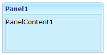
<panel height="100px" width="200px" border="normal"
    title="Panel1"  framable="true">
    <panelchildren>PanelContent1</panelchildren>
</panel>
collapsible, and open
The content of panel could be hidden using collapsible property.
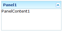
<panel height="100px" width="200px" border="normal"
    title="Panel1" collapsible="true">
    <panelchildren>PanelContent1</panelchildren>
</panel>
Along with collapsible property, you can set it to be opened or not using open property.
![]()
<panel height="100px" width="200px" border="normal"
    title="Panel1" collapsible="true" open="false">
    <panelchildren>PanelContent1</panelchildren>
</panel>
maximizable, and maximized
You can make panel's body expansible by specify maximizable property to be true.
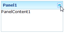
<panel height="100px" width="200px" border="normal"
    title="Panel1"  maximizable="true">
    <panelchildren>PanelContent1</panelchildren>
</panel>
Whether to expand it can be configured using maximized property.

<panel height="100px" width="200px" border="normal"
    title="Panel1"  maximizable="true" maximized="false">
    <panelchildren>PanelContent1</panelchildren>
</panel>
minimizable, minimized, and closable
You can allow the user to minimize the panel by specify minimizable property to be true.
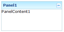
<panel height="100px" width="200px" border="normal"
    title="Panel1"  minimizable="true" >
    <panelchildren>PanelContent1</panelchildren>
</panel>
Or you can control whether to minimize it using minimized property.
<panel height="100px" width="200px" border="normal"
    title="Panel1"  minimizable="true" minimized="false">
    <panelchildren>PanelContent1</panelchildren>
</panel>
Even, you can make it closable using closable property.
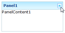
<panel height="100px" width="200px" border="normal"
    title="Panel1"  closable="true">
    <panelchildren>PanelContent1</panelchildren>
</panel>
floatable, and moveable
You can define whether to make the panel floatable to be displayed inline to its parent component using floatable property.
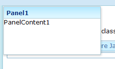
<panel height="100px" width="200px" border="normal"
    title="Panel1"  floatable="true">
    <panelchildren>PanelContent1</panelchildren>
</panel>
Even, when the panel is floatable, you can make it draggable using movable property.
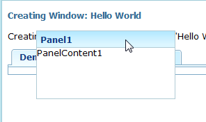
<panel height="100px" width="200px" border="normal"
    title="Panel1"  floatable="true" movable="true">
    <panelchildren>PanelContent1</panelchildren>
</panel>