Toolbarbutton
Toolbarbutton
- Demonstration: Toolbar and Fileupload
- Java API: Toolbarbutton
- JavaScript API: Toolbarbutton
- Style Guide: Toolbarbutton
Employment/Purpose
The behavior of Toolbarbutton is similar to the button except the appearance is different. The button component uses HTML BUTTON tag, while the toolbarbutton component uses HTML DIV tag.
A toolbarbutton could be placed outside a toolbar. However toolbarbuttons change their appearance if they are placed inside a toolbar.
Toolbarbutton supports getHref(). If getHref() is not null, the onClick handler is ignored and this element is degenerated to HTML's A tag.
Within ZK 5, the file upload has been redesigned so it can be integrated with any widget. For example, the toolbarbutton can now be used to upload a file. In addition to this, the display of the upload status has been enhanced and can be customized easily.
Example
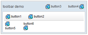
<window title="toolbar demo" border="normal" width="300px">
    <caption>
        <toolbarbutton label="button3" image="/img/network.gif" />
        <space />
        <toolbarbutton label="button4" image="/img/network.gif"
            dir="reverse" />
    </caption>
    <toolbar>
        <toolbarbutton label="button1" image="/img/network.gif" />
        <space />
        <toolbarbutton label="button2" image="/img/network.gif" />
    </toolbar>
    <hbox>
        <toolbarbutton label="button5" image="/img/network.gif"
            orient="vertical" />
        <space />
        <toolbarbutton label="button6" image="/img/network.gif"
            orient="vertical" dir="reverse" />
    </hbox>
</window>
Toggle Mode
Since 6.0.0
In the toggle mode (mode="toggle"), the toolbarbutton will display as checked after a user clicked it, and will be released after the next click.
It will fire CheckEvent when state changed.
<window title="Toolbarbutton" border="normal" width="250px" >
	<toolbar >
		<toolbarbutton label="File system" mode="toggle" >
			<attribute name="onCheck"><![CDATA[
			    if(event.isChecked()){
					result.setValue("Activated:"+event.getTarget().getLabel());
			    }else{
			    	result.setValue("Deactivated:"+event.getTarget().getLabel());
			    }
			]]></attribute>
		</toolbarbutton>
	</toolbar>

	<label id="result" />
</window>
File Upload
Any toolbarbutton[1] can be used to upload files. All you need to do is:
- Specify the
uploadattribute with true - Handles the
onUploadevent.
<toolbarbutton upload="true" label="Fileupload" onUpload="myProcessUpload(event.getMedia())"/>
When the file is uploaded, an instance of UploadEvent is sent to the button. Then, the event listener can retrieve the uploaded content by examining the return value of UploadEvent.getMedia().
Supported Events
| Event: CheckEvent
Denotes when toolbarbutton is checked , only available in toggle mode . (since ZK 6.0.0) |
- Inherited Supported Events: Button
Supported Children
*NONE
Use Cases
| Version | Description | Example Location |
|---|---|---|
Version History
| Version | Date | Content |
|---|---|---|
| 6.0.0 | 2/10 | Introduce Toggle Mode to Toobarbutton |

