Hbox
Hbox
Employment/Purpose
The hbox component is used to layout its child components horizontally and control those children's horizontal and vertical position..
Recommend Hlayout
Notice that hbox and vbox are designed to provide a more sophisticated layout, such as splitter, alignment, and packing. ZK renders these 2 components with an HTML table. If you only need the components for layout, we suggest using Hlayout and Vlayout instead, since the performance is much better (due to the use of HTML DIV instead of TABLE).
Example
<zk>
	<vbox>
		<button label="Button 1" />
		<button label="Button 2" />
	</vbox>
	<hbox>
		<button label="Button 3" />
		<button label="Button 4" />
	</hbox>
</zk>
Properties
- Inherited Properties: Box
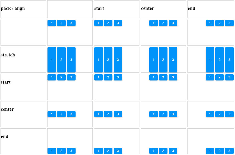
Align and Pack
<zk xmlns:n="native">
    <style content=".box {| class='wikitable' | width="100%"
    <custom-attributes
        packs="${['', 'start', 'center', 'end']}"
        aligns="${['', 'stretch', 'start', 'center', 'end']}"
    />

    <vlayout>
        <hlayout height="70px" width="900px">
            <div hflex="1" vflex="1" sclass="box">
              <n:h3>pack / align</n:h3>
            </div>
            <div forEach="${packs}" hflex="1" vflex="1" sclass="box">
              <n:h3>${each}</n:h3>
            </div>
        </hlayout>
        <hlayout forEach="${aligns}" height="100px" width="900px">
            <custom-attributes align="${each}"/>
            <div hflex="1" vflex="1" sclass="box">
              <n:h3>${align}</n:h3>
            </div>

            <hbox forEach="${packs}" align="${align}" pack="${each}" hflex="1" vflex="1" sclass="box">
                <button label="1" />
                <button label="2" />
                <button label="3" />
            </hbox>
        </hlayout>
    </vlayout>
</zk>
Since 5.0.0
Cell Component
In ZK5, we have introduced a new component named Cell which can be embedded into a Grid or Box (Hbox and Vbox) to fully control the layout and the style. You can now use the rowspan or the colspan property to layout your Grid, for example a content cell can now cross over multiple rows. The code below demonstrates how to do this:
<hbox>
    <cell sclass="years">
        ...
    </cell>
</hbox>
Since 5.0.0
Limitation
Box component is consisted by Table element. Therefore, when put Input element like Textbox, Combobox inside Box component, specify width and height to Box component will be ignored when browser try to render table element.
For example,
<hbox height="200px" width="200px" style="border: 1px solid red">
    <textbox hflex="1" value="1" />
    <textbox hflex="1" value="1" />
</hbox>
You will see the Box width exceed 200px. Also check the sample with pure HTML in jsfiddle.
Supported Events
| None | None |
- Inherited Supported Events: Box
Supported Children
*ALL
Use Cases
| Version | Description | Example Location |
|---|---|---|
Version History
| Version | Date | Content |
|---|---|---|

